


![]() Foot Locker Logo PNG
Foot Locker Logo PNG
The main message of the Foot Locker logo is that its shoes are comfortable and lightweight. The badge sets the brand apart from other offerings, demonstrating its commitment to sports and sneakers in every style. The company’s models are the best that you can buy for training.
Foot Locker’s roots go back to F.W. Woolworth, the American “five-and-dime” chain founded by Frank Winfield Woolworth. By the mid-20th century, Woolworth’s had become a diversified retail group. In 1963, it bought Kinney Shoe Corporation, where the Foot Locker concept later appeared.
The first Foot Locker opened on September 12, 1974, at Puente Hills Mall in City of Industry, California. It operated as part of Kinney Shoe Corporation and focused on athletic footwear, a narrow retail format at the time. The name referred to sports locker rooms, while employees wore referee-style uniforms. Nike and Adidas became key suppliers as the running and fitness culture expanded in the United States.
By 1978, Kinney’s division reached $800 million in annual sales, growing about 18-20% a year. Foot Locker used Woolworth’s retail network to enter major malls across the country. In 1982, Lady Foot Locker was launched for women, followed by Kids Foot Locker in 1985. In 1988, “Woolworth” bought Champs Sports, adding another sportswear and footwear chain to its portfolio.
As Woolworth’s old retail model declined, Foot Locker became a stronger business. Woolco closed in 1982, and the last Woolworth stores in the United States shut down in 1997. The company became Venator Group in 1998, then Foot Locker, Inc. in 2001. Later, it moved into online sales in 2004, invested in GOAT in 2019, and bought WSS and Atmos in 2021.
Meaning and History
![]()
Foot Locker positions itself as a brand for sneakerheads, for people who collect sneakers and know how to distinguish an original pair from a fake one. It states that its assortment includes many exclusive shoes not available at other stores. And all because of an unusual concept built on the love of sneakers. On the other hand, the catalog is not limited to a single product category; the retail chain offers a wide selection of men’s, women’s, and children’s sportswear.
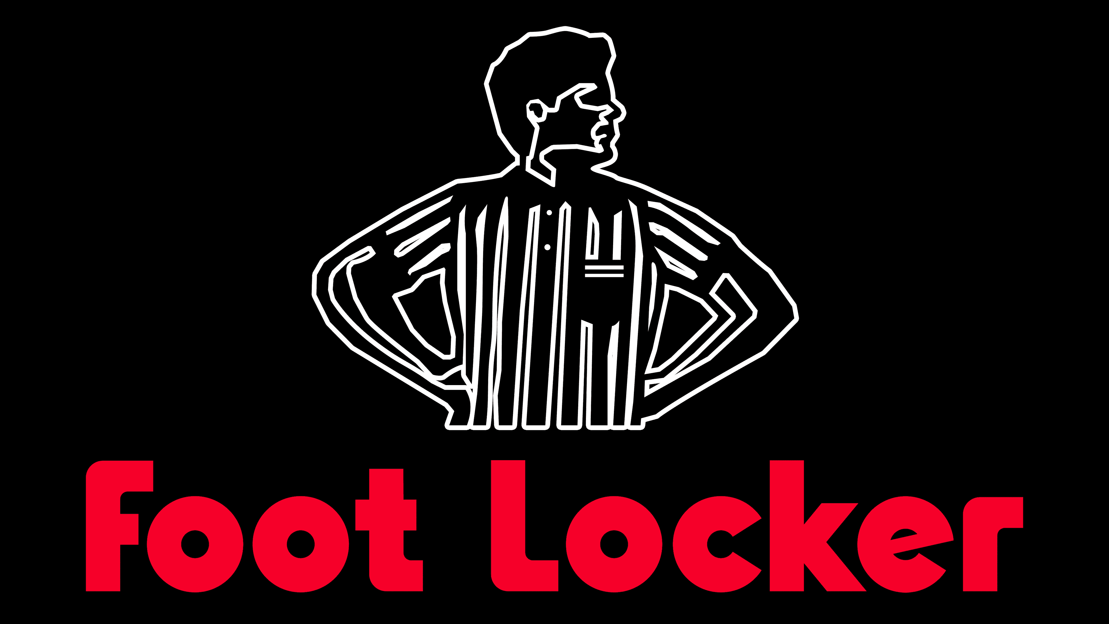
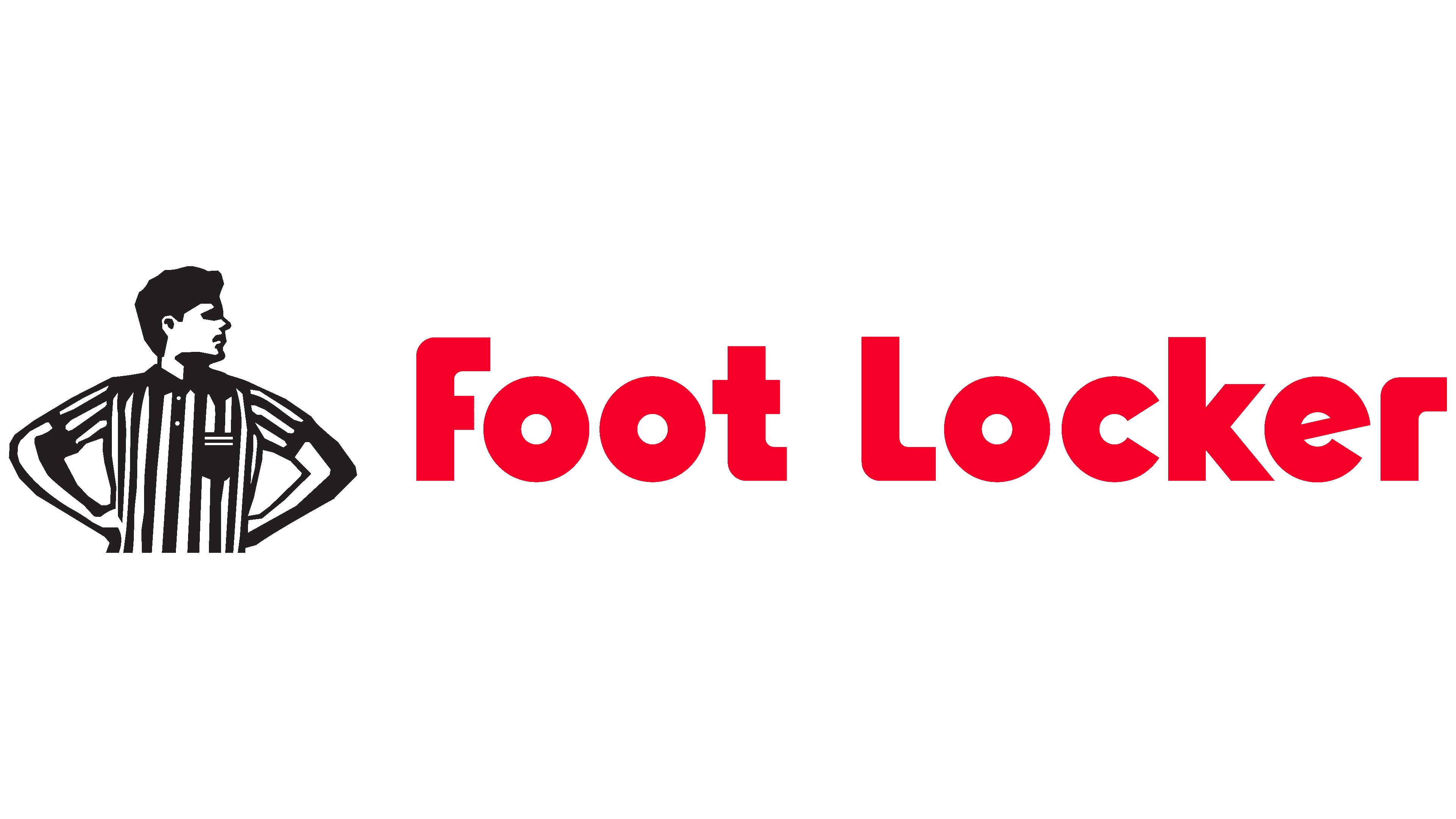
The Foot Locker logo has long depicted a referee wearing a striped black-and-white T-shirt. By the way, store employees wear the same uniform, maintaining a single visual identity. The sports referee is still the brand’s main mascot, but it is no longer in the main version of the wordmark; now the main one is a single inscription in a rectangle.
What is Foot Locker?
Foot Locker was once the flagship brand of F.W. Woolworth Company. This name is now Venator Group, Inc. (formerly Woolworth Corporation), which was renamed in 2001. Its international network includes more than 2,500 sportswear, shoe, and accessory stores.
1974 – 1988
![]()
In 1974, F.W. Woolworth Company acquired the flagship Foot Locker brand. Its name was centered in the logo, in red, using a custom sans-serif font. The latter is very similar to ITC Bauhaus Heavy. All letters, except “k,” were rounded. The “e” had a skewed horizontal line, and the edges of the “c” were aligned with the cuts at an unusual angle. The inscription was on a white background, surrounded by a green line that formed an upside-down bathtub.
1988 – today
![]()
In 1988, the parent company established a division of the Woolworth Corporation to operate Foot Locker. Meanwhile, the shoe brand changed its logo. As a result of the redesign, the green border has disappeared. Instead, an image of a referee in a jersey with vertical black-and-white stripes and a small black pocket on the right appeared above the brand name. At the same time, the developers made the font more confident by replacing smooth curves with right angles, while preserving the overall shape of the geometric grotesque. The red color has become slightly lighter and brighter than in the first version.
2020 – today
![]()
In 2020, Foot Locker (formerly Woolworth Corporation, known as Venator Group, Inc. from 1998 to 2001) revisited its brand concept. In this, she was helped by the staff of the agency Jones Knowles Ritchie. They developed a new strategy and brand identity to appeal to women who love athletic shoes.
The specialists chose a discreet black-and-white scheme to reach the target audience. At the same time, the image of the sports referee was removed from the main version of the logo. Now the wordmark contains only a white inscription within a black rectangle. The font has not changed much: the designers have retained the original letterforms, which keeps the brand recognizable.
Font and Colors
Jones Knowles Ritchie drew parallels to World War I-era ships that used striped camouflage not to hide but to avoid being recognized. So modern Foot Locker magazines can be identified by black-and-white lines, as on the referee’s uniform. The new discreet logo fits perfectly into this environment. But the old emblem featuring the referee was not forgotten, as the sports referee remains the main talisman of the Foot Locker.
The current lettering design was developed back in 1988. And only in 2020 did representatives of the Jones Knowles Ritchie agency, together with typographers from the F37 Foundry, create an individual sans-serif typeface based on it. More precisely, a whole family with three subtypes of typefaces: Classic, Standard, and Stripped. The Classic version is used for the logo.
The color of the current wordmark corresponds to the coloring of the referee’s uniform. The designers did not repeat the iconic stripes; instead, they made the company name white and placed it inside a black rectangle.