The Forbes logo demonstrates a businesslike and serious approach. Light aristocratic features and a touch of elegance have been added to the emblem, which indicates the desire to revive dry data and numbers, to make the business world interesting.
Forbes: Brand overview
| Founded: | September 15, 1917 |
| Founder: | Integrated Whale Media Investments, Forbes family |
| Headquarters: | Jersey City, New Jersey, U.S. |
| Website: | forbes.com |
Meaning and History
The original name of the world-famous magazine was Forbes: Devoted to Doers and Doings. It was co-created by two acquaintances: Bertie Charles Forbes, a Scottish-American journalist, and Walter Drey, CEO of Wall Street. The first provided his name and financial support, the second – publishing experience. Walter took over as head of B.C. Forbes Publishing Company and Bertie Charles became editor-in-chief of the magazine. He remained in this position until his death.
After 1954, the father’s business passed to his sons: Bruce Charles Forbes took the president and CEO of the company of the same name, and Malcolm Forbes headed the magazine as editor-in-chief. They raised the prestige of the publication to a very high level, which attracted the attention of potential buyers. Today the print edition also has its Internet platform. As a result, in 2014, the company that publishes Forbes was bought by the Hong Kong investment group Integrated Whale Media Investments.
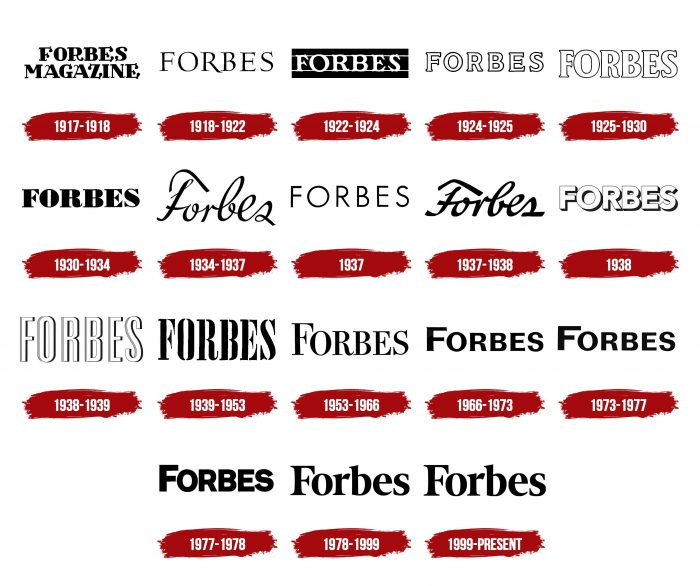
The whole world is equal to the magazine because it is famous for its impartial business view. He is appreciated for his regular rankings, including ranked lists of the world’s billionaires, planetary influencers, wealthy celebrities, the richest Americans (Forbes 400), leading international companies (Forbes Global 2000). And the magazine had a lot of logos because it strives to keep up with the times and attract readers’ attention.
What is Forbes?
Forbes is a periodical publication that publishes content on serious topics related to the global economy. Its articles cover issues of science, technology, finance, marketing, investments, politics, business, and more. However, it is best known for its annual rankings of the largest companies and wealthiest individuals. The first issue of the magazine was published in 1917 under the title Forbes: Devoted to Doers and Doings.
1917 – 1918
The debut numbers were adorned with the inscription “Forbes Magazine,” located in two rows and executed in the font in the Old English style. At the ends of the wide letters, instead of serifs, there were bold dots with miniature curls that resembled commas. They were especially pronounced in “F,” “G,” “E,” “Z,” “S,” and “R.” Both “A” had small hook-like protrusions. “B,” “M,” “I” have been styled with mini serifs.
1918 – 1922
During this period, the emblem was used with thin black letters with classic serifs. There was enough space between the signs, so they did not merge. The exception was the “R” and “B” located in the center. The elongated leg of the first letter went under the second. The authors removed the word “Magazine.”
1922 – 1924
The editors approved a new logo for the cover of the magazine. It was a horizontal black rectangle. It had two thin white stripes that ran along the bottom and top of the geometric figure, and between them was the name of the print edition. Moreover, lines on both sides connected the letters, so miniature protrusions from curved serifs were visible against a dark background.
1924 – 1925
The redesign undertaken brought an updated character design. As a result, they got a white and a black outline in the form of a thin solid strip. The curved serifs have been corrected to be classically flat.
1925 – 1930
For the next five years, the emblem consisted of wide outline marks that were hollow on the inside. They looked large, elongated, and were located almost end-to-end. “F” and “E” had shorter crossbars. The designers kept the serifs.
1930 – 1934
The logo of that time contained a half-figured inscription. The letters in the magazine’s title had very wide sides, which were connected by thin and short lines. The center strokes of “F” and “E” looked like diagonal triangles, pointed inward and edge outward.
1934 – 1937
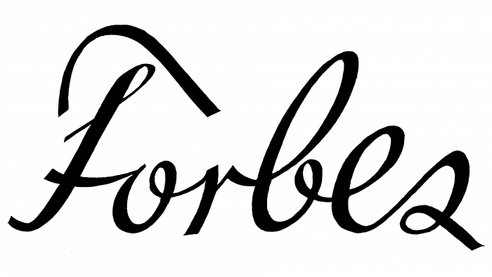
After many years of using block letters, lowercase was introduced, with the word “Forbes” in cursory handwriting. The inscription was thin and coherent: the line went without interruption and connected all the signs.
1937
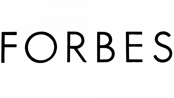
The emblem used thin sans-serif uppercase characters for the first time. As a result, the title has become much more expressive, clearer, and easier to read. It was on a light gray background – a horizontal rectangle that almost merged with white and was almost invisible.
1937 – 1938
After experimenting with grotesque, the authors of the logo decided to bring back the handwritten style. But for this, they changed the shape of the letters, leaving only the continuity of the inscription (coherence) from the previous version.
1938
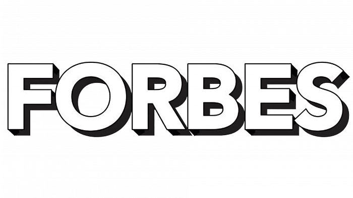
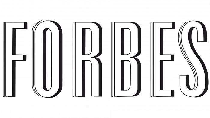
The title of the magazine has become light and large. The symbols were so tightly connected that they almost merged. On the left side, each of them consisted of a thin outline, on the right – of wide shadows. They gave the letters volume and made the title of the magazine three-dimensional.
1938 – 1939
The designers regrouped the inscription: they extended the signs, which made them tall and narrow. For more convexity, the developers added one contour strip on the left side.
1939 – 1953
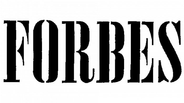
Beginning in 1939, the magazine used a large stencil font with elongated black characters.
1953 – 1966
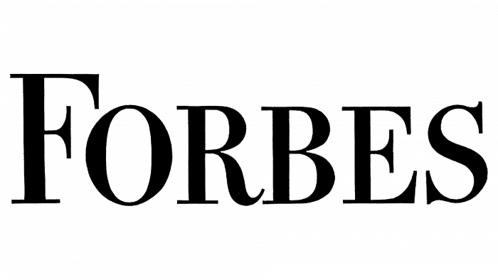
The logo featured a classic serif typeface that carried over from the previous version. Moreover, the authors left only “F” large and made all other characters small, although they were also uppercase.
1966 – 1973
The emblem text has been returned to width, resulting in a slightly larger letter spacing, adding legibility to the text. The serifs on the signs were tiny.
1973 – 1977
The logo retained the same name, from which the serifs were removed.
1977 – 1978
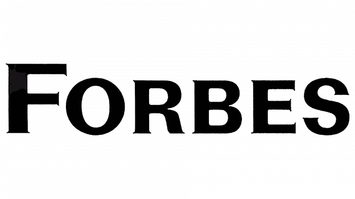
The title on the cover of the magazine was in bold. The designers squeezed the letter “F,” shortening the protruding lines, and at the “R,” they straightened the right leg. The letters were again very closely spaced.
1978 – 1999
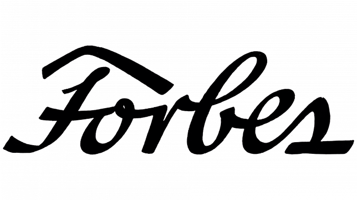
1978 saw a quantum leap in headline design. At that time, a completely different typeface was approved – modern, stylish, elegant. Only “F” remained in uppercase, while the rest of the characters were converted to lowercase.
1999 – today
The emblem uses an elegant font as the authors have made the letters slightly thinner than in the previous version. They also added the “F” curl, replaced the dot on “r” with a short stroke, and removed the bottom serif from “b.” In addition, the title has become colored, which equates to a revolution in a business magazine.
Forbes: Interesting Facts
Forbes magazine has been a big business, finance, and investment name for over 100 years, influencing entrepreneurs and leaders everywhere.
- Start: B.C. Forbes, a Scottish immigrant, and his partner Walter Drey launched Forbes in 1917. It quickly focused on business and the stories of people making things happen.
- Famous Lists: Forbes is known for its lists, such as the Forbes 400 of the wealthiest Americans and the World’s Billionaires. These lists grab attention worldwide every year.
- From Family to Global: Originally run by the Forbes family, the magazine is now a global brand after selling a major stake to international investors.
- Online Shift: Forbes jumped onto the Internet early, starting Forbes.com in 1996. The site now reaches more readers than the print magazine.
- Conferences: Forbes also holds events worldwide, where leaders and innovators discuss big industry and economy topics.
- Broad Coverage: While it still focuses on business and finance, Forbes now also covers tech, leadership, personal finance, and lifestyle, drawing in more readers.
- Worldwide Editions: With editions in Asia, Europe, and countries like China and India, Forbes addresses business news from a local perspective.
- Spotlight on Giving Back: Forbes often features stories on philanthropy and social entrepreneurship, highlighting those who succeed in business and help society.
- Collectibles and History: Although the Forbes Galleries closed in 2014, they showed the Forbes family’s interest in art, toys, and history.
- Content Innovation: Forbes lets experts and leaders write on its platform, adding diverse viewpoints, even as it raises questions about content quality.
Forbes has grown from a print magazine to a broad media brand, adapting well to changes in media and continuing to offer valuable insights and stories to its global audience.
Font and Colors
The history of the reincarnation of the Forbes identity is the evolution of its type because the entire logo consists of text. Earlier versions were dominated by serifs, while middle years were dominated by sans. Now again, there is a return to small serifs.
A typeface called Nicholas Bold is now in use. Nick Shinn designed it. The closest free font to it is Buenard Bold Font. The color palette of the lettering has always been restrained – black. In 1999, she turned blue.
Forbes color codes
| Lapis Lazul | Hex color: | #2f629b |
|---|---|---|
| RGB: | 47 98 155 | |
| CMYK: | 70 37 0 39 | |
| Pantone: | PMS 7691 C |
