


![]() Forza Motorsport Logo PNG
Forza Motorsport Logo PNG
Strive forward and overcome obstacles; this is the main message of the Forza logo. The speed, bordering on flight, is reflected in the emblem’s clear lines, soaring high. Each symbol is streamlined and agile, ready for an instant launch.
Forza began in 2001, when Microsoft created Turn 10 Studios in Redmond to build a racing simulator for Xbox’s console lineup. The target was Sony’s Gran Turismo, which had dominated the genre since 1997.
Turn 10 had little direct development experience, but on May 3, 2005, Forza Motorsport launched for the original Xbox. It focused on realistic handling, car damage, and Xbox LIVE racing, giving the console a credible simulation series.
Forza Motorsport 2 arrived in 2007 on Xbox 360 with a livery editor and online auction house, helping form a community of painters, tuners, and racers. Forza Motorsport 3 followed in 2009 and passed 2 million sales. In 2011, Forza Motorsport 4 added Kinect support and Autovista, a showroom-style mode for exploring cars. Turn 10 then partnered with Playground Games, a British studio founded by Codemasters veterans, to build an open-world racing spin-off.
Forza Horizon launched in October 2012, setting the series around a fictional festival in Colorado. From that point, Forza split into two lines: Motorsport for simulation and Horizon for open-world racing. Forza Motorsport 5 was an Xbox One launch title in 2013, featuring Drivatar AI. Horizon 2 moved to Southern Europe in 2014 with day-night cycles and weather.
By 2017, Forza retail sales had passed $1 billion. In 2018, Playground Games joined Xbox Game Studios, and Horizon 4 launched in Britain with weekly seasons. Horizon 5 moved to Mexico in 2021 and drew over 10 million players in its first week. In 2023, Turn 10 rebooted Motorsport. In 2025, Horizon 5 reached PlayStation 5, while layoffs at Turn 10 raised questions about Motorsport’s future.
Meaning and History
![]()
The media franchise’s main logo represents all the Forza racing video games. It is designed as a capital “F” and styled like a sports car. And the choice of vehicles in both series is very wide.
What is Forza?
The Forza media franchise is based on a series of racing games of the same name, which, in turn, is divided into two parts. The first, Forza Motorsport, is dedicated to professional sports. Turn 10 Studios developed it for Xbox consoles. The second part of the series is Forza Horizon, created by Playground Games Limited. It allows gamers to experience the atmosphere of a fictional festival.
![]()
Forza Motorsport Logo History
Forza Motorsport, for example, allows gamers to drive real, licensed cars, from the Audi R8 to the Honda Civic. The models’ tuning possibilities are not limited. Combined with the sheer number of tracks, this adds variety to the game.
Motorsport has the full series name written in two lines to the right of the F badge. The first word contains large, bold letters that are far apart. A similar sans-serif typeface is used for the second part, but with a thinner style.
By the way, the main logo of the franchise can also include an inscription: the designers have developed a variant in which the word “FORZA” is set below the stylized “F.” They chose a bold, grotesque font for it, with cut corners at the top ends of the “F” and “Z.”
2005
![]()
In May 2005, the first Forza Motorsport racing simulator was released. The logo’s authors played with the first letters of its name, arranging them within a black parallelogram with a silver edging. An orange “F,” with a red gradient, was in the upper-left corner. The “M” was depicted on the opposite side, white with a light gray gradient. To the right of the quadrilateral was written the phrase “FORZA MOTORSPORT.” The designers divided it into two lines and drew a thin horizontal line between them, which broke off when the protruding diagonal of the “R” met it.
To roughly match each other in width, the emblem’s developers made them different sizes. At the same time, the font differed: for “FORZA,” individual glyphs with triangular serifs and truncated strokes were used, and for “MOTORSPORT,” a bold, grotesque font was used. The two parts of the inscription were united only by an inclination to the right. All the letters and the dividing strip were black and appeared three-dimensional due to the orange-and-white outlines of uneven thickness.
2007
![]()
In 2007, a continuation of the racing game appeared. The second part of the series was released under the logo with a two-line inscription “FORZA MOTORSPORT 2”, in which both words were silver, and the deuce glowed with a red-orange gradient. Moreover, the letters had a gradient, with a dark line running through the middle. The designers removed the monogram and placed a long pattern of red-orange squares to the left of “MOTORSPORT.” At the same time, the deuce was at the top, to the right of FORZA. The text used an italic, bold font with sharp corners and holes in unexpected places.
2009
![]()
In 2009, the third racing game in the Forza Motorsport series was released. Then, the initial version of the famous symbol of the stylized letters “FM.” The part with wide red stripes was taken from the “F,” and the three gray geometric figures in the center represented the “m.” The icon’s color was uneven, as if a shadow were falling on it. Below the bottom, the game’s full name was displayed. It occupied a single line but was visually separated by the designers’ use of two colors: red and black. Due to the use of a thinner sans-serif font, the inscription became compact.
2011
![]()
For the fourth part of the Forza Motorsport series, the developers have created a logo with a 3D effect. At the same time, they reduced the distance between the emblem’s components, which represented the stylized letters “FM,” and added a glossy sheen. Thin lines along the edges made parts of the image visually bulge. The first word in the inscription became burgundy, while the second remained dark gray. At the same time, they were both shifted to the left so that the large number “4” would fit on the right, with a vertical line separating them. The four were tilted to the right and colored red with a gradient. It used the same style as the “FM” symbol.
2013
![]()
The logo for the fifth Forza Motorsport game, released in 2013, was all black. The designers recolored all elements in a single color and removed the gradient to create a minimal color scheme. They also omitted the stylized “F” and placed it to the left of the inscription. They had to stretch and shrink the symbol horizontally to balance the components of the emblem. Meanwhile, the name of the game series was split into two lines of equal length. Bold sans-serif was used for the top word and thin for the bottom. The number “5” was designed similarly and was separated by a short vertical line.
2015
![]()
In 2015, the sixth part of Forza Motorsport was released. The developers of its logo did not change anything, but instead of the five, they put the same big six – the designation of the game number.
2017
![]()
After the release of Forza Motorsport 7, a logo with a seven appeared. The number was white and was inside a black square. At the same time, the vertical line on the left side disappeared, but all other elements, including the name of the series of games and the “FM” icon, remained in place.
Forza Horizon Logo
![]()
However, playing Forza Horizon is completely different:
- These games contain many fictional locations and have an open world to explore.
- Their plot is far from professional racing: it revolves around the festival theme, so much attention is paid to various events.
- The series logo has a striking element: a large pink parallelogram.
The word “HORIZON” is written in white letters, and “FORZA” is slightly higher and painted black.
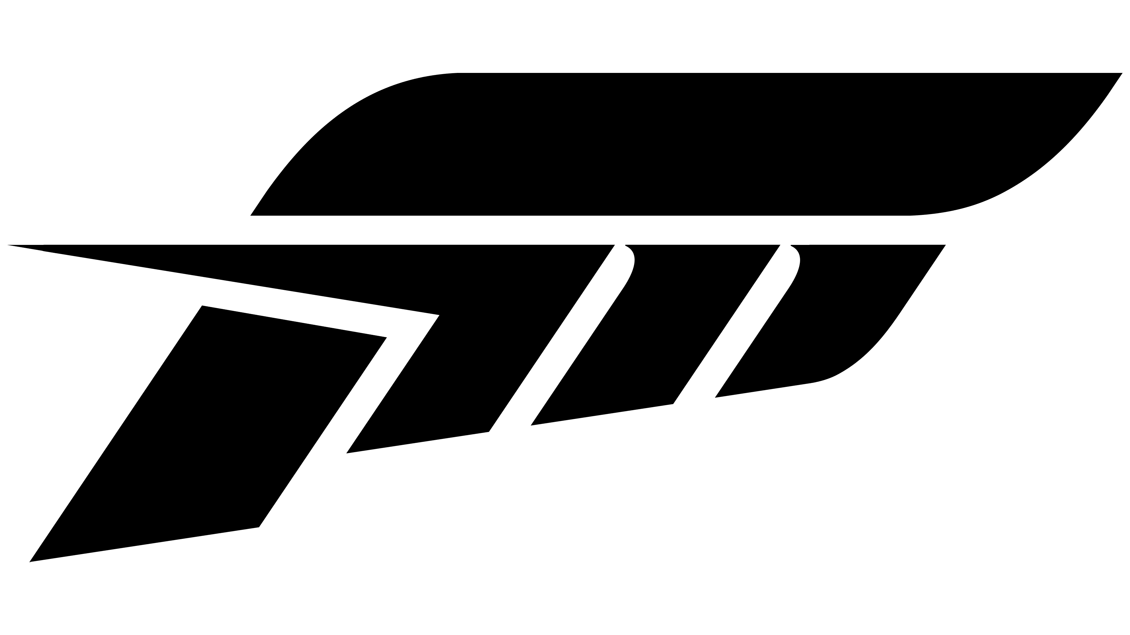
All Forza games have a common symbol representing the franchise name’s first letter. True, it is rather difficult to guess “F”: the image consists of five polygons of different sizes arranged in a certain order. The geometric abstraction is tilted to the right, creating the illusion of movement. This refers to a racing simulator because the fastest player is always the winner.
This emblem also symbolizes power, energy, and authority. It echoes the franchise’s name, which means “strength” in Italian. The stylized “F” complements the wordmarks of both Forza series. It can be above or to the left of the name.
2012
![]()
The first Forza Horizon game was released in 2012. It was recognizable by its logo, which used the familiar franchise symbol: a stylized monogram of the letters “F” and “M.” The designers made it white and placed it inside a black parallelogram, separating it from the word “FORZA” with a vertical line. At the bottom, in a crimson-pink parallelogram, the second half of the title of the series was written. The top line was in straight, bold letters, while the bottom line was in bold italics. In both cases, the spacing between the glyphs was very narrow.
2014
![]()
In the Forza Horizon 2 logo, the name was split into two lines, but the developers have now balanced the width by increasing the spacing between the letters in the first word. At the same time, the upper parallelogram disappeared so that “FORZA” became black and appeared on an empty white background. The “FM” symbol has also been repainted. The designers also increased it several times to respect the proportions between the picture and the text. The second half of the inscription was at the bottom in a pink parallelogram, as in the previous version of the emblem. There was also a deuce, the designation of a new part of the racing game.
2016
![]()
The third game, published in 2016, received the same logo as Forza Horizon 2. Only in the updated version was the deuce replaced with a triple, and the pink color became muted.
2018
![]()
After the release of the fourth game in the Forza Horizon series, a gradient emblem appeared. The designers diluted the uniform pink color by making the left side of the parallelogram a pale orange. The shades smoothly passed one into another and mixed closer to the middle. The place of the three was taken by the same large white four, which, in font, corresponded to the word “HORIZON.”
2021
![]()
Forza Horizon 5 has a three-tiered logo. At the top was an enlarged “FM” symbol, consisting of five black geometric shapes. The second line was occupied by the word FORZA. The designers kept the wide letter spacing but changed the font’s shape. Almost all glyphs looked non-standard. The “F” had its upper horizontal line cut off, the “O” became a square with rounded corners, the “R” had a diagonal leg that did not reach the vertical stroke, and the “Z” had a cut at one end to match the angle of the diagonal line.
The white word “HORIZON” was on the bottom level in a parallelogram with an orange-pink gradient. The colors have become brighter and more saturated, but the font has not changed – the logo developers have left the usual bold sans-serif italics. The number “5” on the right looked like an extension of the quadrilateral because it was also pink.
Font and Colors

The font that matches the lettering on the franchise’s main logo is Reservation Wide Bold. It was designed by Silas Dilworth in 2006 and published by Dilworth Typographics. Its free counterpart is OPTITomasoBold-Extended Font. The game designers reworked many of the glyphs, adding many pointed corners and changing the shape of the “O.”
The word “HORIZON” uses a typeface similar to Futura Condensed ExtraBlack Italic, a bold geometric sans serif italic created in 1993. But the inscription “MOTORSPORT” is made in thin, even letters that resemble Akzidenz Grotesk Extended. This typeface’s history dates back to 1989, when the Royal Typesetter created Royal Grotesk Light.
The monochrome palette is diluted with pink only on the Forza Horizon series logo. The designers chose a bright shade for the parallelogram (#EB0481) to make the white inscription visible against its background. In all other cases, only two colors are used: black and white.