


![]()
Frameworks was founded in London in 2017 and presented itself as a developer of modern office spaces. Its clients included international corporations and startups that required flexible solutions. Over time, the business grew, and the previous style no longer fit the company’s scale.
The old logo looked minimalist. A thin-lined typeface and a rectangle in place of the letter “O” resembled an architectural frame. Initially, the image suited a young project, but later failed to reflect the richness of the interiors and the scope of the work. The visual system appeared neutral and failed to reflect the brand’s character.
![]()
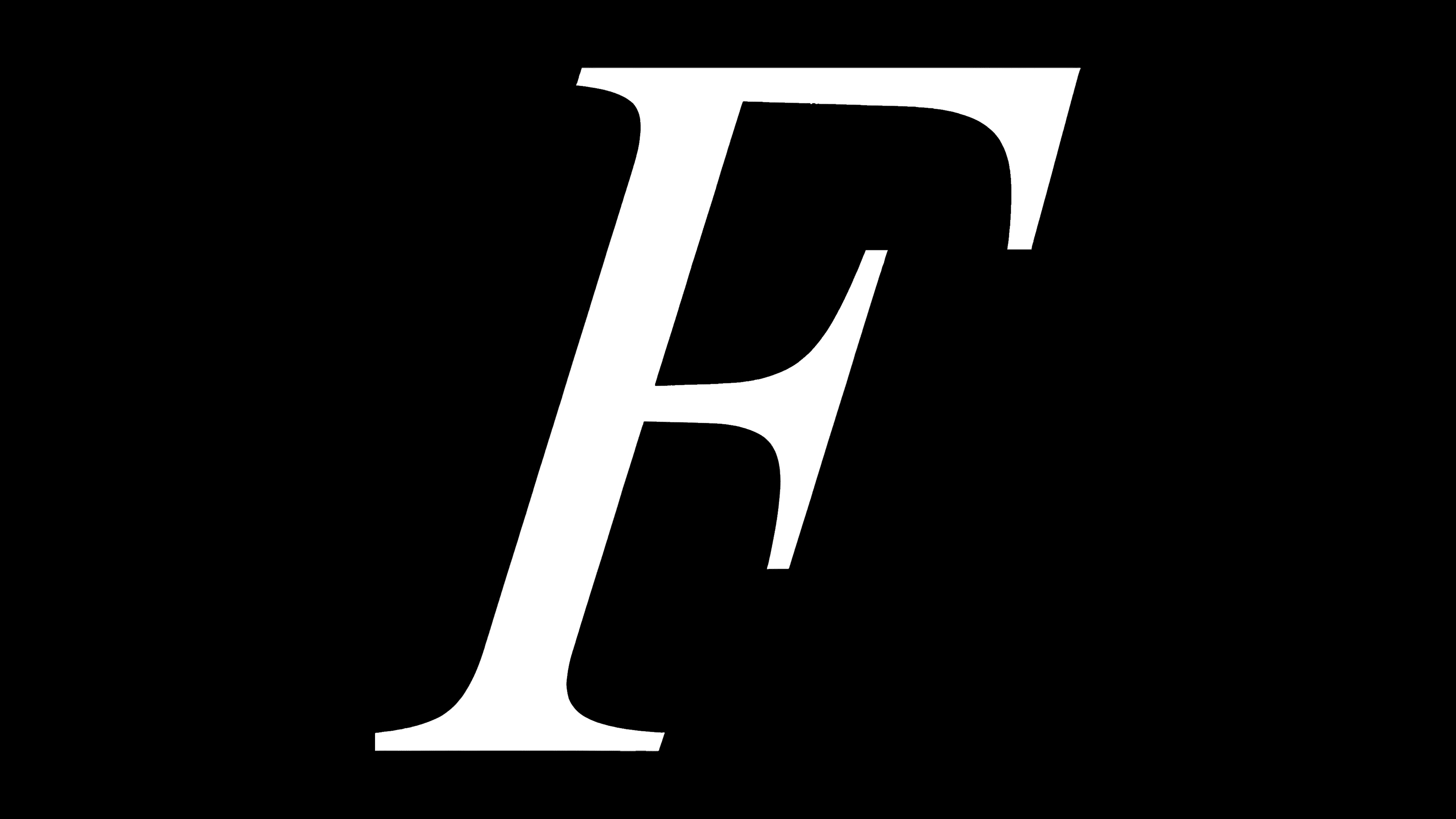
The update was carried out by the studio Blackburn. The designers used the RL Refusit Bold typeface and emphasized massive forms. The new mark creates the impression of a monumental structure, and the name is perceived as an architectural object.
An unusual solution was the letter “W,” created by flipping the letter “M.” It disrupts the usual perception, adding an accent to the composition that prompts the viewer to pause and examine the logo more closely, thereby increasing name recognition.
In addition to the main logo, a secondary mark was also created. A monogram in which decorative serif letters are assembled into a dense composition. The symbol resembles a seal or stamp on architectural drawings. It is used on documents, merchandise, and navigation inside buildings.
The identity received a color system based on the shades of interiors and the features of the buildings where the offices are located. Each location has its own visual image but remains part of the overall system.
![]()
The studio also proposed a method for naming offices, assigning them names based on the neighborhood or the building’s history. This strengthens the brand’s connection with the urban context and emphasizes the company’s attention to London’s cultural environment.
The renewed style makes Frameworks more noticeable and convincing. The brand now has a visual language that reflects the architectural nature of the projects and the level of their execution. The logo and symbol system have become essential tools for communication with clients and partners, demonstrating the company’s maturity.