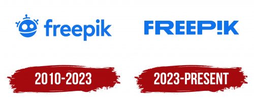
The Freepik logo evokes many strong emotions while remaining simplistic in its design. Consisting of the single word “FREEPIK,” the logo incorporates an exclamation mark instead of the letter “I,” a symbol capable of expressing excitement, indignation, and other strong feelings. The stretched “R” and “P” contrast with the compressed “F” and “E,” adding a sense of motion to the logo. Meanwhile, the cool blue color balances out the emblem’s expressiveness, keeping it within bounds.
Blue symbolizes stability, trustworthiness, and a sense of calm. The platform sends a message of reliability by opting for a cool blue hue. It reassures users that despite its dynamic and emotion-stirring capabilities, it remains a dependable source for millions of images. This color choice is a calming force amid the rollercoaster of emotions that the platform’s content may inspire.
The unique typography adds layers of depth to the brand’s identity. The logo communicates that this is no ordinary platform by replacing the ‘I’ with an exclamation mark. It’s a destination filled with expressive content designed to elicit strong reactions. This creative play with letters and punctuation serves as a visual cue for the array of emotions that users might experience while engaging with the platform’s content.
The letters in the wordmark are not uniformly designed, further enhancing the emotional range expressed by the logo. The elongated “R” and “P” give an impression of stretching beyond limits, suggesting a never-ending supply of creativity and imagination. On the flip side, the compressed “F” and “E” serve to ground the design, providing a solid base for the emotional highs and lows.
Freepik is known for its massive offering of images that span diverse themes and moods. The logo encapsulates this diversity by opting for a seemingly perpetual design. The interplay of stretched and compressed letters lends dynamism, implying that the platform constantly evolves, much like the emotions it seeks to evoke.
The logo succeeds in portraying a unique blend of emotional expressiveness and reliability. Its color scheme, typography, and innovative use of punctuation collectively offer a visual narrative that aligns well with what the platform delivers: a vast array of images designed to stir emotions yet grounded in the promise of quality and dependability.
Freepik: Brand overview
| Founded: | 2010 |
| Founder: | Alejandro Sánchez, Pablo Blanes y Joaquín Cuenca |
| Headquarters: | Málaga, Spain |
| Website: | www.freepik.com |
Founded in the year 2010 in the Spanish city of Malaga, Freepik came into existence through the collaborative efforts of Alejandro, Pablo Blanes, and their friend Joaquín Cuenca. In its initial phase, the company functioned as a search engine focusing on freely available graphic materials made by others.
Three years later, in 2013, the company expanded its operations by establishing its online marketplace. This marketplace offered a variety of vectors, photos, and templates for presentations. That same year marked the inception of a new contributor model, making it possible for independent designers to upload and share their creations through the platform.
2016 saw a pivotal change for the company as it began producing its graphical assets. This was possible by forming an internal team comprising designers, photographers, and illustrators.
A significant event occurred in 2020 when investment firm EQT bought a controlling interest in Freepik. This acquisition aimed to amplify Freepik’s market penetration in diverse regions, including North America, Southeast Asia, and Latin America.
Currently, the company boasts a diverse and expansive contributor base, with over 21,000 individuals hailing from more than 100 nations. Its extensive catalog of digital assets serves millions of users globally and has caught the attention of prominent companies such as Microsoft, Amazon, and Spotify.
Freepik, which had modest beginnings in Spain, has become a preeminent global hub for stock visuals. The platform offers a wide range of both user-generated and internally produced content. Its growth has been significantly fueled by a major investment in 2020 aimed at broadening its global reach.
