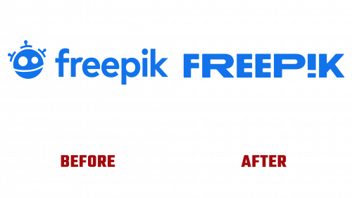
Freepik, the global powerhouse known for a plethora of graphic and audiovisual offerings, is stepping into a new era with its brand makeover. The rebranding not only encompasses a logo overhaul but also reflects the company’s mission to remain both dynamic and accessible. As the parent organization of a suite of tools that include Flaticon, Slidesgo, Videvo, Iconfinder, Wepik, and EyeEm, Freepik’s impact on the digital resource market is significant, boasting over 100 million monthly users globally.
The Freepik logo has undergone a transformative redesign, moving away from its formerly enigmatic robot icon. The updated logo champions a meticulously tailored wordmark, with accentuated letters such as “R” and “P” though no explicit reason has been provided for the selective emphasis. A flipped “i” is used creatively as an exclamation point, imbuing the brand with a playful spirit. Yet, the uneven width of the letters draws attention away from this distinct feature, generating mixed reviews.
On the social media front, this exclamation point is integrated within the letter “F,” marking an inventive yet somewhat unconventional design choice. The palette of vibrant shapes and lively textures appears to mirror the variety of assets available for sale on Freepik’s platform, making the new logo resonate with the brand’s ethos.
Behind this robust redesign is a company on the rise. Freepik’s workforce has swelled to over 550 in-house staff, supplemented by 600 exclusive remote designers and more than 42,000 contributors. Its meteoric growth hasn’t gone unnoticed; the Financial Times has named it among the ‘1,000 Fastest Growing European Companies’ for four consecutive years. G2Company also ranks it in the Top 50 Best Software Sellers.
As it stands, the new branding dovetails with Freepik’s mission to offer a lively, yet user-friendly source of design assets, appealing to everyone from design amateurs to seasoned professionals. The revamp aims to energize the brand and make it more relatable, without alienating its core user base.
This pivotal rebranding marks an important chapter in Freepik’s corporate narrative. As the digital design resource sector expands, so does the pressure for companies to adapt and stand out. Freepik’s new look is more than just skin-deep; it’s a sign of the brand’s readiness to evolve in an ever-competitive market, where adaptability is key to maintaining relevance and market share.


