Freshtohome: Brand overview
In 2015, Freshtohome, founded by Shan Kadavil and Matthew Joseph, emerged in the bustling city of Bangalore, India. This innovative startup sought to revolutionize the traditional fresh food supply chain by establishing direct links between consumers and primary producers such as fishermen and farmers.
Starting their journey in Kerala, the duo focused on the procurement and distribution of freshly caught fish and other seafood products. Over time, the company’s scope expanded to the production of antibiotic-free poultry, lamb and eggs with a focus on quality and freshness. The company has adopted cold chain technology and rigorous quality control systems to ensure it has the freshest products available.
Between 2019 and 2021, the startup has embarked on an aggressive expansion, rolling out its services in India’s major metropolitan cities including Mumbai, Delhi and Hyderabad. With an eye for efficiency, in 2021, the company shifted to eco-friendly transportation by launching a fleet of electric vehicles to provide same-day delivery. Their efforts and unique offering caught the attention of investors and by the end of 2021, the company had secured significant funding of $130 million.
Today, at the forefront of sustainable sourcing and modern market technology, Freshtohome prides itself on delivering the freshest meat, seafood and produce to its customers’ doorsteps. With a customer base of over 150,000, the company proudly positions itself as India’s leading consumer-to-consumer fresh fish and meat brand. Their vision remains clear: to lead the digital transformation of India’s fresh food supply chain and strengthen their presence in the Indian market.
Meaning and History
What is Freshtohome?
Since its inception in 2015, Freshtohome has completely changed the approach to home delivery of fresh food in India. The online platform, run by Shan Kadavil and Matthew Joseph, has become one of the most trusted and widespread food delivery services in the country due to its commitment to delivering only the freshest produce and ingredients. The company offers a wide range of products from halal meat to fresh seafood, each carefully selected from verified fishermen and farmers.
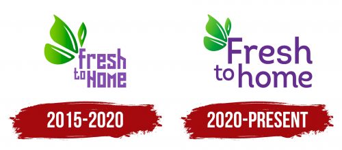
2015 – 2020
2020 – today
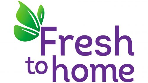
An Indian company specializing in delivering products directly from producers and farmers has a friendly logo. It reflects a warm atmosphere, safety, joy, and naturalness. The logo is based on two elements: the name and a small graphic symbol discreetly located to the right of the letter “F .”It represents three green leaves of different shapes with thin white highlights. The inscription is two-level, clearly divided into three segments: “Fresh” (above), “home” (below) and “to” (in between). The typeface is predominantly lowercase, rounded, and large.
The tiny leaves next to the letter “F” resemble little friends saying hello to each other. Each leaf has a different shape, suggesting diversity and real nature rather than plants grown according to a template. The word “Fresh” at the top resembles a waving banner promising delicious things to come. The words “home” and “to” are arranged like stepping stones, seemingly guiding from Fresh Farms straight to your home. The rounded, large letters create a sense of lightness and comfort, as if you are in a place of well-being.
Freshtohome color codes
| Medium Violet | Hex color: | #834cae |
|---|---|---|
| RGB: | 131 76 174 | |
| CMYK: | 25 56 0 32 | |
| Pantone: | PMS 2587 C |
| Kelly Green | Hex color: | #6cc300 |
|---|---|---|
| RGB: | 108 195 0 | |
| CMYK: | 45 0 100 24 | |
| Pantone: | PMS 802 C |
| Office Green | Hex color: | #008012 |
|---|---|---|
| RGB: | 0 128 18 | |
| CMYK: | 100 0 85 50 | |
| Pantone: | PMS 354 C |


