![]() Fresno Grizzlies Logo PNG
Fresno Grizzlies Logo PNG
The Fresno Grizzlies logo represents the baseball team’s athletic affiliation and regional identity. Its graphic style emphasizes the club’s strength, energy, and connection to Fresno.
The Fresno Grizzlies brought professional baseball back to Fresno in 1997 after nearly a decade. Initially affiliated with the San Francisco Giants, they played at Fresno State University’s stadium until their downtown ballpark was completed. Chukchansi Park opened in 2002, drawing nearly 13,000 fans at its debut.
Their partnership with the Giants ended in 2014, and the Grizzlies partnered with the Houston Astros, winning their first league championship in 2015. Notable players from that period included future stars Carlos Correa and Alex Bregman. For marketing purposes, the team created unique alternate identities, such as Fresno Tacos, which have gained popularity nationwide. Their annual Taco Truck Throwdown festival attracts tens of thousands of fans.
In 2019, the team became an affiliate of the Washington Nationals, then switched to the Colorado Rockies in 2021 and relocated to the Low-A California League. Despite this drop, the Grizzlies again won the championship in 2022. Today, the Fresno Grizzlies remain an integral part of California’s community and sports culture.
Meaning and History
![]()
What is Fresno Grizzlies?
It is a California baseball club, formerly a Triple-A affiliate of the San Francisco Giants and Houston Astros, now at the Single-A level. The club is renowned for its record-setting games, including a pitcher’s perfect game, and has produced former players such as World Series winners Tim Lincecum and Buster Posey.
1998 – 2001
![]()
In 1998, when the Fresno Grizzlies debuted in Triple-A after relocating from Tucson to California, the team unveiled its first logo. It reflected the new franchise’s aggressive, bold image, ready to make its mark in the league.
The emblem depicts a grizzly bear in an attacking pose, as if throwing a powerful baseball pitch. The baseball has deep claw marks, enhancing the feeling of strength and intensity. The bear wears a black baseball cap with a purple visor and a prominent letter “F” on the front panel. This element became a distinctive feature in the club’s uniforms and visual identity during its early years.
The design composition relies on the diagonal movement of the bear and the baseball’s trajectory, both pointing in the same direction, creating a sense of swift action. The bear’s open mouth, visible teeth, contrasting fur shading, and expressive claws emphasize the figure’s aggressive character.
The palette includes purple, black, beige, golden-brown, and red. This combination links the visual image to regional identity: the purple color and styling suggest a connection to California and San Francisco. At the same time, the bear references the state symbol.
The emblem conveyed the team’s energy and competitive spirit, creating a recognizable, slightly grungy visual style characteristic of the Fresno Grizzlies’ first seasons.
2002 – 2004
![]()
In 2002, coinciding with their move to the new Chukchansi Park stadium, the Fresno Grizzlies introduced updated branding, shifting from the bear-pitcher image to a prominent wordmark. The new design became simpler yet retained an aggressive tone through graphic details.
The composition centers on the large word “Grizzlies,” presented in vibrant purple with a broad silver outline and a dark gray shadow. Above the main text is the smaller word “Fresno,” rendered in white with purple outlines and a sans-serif typeface, integrated into a curved line above the primary wordmark.
A key design element is the inclusion of four diagonal scratches running through the letters in “Grizzlies,” stylized as claw marks. They visually express strength and dynamism, creating the impression that the text has been clawed. The logo features a slight horizontal curve, with the outer letters larger than the center ones.
The palette consists of purple as the primary brand color, silver and dark gray for outlines, black for depth, and white to highlight the upper word.
The design symbolized the club’s refreshed image. It reinforced its connection to Central California, maintaining team name recognition while introducing the “scratching claw” motif as a metaphor for competitive spirit.
2005 – 2007
![]()
In 2005, a new visual identity was created for the Fresno Grizzlies, combining sports motifs with the grizzly image. The design featured a shield shape integrated with the letter “G.” Inside the letter was a bear paw print, and at the top, a stylized baseball appeared. Above the composition, an illustration of a rising sun was depicted. The symbolism was presented in a compact, heraldic style.
The wordmark beneath the shield was split into two parts: the word “the” was handwritten in cursive. At the same time, “Fresno Grizzlies” was set in a decorative typeface with a dimensional effect created through outlines and shading. The contrasting lettering styles emphasized distinction between elements, and the bold contours and distinctive serifs provided expressiveness.
The palette featured brown, golden yellow, and dark green tones. This color combination created a retro-inspired atmosphere, highlighting California’s regional associations. The new color scheme did not repeat previous variations, completely altering the club’s visual identity.
The visual concept carried several layers of meaning: the shield represented stability and heritage; the paw print and baseball symbolized strength, intensity, and game dynamics; and the decorative typography ensured recognition within the Pacific Coast League.
This version was available in both full and abbreviated formats, with text and symbols, and a shortened version featuring only the shield emblem.
2008 – 2018
![]()
The Fresno Grizzlies logo redesign in the late 2000s introduced a more aggressive, dynamic visual identity. The primary image was a grizzly bear in an action-oriented pose, its paws gripping the word “Grizzlies” and its claws protruding, creating a sense of direct interaction with the logo’s surface. Below the text, a baseball was placed within an angular geometry, forming an inverted triangle alongside the bear’s body.
Above the prominent wordmark, the word “Fresno” was highlighted within a rectangular frame. This arrangement emphasized textual hierarchy and created a visual connection from the city’s name down to the team’s title. The upper and lower parts formed a unified composition, with the bear’s silhouette and triangular base perceived as one cohesive shape.
Typography relied on a bold sports-style font with massive strokes and sharp internal angles. The letters were set in lowercase, with broad strokes and a clear contrast between the fill color and the outlines, making the logo stable and easily adaptable across formats without losing its expressiveness.
The palette was based on brown tones, with bear fur, vivid orange for text and outlines, and black-and-white accents that highlighted details. This combination maintained associations with the land and nature of Central California, while the orange added visual energy and impact.
The logo’s symbolism combined the grizzly bear, a metaphor for strength and persistence, with traditional baseball imagery. The claws emphasized threat and dynamism, the baseball linked the symbol to the sport, and the text identified the city and team affiliation.
2019 – 2020
![]()
The Fresno Grizzlies unveiled an updated corporate identity following a comprehensive rebranding effort. The redesign was developed by the San Diego-based Brandiose studio, with Dorian Castro, a Fresno native and the club’s in-house designer, as a key contributor. His five years of experience with the team allowed him to adapt the visual language to regional culture and ideas, unified under the concept “Growlifornia.”
At the heart of the composition was the profile of a grizzly bear in an attacking movement facing left. Its paws extended forward, with claw lines transformed into four elongated blades, creating the visual effect of slashing through the plane. Below this graphic was a two-line wordmark: “Fresno” in black on the upper line and “Grizzlies” in scarlet on the lower line. The same four claw marks ran diagonally across both lines of text.
The palette combined scarlet, black, gold, and beige. It was chosen independently of the main league’s colors. Still, it coincided with the red of the affiliate partner, the Washington Nationals. This combination supported regional identity and visually distinguished the club within the MiLB system. Beige and gold tones, detailed fur, and accents add visual depth.
Typography featured a bold, angular style with adapted claw motifs, reinforcing the energetic symbolism associated with bear imagery.
The emblem appeared on uniforms, hats, merchandise, and promotional materials. A prominent element was the home cap in scarlet, featuring a Bear Flag variant and a clawed banner symbol. Alternate versions included an “F Slash” element, redesigned to match the new wordmark style. The secondary “Bear Flag Rebellion” logo, created by the same studio, earned a Creamer Award as the best alternate logo of 2019.
The new visual concept reinforced the club’s independent identity, shifting the emphasis from the parent team’s colors to territorial and cultural affiliations with Fresno and the Central Valley. The aggressive grizzly in motion solidified associations with strength, speed, and readiness to attack, becoming central to the team’s updated identity.
2021 – today
![]()
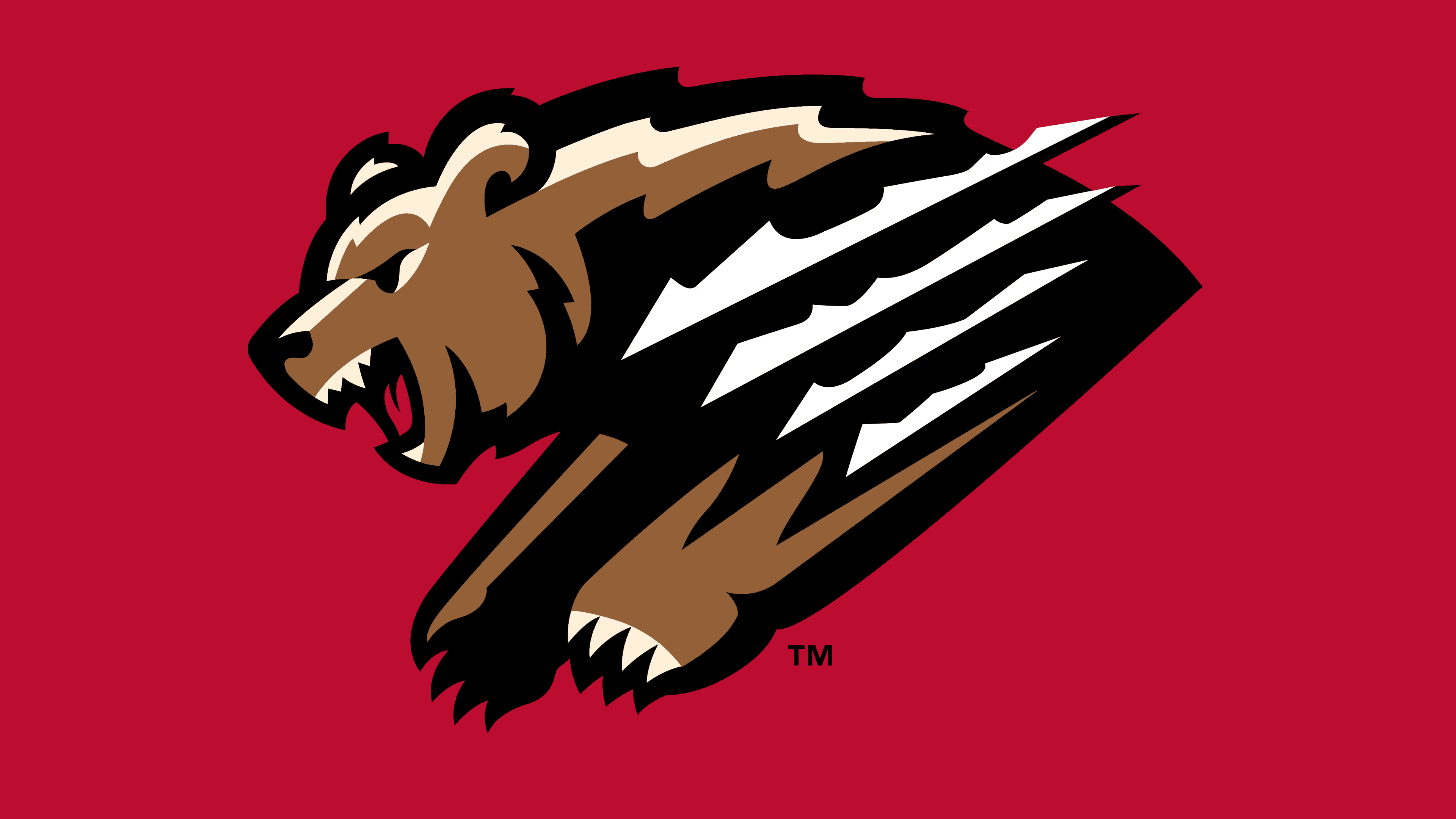
In 2021, the club transitioned to a simplified logo, abandoning the wordmark in favor of a single image. This move logically continued the previous visual approach. Still, it introduced a different emphasis: a symbol that did not require explanatory text.
The emblem depicts a grizzly bear attacking in profile. The figure is arranged diagonally, its body extended forward, paws aligned with the direction of motion. The silhouette is outlined with a contrasting red border, enhancing its separation from the background and creating a sense of motion.
Without a textual block, visual balance is achieved through proportion and axis alignment. The massive front section and extended claw marks form a stable diagonal, while sharp angles create an aggressive rhythm. Negative space within the claw marks serves as a key visual accent, ensuring recognition at any scale.
The symbolism remains closely tied to the club’s identity: the bear silhouette conveys strength and readiness to attack, while the claw lines convey energy and speed. Omitting text elements strengthened the logo’s standalone presence, making it effective in compact formats without sacrificing brand recognition.