


![]() Washington Nationals Logo PNG
Washington Nationals Logo PNG
Designers proposed the Washington Nationals logo in the colors of the national flag because patriotism, like sports, is its main theme. Also, the round seal is typically placed on documents to confirm everything stated above. Such an emblem makes the club’s management supremely legitimate and natural. Talented athletes possess a powerful identity.
The history of the Washington Nationals begins in 1969, when the franchise entered MLB as the Montreal Expos, the first team outside the United States. Early support was strong, and by 1979, the club had won 95 games and was competing for the division title.
In 1981, the Expos reached the NLCS after defeating the Philadelphia Phillies, but lost to the Los Angeles Dodgers in a deciding game. In 1994, the team held the best record in baseball at 74–40 before a strike canceled the season, ending a strong campaign.
Following that period, financial issues forced the departure of key players, including Pedro Martínez, who later joined the Boston Red Sox. Attendance and performance declined, and in 2002, MLB assumed control of the franchise.
In 2005, the team relocated to Washington and became the Nationals, restoring top-level baseball to the city after decades. Early seasons were losing ones, but the club focused on rebuilding through the draft.
By 2012, the Nationals reached the playoffs and later won the division in 2014, 2016, and 2017, though they failed to advance deep in the postseason.
In 2019, the team started 19–31 but recovered to reach the playoffs. It defeated the Dodgers, swept the St. Louis Cardinals, and beat the Houston Astros in the World Series, securing the franchise’s first title.
When Theodore N. Lerner became the owner of the club (in 2005), he first hired Stan Kasten, appointing him as president. He planned to radically revise the roster to bring in new players to the new stadium. Along with the change of location, the franchise’s name also changed: it has been known as the Washington Nationals since then.
The club had two logos repeated in different modifications: one appeared in the founding year, the other after the relocation. The debut version contained the capital letter “M” and the combination “e” plus “b.” The logo was well recognized, so it remained in use for over 30 years. After receiving a new name, the team replaced the previous graphic sign with the letter “W.”
Meaning and History
![]()
The Washington Nationals team was founded as the Montreal Expos, a fact that naturally reflected in its symbolism. The first two logos are original combinations of the letters “e” (expo), “M” (Montreal), and “b” (baseball). The structure of this combination is very interesting, which is why it has performed well in competitions at all levels. The first letter is lowercase and located at the bottom left, the second is uppercase and in the middle, and the third is lowercase and formed from one of the legs of “M.”
Then, a radically different version appeared, tied to the franchise’s relocation: it moved from Montreal to Washington. In this case, the emblem’s style changed with a redesign. Then, attention was focused on the letter “w”.
What is Washington Nationals?
The Washington Nationals became the first Major League Baseball franchise in Canada, joining the league in 1971. Previously, it was known as the Montreal Expos. After relocating in 2005, it became the eighth MLB team based in Washington.
1969 – 1991
![]()
For the first 40 years, the Montreal Expos club used this logo, which looked great on Expos de Montreal baseballs. The intertwined red, white, and blue letters “EMB” correspond to the phrase “Expos de Montreal Baseball.” Below them, the word “expos” is written in blueprint letters.
1992 – 2004
![]()
In 1992, the team changed its logo for the second time. The new logo incorporated the letters “EBM,” which were present in the previous logo, and placed them on a classic white baseball. The ball is inside a red-blue ring on which the team’s full name, “Montreal Expos,” is written.
2005 – 2010
![]()
The Washington Nationals changed their team’s name, and the logo’s concept changed accordingly. The main part is occupied by the inscription “Nationals” in white with a red-blue outline, and above it, the word “Washington” in white with a red background. Under the inscription, a white baseball is visible, surrounded by a blue ring with nine white stars.
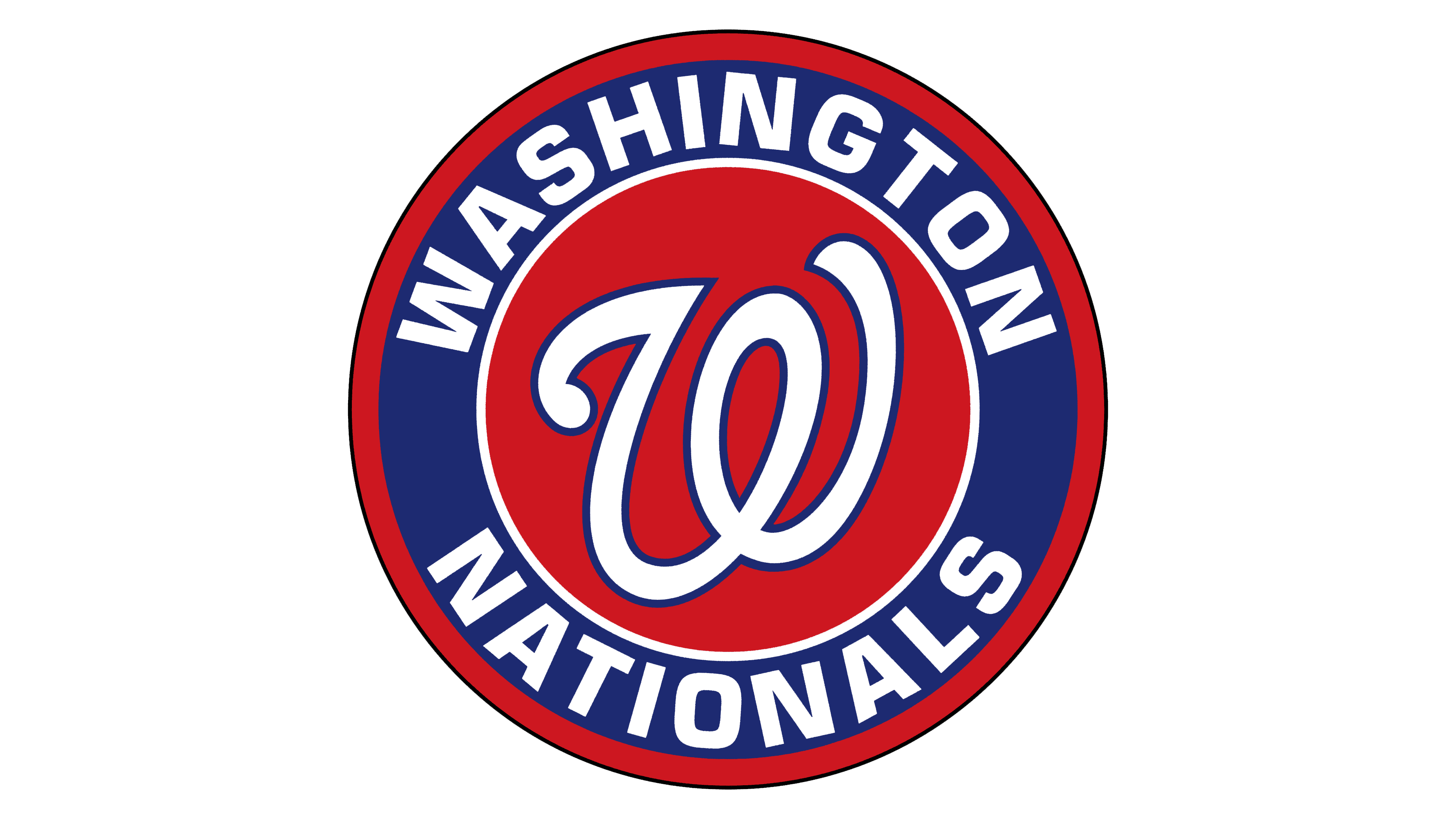
2011 – today
![]()
The Washington Nationals’ current emblem is based on previous versions. The logo is minimalist and modern. The club uses the legendary letter “W,” borrowed from the Washington Senators. This allowed the athletes to preserve the city’s baseball traditions. Nonetheless, the Washington Nationals developed their configuration, which was approved in 2011.
The red letter “W” is centered on the emblem’s white background, surrounded by a thin blue line. The central ring represents a ball. Two lines of different colors surround it, forming a wide space with the team’s name. Five-pointed stars separate the words. The modern version mirrors the 1992 version, in which the franchise name is simply replaced.
Font and Colors

The logo’s graphic part has always been diverse. If it had previously been only a stylized image, textual design appeared later (since 1992) and began to be used alongside graphics. At the same time, the classic round shape of a rondel, often used in sports team symbolism, emerged. This version’s distinguishing feature is the handwritten letter “W” in the center.
The key element’s font resembles cursive, while the surrounding inscription is in the grotesque Neutraface Text Bold. These are strict, straight symbols without serifs, whereas earlier versions had serifs. Additionally, the letters have always been uppercase, except for the debut emblem.
The official palette is scarlet, maroon, blue, and white, all present in logos of different years.
FAQ
What does the Washington Nationals logo mean?
The Washington Nationals logo has no hidden meaning – it represents a sports team and meets modern design criteria. The base is a white circle with a wide blue frame outlined by thin red rings on both sides. In the center is a stylized red letter W (for Washington), and the baseball club’s name is written on the frame.
Have the “Washington Nationals” changed their logo?
Throughout its history, the “Washington Nationals” have changed several logos. The most significant redesign concerned the franchise’s relocation and renaming. The last logo update occurred in 2011.
What were the “Washington Nationals” called before?
Until 2005, this club was called the Montreal Expos in honor of Canada’s main celebration, held in the year of its centennial, the 1967 International and Universal Exposition. After moving to the U.S., the franchise was renamed. The new name, Washington Nationals, was announced on November 21, 2004.
When was the “Washington Nationals” team founded?
In 1969, the National League of Professional Baseball Clubs granted Montreal a franchise, and the Montreal Expos team was born. The team has been known under its current name since 2004, when it moved to Washington.