


![]() San Francisco Giants Logo PNG
San Francisco Giants Logo PNG
The San Francisco club’s branding includes the San Francisco Giants logo and emblem, linking the team to the sport and the city. The modern visualization is succinct and stylish, demonstrating the club’s commitment to progressive change.
The San Francisco Giants are a professional baseball team from the U.S., part of MLB since 2000, and a member of the NL West Division. The team was founded in 1883 and is based in San Francisco, California.
The franchise originated in New York and was initially called the “New York Gothams.” John Day was its owner. After three years, it was renamed the New York Giants. Ten years later, it changed ownership to C. K. Van Cott, who managed the team until 1895. Subsequently, it was owned by Andrew Freedman (1895-1902), John Brush (1902-1912), and Harry Hempstead (1912-1919).
After 1919, the Stoneham family era began: Charles Stoneham controlled the club until 1936, and Horace Stoneham controlled it until 1976. Under their leadership, the pivotal move to San Francisco occurred. This event dates to 1958 and is associated with the search for a more suitable stadium.
Learning about the “Giants'” problem, San Francisco Mayor George Christopher approached them with a lucrative offer. Consequently, the principal owner, Horace Stoneham, despite objections from some shareholders, began negotiations with the city administration. In the summer of 1957, his franchise was relocated to California.
Subsequent club owners were Bob Lurie (1976-1993), Peter Magowan (1993-2008), and Bill Neukom (2008-2011). Since 2012, it has been managed by the city organization San Francisco Baseball Associates LLC.
Throughout its career, the franchise has had several names. The first name was based on its location, “New York Gothams.” A few years after official registration, it was renamed the New York Giants. The third name resulted from the San Francisco Giants’ relocation. The name “Giants” spontaneously appeared after a convincing victory over the “Philadelphia Phillies.” Then, Jim Mutrie, the manager of “New York Gothams,” rushed into the locker room and excitedly exclaimed: “My giants!.” Since then, the nickname “giants” has turned into the name.
Meaning and History
![]()
The team’s history includes 23 logos: 18 belong to the New York period, and 5 to the San Francisco period. All recent versions feature a baseball with the inscription “Giants” in various forms. The color palette used to be more vibrant, including cream, orange, red, blue, brown, and black. After the club’s relocation, it switched to a monochromatic palette.
What is San Francisco Giants?
The San Francisco Giants are a professional baseball team based in San Francisco, U.S.A., playing in the MLB’s National League (West Division). The team was founded in 1883, initially called the “New York Gothams.” After some time, it was renamed “New York Giants,” and when it moved, it took its current name (in 1958).
1883 – 1885
![]()
When the team was also called “New York Gothams,” an embroidered image was used on the club’s uniform instead of a logo.
1900 – 1907
![]()
The team was renamed “New York Giants.” The first logo from 1900 featured two large letters, “NY,” in dark blue, symbolizing New York City.
1908
![]()
The logo featured a large classic Old English letter N in dark blue, denoting the team’s location: New York City.
1909
![]()
The color of the letter N changed from dark blue to black-brown. The font remained the same.
1910
![]()
The classic Old English letter N is now red.
1911 – 1912
![]()
The letter’s color changes again, this time from red to black.
1913 – 1914
![]()
In 1913, the classic Old English letter N, denoting New York City, became black with barely noticeable purple outlines.
1915
![]()
The letter N’s font slightly changes as the lines become thinner.
1916
![]()
And again, the letter adopts shades of purple.
1917
![]()
The classic dark blue letter N continues to symbolize New York City.
1918 – 1922
![]()
For another four years, the New York Giants logo remains the letter N, styled in Old English and now in dark blue.
1923
![]()
The letter’s color changes to red again, with a thin black outline added.
1924 – 1927
![]()
The thin outline is completely removed from the logo, leaving only the Old English letter N in red.
1928 – 1929
![]()
For the next two years, the logo uses a dark blue letter N with a thin red outline.
1930 – 1932
![]()
The red color returns to the logo in daily life, with a thin black outline added around the letter N.
1933 – 1935
![]()
The classic letter N continues to appear on the Giants’ club logo. This time, it is black again, with a red border added.
1936 – 1939
![]()
The letter N is rendered in Old English and in blue. The letter denotes New York City.
1940 – 1946
![]()
A thin red border is added to the blue letter, enhancing its decoration.
1947 – 1957
![]()
The club’s last logo before relocating to San Francisco features a classic white ball with orange seams and gray shades. Above the ball, diagonally, the word “Giants” is in black.
1958 – 1967
![]()
In 1958, the club moved to San Francisco and was renamed the “San Francisco Giants.” The new logo was based on the previous one, but this time the baseball was entirely white, and the word “Giants” was positioned slightly higher.
1968 – 1972
![]()
Nine years later, the logo changed slightly. The white ball transitions into a light orange hue.
1973 – 1982
![]()
The logo changes color again. The orange on the baseball becomes saturated and bright, and the orange seams are replaced with black.
1983 – 1993
![]()
The Giants make minor changes to their logo, but the concept remains the same. The ball was rotated so that the seam lines were directed toward the center of the image, and the ball itself became white again. The word “Giants” was placed in the center, but with a different font. The letter is black, with an orange outline.
1994 – 1999
![]()
The baseball in this logo is smaller than in the previous one, and the word “Giants” has a slightly altered font.
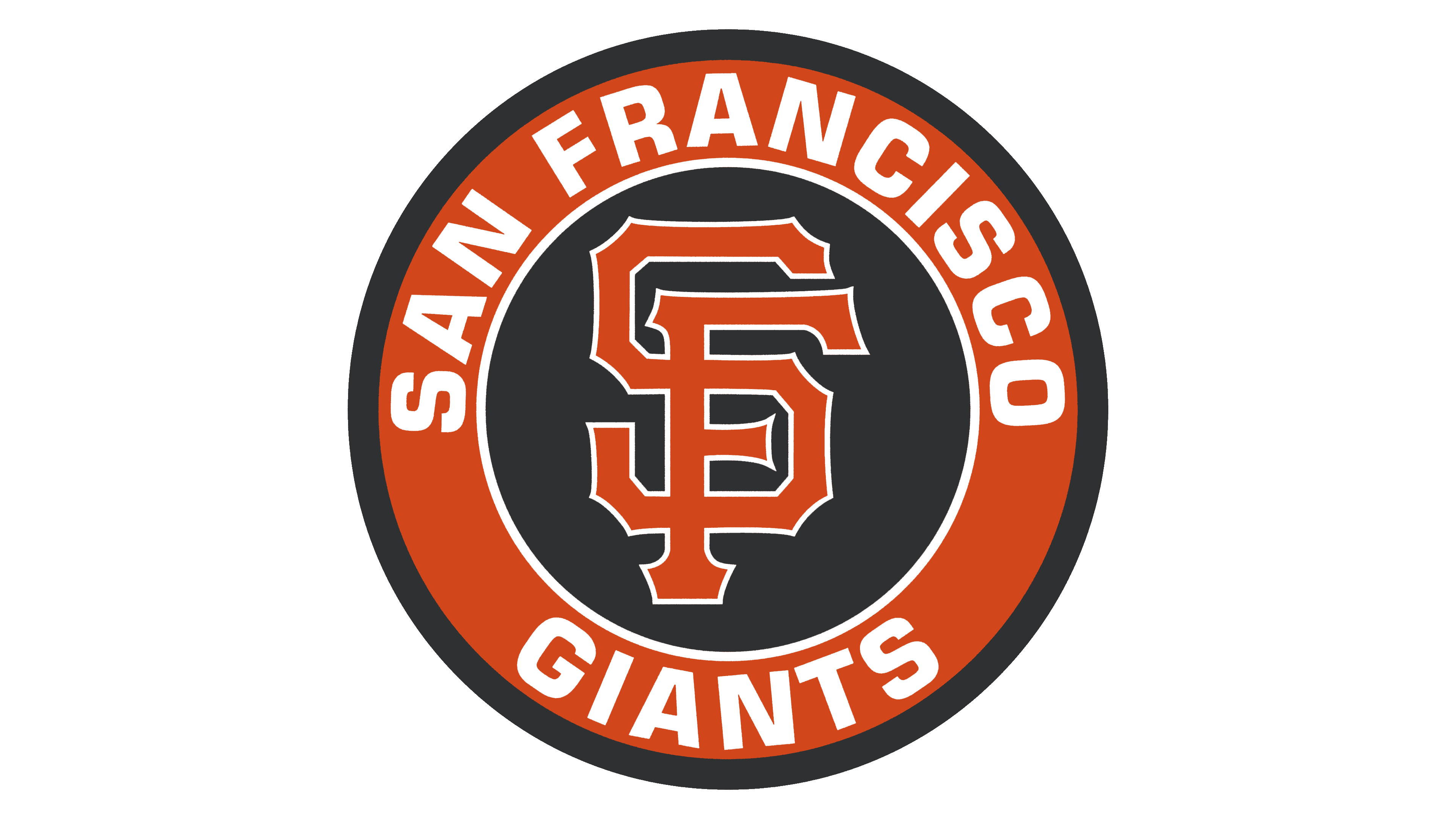
2000 – today
![]()
The current graphic symbol of the “San Francisco Giants” repeats the previous version. However, unlike it, it has become textured due to the beige shade. It creates a three-dimensional effect, making the logo not look flat. The ball is painted in white and cream with two orange lines above and below. The seams on the ball are now red. The team’s name is brown with an orange border. The letters are styled with angular serifs.
Font and Colors
The twenty-five logos of the San Francisco Giants, on one hand, are striking in their diversity, and on the other, they are surprised by their uniformity. The team started under a different name and repeatedly remade its personal symbolism. As a result, many identical symbols with the monogram “NY” (from the New York Giants) were produced. In the original version, the letters were printed, then rendered in Old English.
Starting in 1947, an entirely different version of the emblem appeared, combining graphic and textual elements. The first half is a drawn basketball with two thin lines stitched in a herringbone pattern. The second is the word “Giants,” placed horizontally and rising upwards. The current logo has acquired an arched form.

The “San Francisco Giants” emblem has several types of inscriptions. At the beginning of the team’s sports career, a block font was used, then Old English, and in the middle years, a cursive, rounded font. Now, a font close to Old English is used with sharp projections on the sides. The symbols are wide, well-spaced, and easily legible.
The logo’s palette has changed over time. Among them were blue, red, brown, and purple, as well as shades of purple. Later, gray, white, orange, gold, and cream appeared, which are included in the official range of the baseball club.