


![]() Friskies Logo PNG
Friskies Logo PNG
The Friskies logo emphasizes accessibility and brand recognition. Its graphic design symbolizes the product’s appeal to consumers who value quality and reliability.
The Friskies brand originated in the 1930s when Carnation introduced its first dry dog food, Friskies Cubes, formulated with meat, fish, liver, and vegetables. In 1951, Friskies became one of the first producers of canned dog food, using advertising heavily to promote its products.
A significant turning point occurred in 1956 when Friskies introduced its first dry cat food, Little Friskies for Cats. Although initially considered a risk, the cat food quickly gained popularity among consumers.
In the 1960s, Friskies expanded internationally, opening markets in Europe and Japan. By 1973, Friskies was among the top five pet food producers globally. In 1985, Nestlé acquired Carnation, including the Friskies brand, strengthening its market position.
In 2001, a major merger with Ralston Purina resulted in the creation of Nestlé Purina PetCare. Recently, Friskies has actively experimented with digital technology and unique advertising campaigns featuring famous internet cats.
Today, Friskies remains a leading cat food brand, offering over 60 varieties of wet and dry food.
Meaning and History
![]()
What is Friskies?
It is a popular cat food brand offering various flavor combinations. Its products include dry food, wet canned food, and treats. The brand targets the mass market with affordable products widely available in supermarkets. Varieties include a diverse range of meat and fish flavors, along with unique additions such as cheese.
1934 – 1955
![]()
During this period, the Friskies trademark was purely textual, featuring no additional symbols or decorative elements. The design was based on a simple horizontal rectangular format, with a focus on readability and silhouette stability.
The word “Friskies” was set in a sans-serif typeface with precise geometric proportions and uniform stroke thickness. The typeface lacked serifs, which lent it a modern appearance by mid-20th-century standards. The letter spacing was compact, but it ensured that glyphs did not merge.
The color scheme emphasized a contrast between a rich single tone and its background. Historical examples indicate the use of dark colors, such as black or dark blue, on a lighter background. For darker backgrounds, inverted color schemes were used, with light-colored letters against a dark background.
Stylistically, this variant aligned with the functional design trends of that era: minimalism, absence of decorative flourishes, and emphasis on the wordmark as a memorable brand identifier.
1956 – 1965
![]()
In the second half of the 1950s, the Friskies trademark became more dynamic while retaining strict functionality. The visual concept remained centered on the wordmark, but the letterforms were slightly adjusted, adding subtle individuality to the logo.
The word “Friskies” was set in a sans-serif font. Glyph proportions were carefully balanced with moderate stroke widths. A gentle slant to the letters and softened stroke endings introduced a sense of mild motion. The initial letter “F” was distinctive: its inclination and internal shape set a rhythm for the remaining letters.
The composition stood independently without additional symbols or frames. Its horizontal format facilitated easy integration onto packaging, signage, and printed materials. Letter spacing was tight yet optimized for readability, even at smaller sizes.
The color palette, consistent with the brand’s historical colors, could include deep cherry red or darker shades on a light-colored background, sometimes with a yellowish tint.
Symbolically, the emphasis remained on the textual logo as the primary identifier, in line with mid-century trends. The absence of unnecessary decoration and the compact form highlighted reliability and stability. At the same time, inclined glyphs added contemporary relevance and energy.
1966 – 1986
![]()
Starting in the mid-1960s, the Friskies trademark evolved into a more distinctive and memorable form. The composition continued to be built around a single word within a horizontal rectangle, ensuring stable geometry and easy application across packaging and outdoor advertising.
The word “Friskies” was set in a sans-serif grotesque typeface with gentle rounded stroke endings. Letters featured precisely aligned verticals and horizontals, with generous spacing between characters. This rhythm provided a sense of lightness. Glyph proportions were balanced to maintain visual coherence even at reduced sizes.
The palette featured vibrant yellow letters against a rich, dark green background. This combination served two purposes: enhancing contrast and ensuring brand recognition, while also creating associations with nature and freshness. The color scheme is seamlessly integrated into the brand’s marketing strategy and aligns with themes of naturalness and product quality.
1987 – 1999
![]()
At the end of the 1980s, Friskies’ corporate identity introduced a new presentation form that became internationally recognizable. The key change was the introduction of a yellow, flag-like background with wavy upper and lower edges. This geometry added dynamism to the logo and distinguished it from competitors’ static rectangular compositions.
Within this shape, the brand name appeared in bright-red cursive lettering. Notable letterform features included a diagonally cut top stroke on the “F,” a distinctive curve on the “k,” and a shortened right leg on the upper stroke of the “r.” These details lent a distinctive character to the wordmark.
Typographically, the logo leaned toward sans-serif grotesques with moderate stroke contrast, similar to Clear Gothic TS Semi Bold or Serial Bold but customized to the brand’s requirements. Letter width and tilt were calculated to maintain readability across packaging formats and advertising materials.
The palette featured a vivid yellow background, bright red text, and an outline framing the “flag.” The color contrast and intensity ensured excellent shelf visibility and effective print advertising.
The design was developed internally at Purina/Carnation shortly after Nestlé acquired the brand in 1985 and was later refined by Friskies PetCare. This version appeared on packaging, point-of-sale materials, and advertising campaigns from the late 1980s onward, establishing a visual identity that became the foundation of the brand’s style.
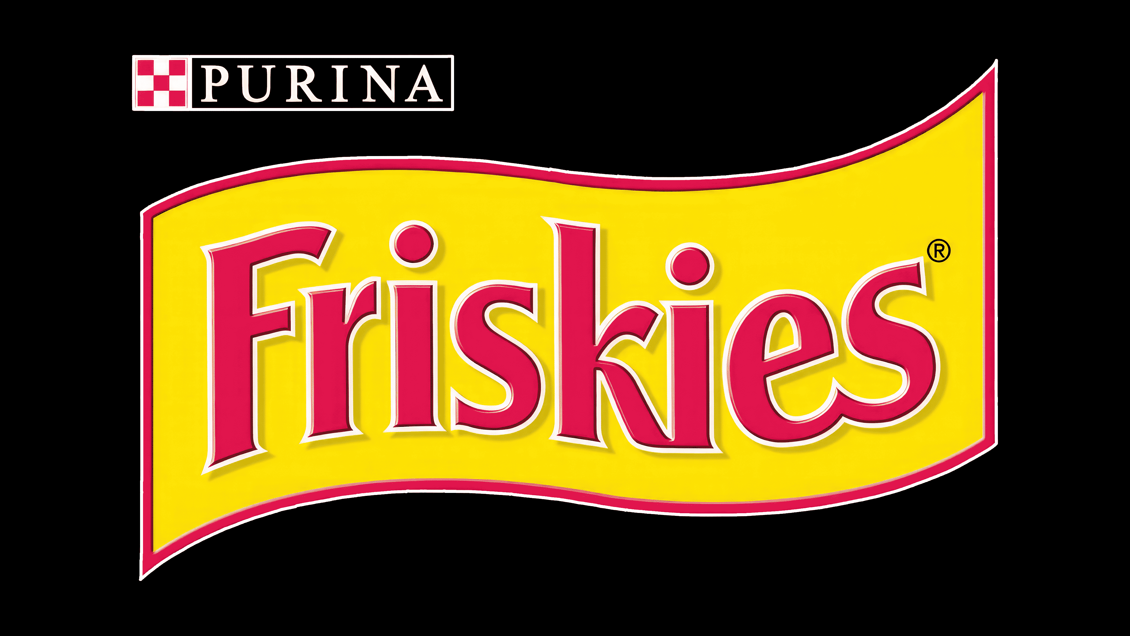
1999 – today
![]()
Following the merger of Nestlé and Ralston Purina in 2001, the Friskies trademark was integrated into Nestlé Purina PetCare. The Friskies visual identity remained autonomous, with the logo used independently of the brand. However, certain versions featured a small black rectangle containing the word “PURINA,” indicating the brand’s affiliation with the corporation.
The redesign featured a bright yellow pennant outlined in red. The lines became more refined, the edges cleaner, and the border thinner. A white outline was added around the lettering, further distinguishing the text from the background. A thin black shadow was introduced, creating a sense of depth and elevating the letters above the field. A similar shadow treatment was applied to the border, enhancing the perception of the flag as a separate layer.
The updated font maintained continuity but lost some of the previous curves; the letterforms became straighter, and the glyphs thinner. The first “s” received a more streamlined silhouette. White outlining along the strokes added visual relief and structured the typography.
The color scheme relies on a contrast between vibrant yellow and subdued red. White lines and a thin black shadow establish hierarchy among elements, improving readability from a distance. This palette supports the brand’s identity as a product for cats and suits both offline and online marketing environments.
Associatively, the flag shape conveys dynamism and a friendly tone of communication. The contrasting composition facilitates recognition in the highly competitive pet food market.
Font and Colors
The visual identity of the Friskies logo is built on an energetic combination of a vibrant yellow background and warm red typography. The white outline surrounding the glyphs separates the lettering from its background, enhancing readability at various scales. The contrast among the three layers, comprising the main letter color, the white contour, and the subtle shadow, creates a dimensional effect that gives the logo a sense of depth and volume.
The typeface is sans-serif, with strokes that thicken slightly toward the ends. The font’s style gives the lettering dynamism, while precise geometric proportions balance smooth curves. The closest font analogs are Clear Gothic TS Semi Bold or Serial Bold, indicating a connection to families known for their high readability and visual stability.