


 Carnation Logo PNG
The Carnation logo is expressive and precisely conveys the company’s core philosophy of product quality. It shows friendliness and care for every customer. High-quality dairy products have always attracted all segments of the population. Mothers ensured their children consumed quality foods, and this healthcare tradition was passed on to grandmothers. Multiple generations have grown up on Carnation products, and each new flavor and innovative offering has instantly met high demand.
Carnation began in 1899, when Elbridge Amos Stuart and E. A. Bainbridge founded Pacific Coast Condensed Milk Company in Kent, Washington. The business was built around condensed milk, a product suited for long storage before home refrigeration was common. In 1901, Stuart took the Carnation name from a cigar display and later introduced the flower logo.
The company struggled at first because canned milk was still unfamiliar to many buyers. Stuart relied on active promotion, and in 1904 the brand won a gold medal at the St. Louis World’s Fair, raising trust and sales. In the 1910s, Carnation added powdered milk, which had been used during World War I for long-term supply.
During the 1920s, the company expanded across the United States, entered Canada and Europe, and launched the “Milk from Contented Cows” campaign. It survived the 1930s through product diversification, then added cheese, ice cream, and baby food in the 1940s and 1950s. In the 1960s and 1970s, it moved into pet food, garden equipment, and other food and drink businesses.
In 1985, Nestlé acquired Carnation for $3 billion, while the brand kept its name. In the 1990s and 2000s, the line added nutrition bars and ready-to-drink beverages, and, in 2005, Carnation Breakfast Essentials. Later releases included lower-fat evaporated milk in 2008, refreshed packaging in 2010, baking flavors in 2012, lactose-free products in 2015, organic evaporated milk in 2017, high-protein breakfast items in 2019 and 2020, plant-based cooking milk in 2021, recyclable packaging in 2022, and vitamin-enriched functional foods in 2023.
Meaning and History
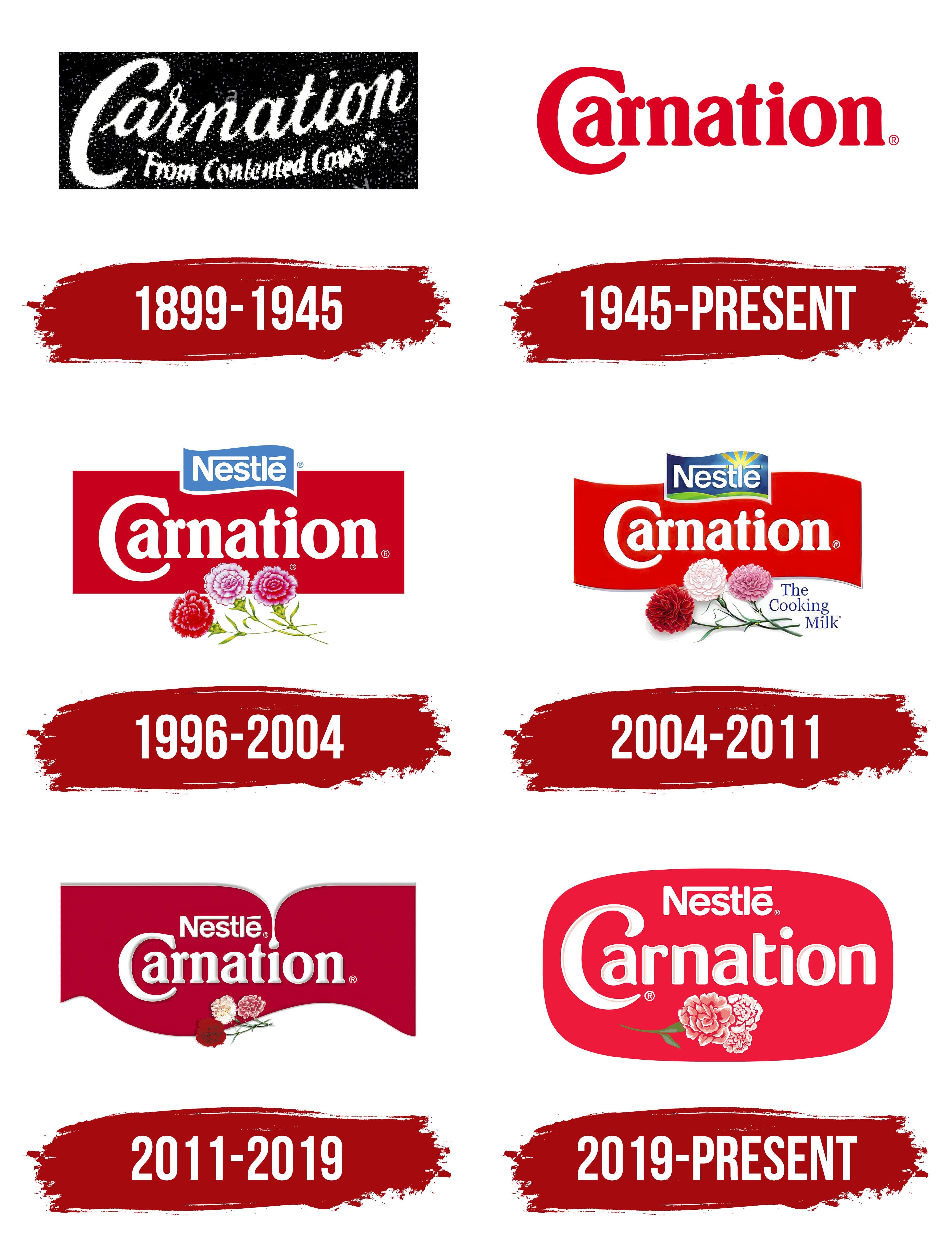
The company has put significant effort into all aspects of its operations, with special attention given to its identity. The identity has evolved, reflecting the company’s continuous development and improvement of its food products.
What is Carnation?
It is a Nestlé-owned brand that offers a variety of dairy products. Known primarily for its evaporated milk, it is a staple in many families for cooking and baking. The brand’s product line includes evaporated milk, sweetened condensed milk, and powdered milk. The company emphasizes quality by offering versatile ingredients that help enhance the flavor and texture of food. The brand is widely available in supermarkets, grocery stores, and online retailers.
1899 – 1945

The first identity was created in a vintage style, featuring a contrasting black-and-white emblem. Against a black graphite background, two separate phrases were displayed. The first presented the brand, and the second informed about the quality of the dairy products.
White text on a black background stood out and was easily readable. Designers managed to engage potential customers’ imaginations: despite the absence of patterns and drawings, those who saw the logo associated it with milk, clean fields, lush grass, and well-kept livestock; a harmonious image formed naturally.
The cursive script added lightness to the logo and created a sense of movement. Some playfulness was achieved with the rounded edges of the initial capital letter. Although the letters were similar, each retained its individuality. The product information block was smaller than the brand name, emphasizing its secondary importance.
1945 – today

Trends demanded renewal and transformation in the post-war period. The company’s logo underwent significant changes, adopting a modern, somewhat bold look. The new format, including the words’ writing, color, and font, has been immortalized and is still used today. The easy-to-pronounce phrase “Carnation” became integral to all subsequent logos.
Each letter’s conciseness, charisma, and light dynamics made the text part of the logo unique and unnecessary to alter.
On a white background, the word “Carnation” in red looked striking, drawing attention and focusing all accents on itself. The first capital letter stood out, emphasizing the company’s reliability and authority. The other letters were clear, slender, and visually appealing. Glimpses of glamour and tradition are intertwined in this logo.
When the word “Carnation” appeared on the packaging, consumer trust was automatic. During this period, the company significantly expanded its product range.
1996 – 2004
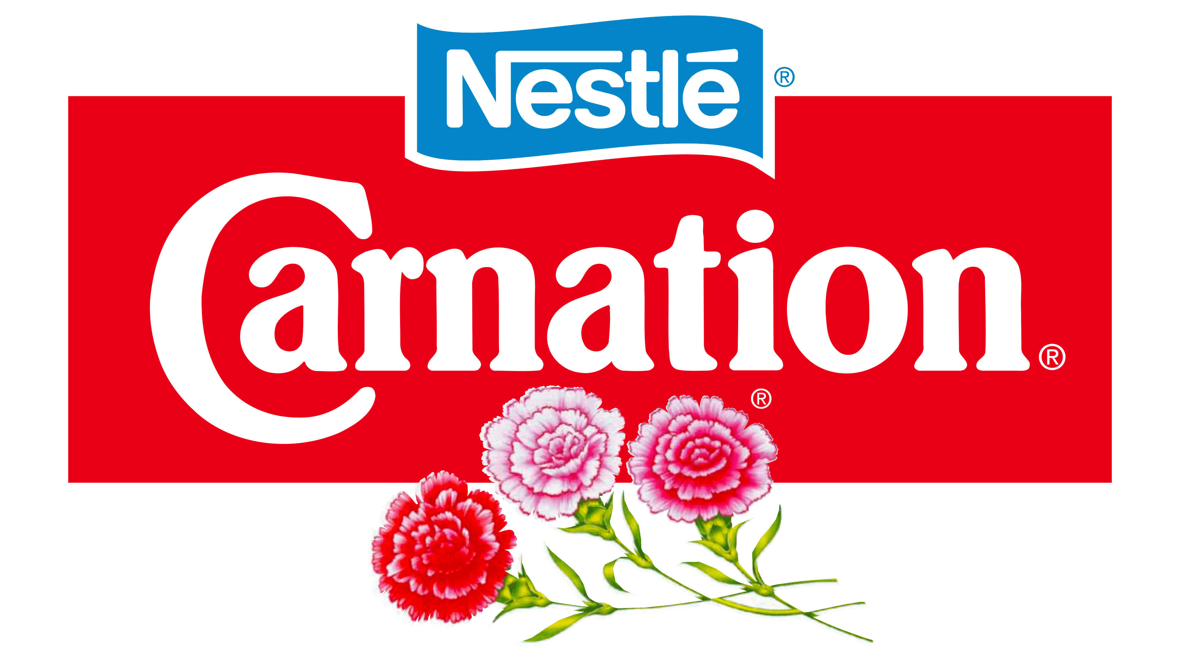
In 1996, the well-known word “Carnation” shone brightly on the new logo. Essentially, there were no changes to the font or any other significant changes. However, considering the new logo elements, the beautiful brand name changed its tone. The letters became white, and the background was a rich and deep red.
The logo’s geometry is sharply defined. A large rectangle with a background color is a magnet for attention, drawing the eye first to it, then to the brand, and finally to the flowers. This shift in focus enhances the overall positive visual effect.
The multicolored plants are particularly interesting. Three of them symbolize the product’s natural quality and superiority. The multicolored carnations, as elements of the brand’s heritage, are symmetrically incorporated into the logo’s graphics and tone.
In 1996, the word “Nestlé” first appeared on the brand’s emblem, complementing the information line. It identifies the brand’s affiliation with one of the most well-known companies, increasing interest and trust. White letters on a blue background with a border look elegant and graceful.
2004 – 2011
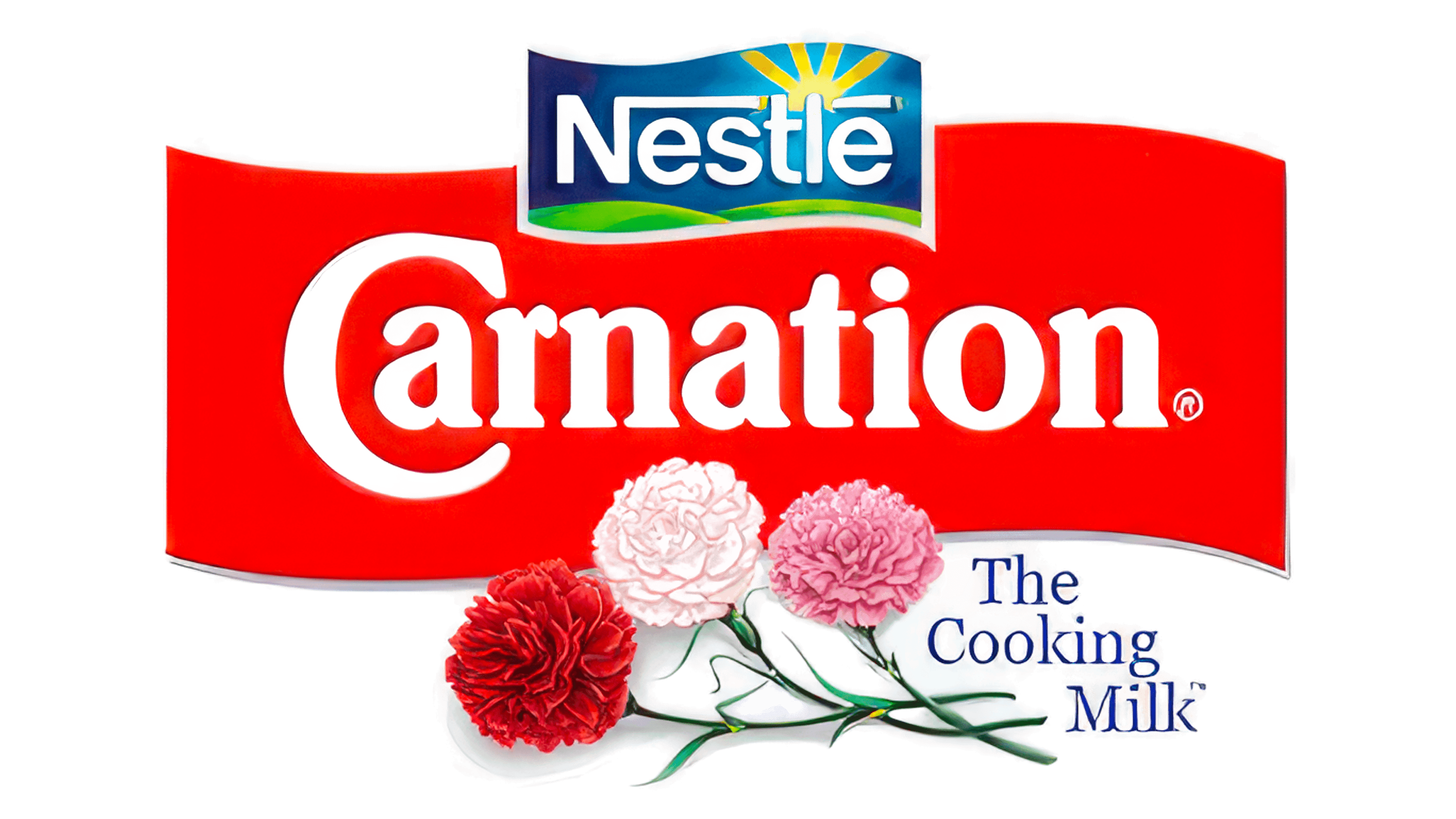
The new logo’s key characteristics are clarity and precision. All its elements are graceful and charismatic, embodying brightness and harmony. The producer of quality dairy products aims to evoke positive and life-affirming emotions.
The brand name is gentle, like May flowers. The beautiful carnations are detailed meticulously, with every part of the plant and its contours carefully drawn. In the new interpretation, the word “Nestlé” shines like never before, creating a powerful and unstoppable visual effect. The number of colors and their aspects is impressive, evoking associations with the products’ excellent taste.
Special attention is drawn to decorative touches, such as the green field next to the word “Nestlé,” the text in the lower right corner, and the carnation petals.
2011 – 2019
The brand identity now places greater emphasis on visual impact. White letters reminiscent of milk, with highlights and tonal variations, stimulate the taste buds, creating a desire to try the milk or bake fluffy pancakes. The white text on a red background looks impeccable, and a wavy, irregularly shaped border enhances the charm.
The company name, previously blue, is now perfectly white. The letters are slightly larger, and the spacing between them has changed, adding harmony.
The flowers on the logo stand out against the sleek, modern design, once again taking on a new appearance. The color contrast aims for minimalism and gentleness. White, red, and pink colors highlight the brand’s heritage.
2019 – today
The brand name not only remains on the logo but also gains sophistication. During this period, it is imbued with playfulness and kindness. The edges of the letters are beautifully and gently rounded, alternating between static and dynamic. This effect is hard to explain logically, but it is present.
The light, milky color of the letters on the red background continues to attract attention. The “Nestlé” inscription is easy to read and looks aristocratic.
The number of flowers remains three, but two carnations seem hidden from viewers in the new identity. Only the carnation in the foreground, with its leaves and stems, is visible. This suggests that many flavors and products remain undiscovered. Modern consumers can expect many more surprises.