


![]()
Frmefest has launched a bold new visual identity crafted in collaboration with the branding agency Percept. The rebrand marks an exciting chapter in the festival’s growth, celebrating its role as a major event in the creative world—spotlighting visual storytelling, art, music, and contemporary culture. The updated look aims to position Frmefest as a global creative hub, highlighting its dedication to innovation, community, and artistic expression.
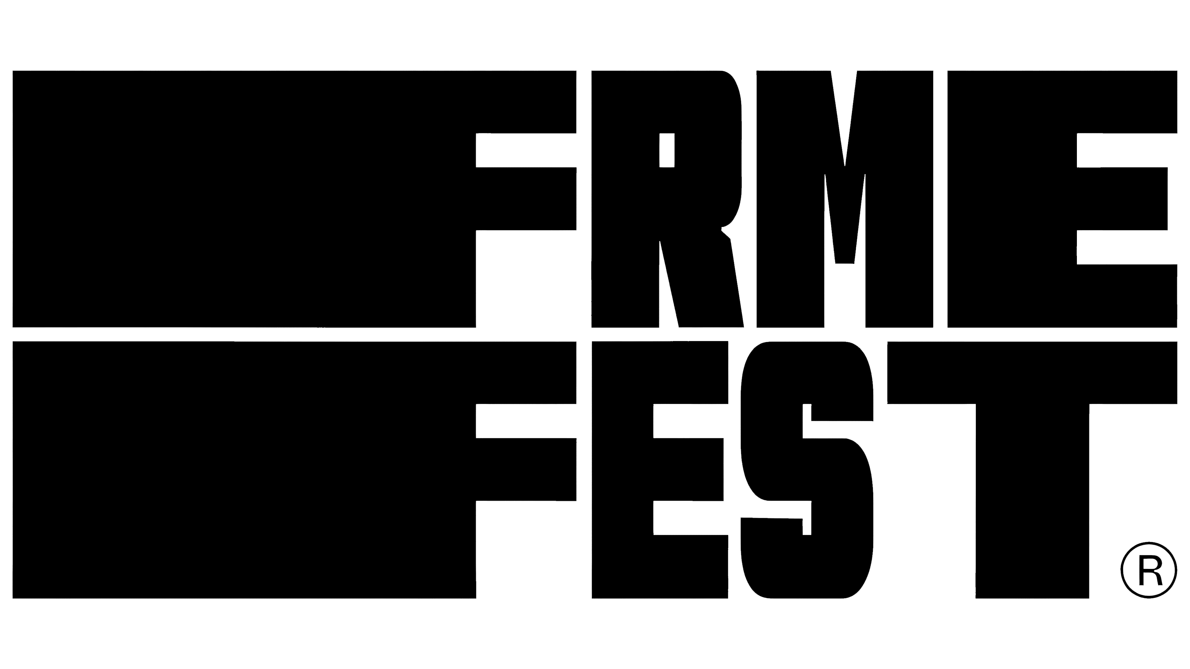
At the center of the rebrand is a striking new logo that reflects the event’s dynamic, ever-evolving spirit. The logo showcases “FRMEFEST” in a bold, geometric sans-serif font with sharp, clean lines. The text is stacked across two lines, forming a compact, eye-catching block. The tightly spaced letters, without gaps between them, create a cohesive, unified look—symbolizing how the festival brings together diverse creative voices under one roof.
Subtle ink traps—small notches within the letter shapes that serve both form and function—add character to the typography. These details give the logo a distinct edge and improve readability across different sizes. The design nods to traditional print aesthetics while maintaining a sleek, modern vibe that matches the event’s forward-looking approach.
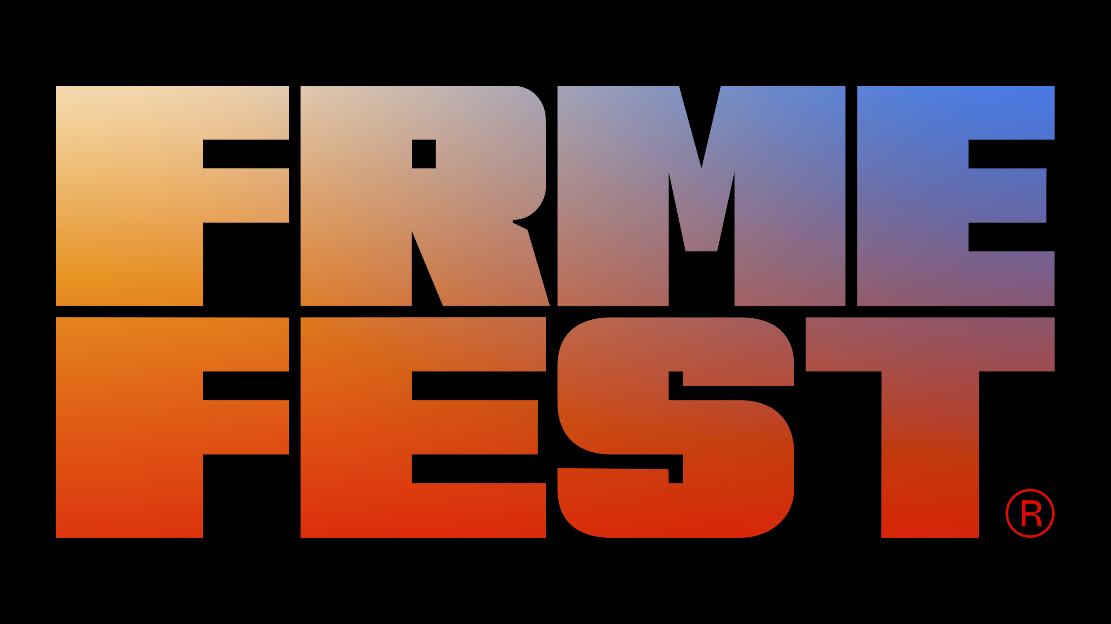
The new identity comes alive through a vibrant color palette anchored by a dynamic gradient. The gradient flows from warm orange-red hues at the bottom to cool blues at the top, mirroring the energy shift from day to night during the event. The fiery tones reflect excitement, creativity, and passion, while the cooler shades bring calm and sophistication. It’s a visual story of how the festival pulses with life, from morning workshops to evening performances.
What makes this gradient powerful is its versatility. Whether featured on digital platforms, print materials, merchandise, or signage, the gradient adapts seamlessly, keeping the brand fresh and recognizable across different spaces.
Alongside the bold typography and dynamic colors, the new identity includes a clean icon system inspired by camera symbols—subtly tying back to the event’s focus on visual storytelling. These icons appear throughout the branding, creating a consistent design language that reinforces its mission: literally and figuratively framing narratives.
Percept introduced a cohesive photographic style with consistent framing and composition. This approach allows the diverse range of artists, performers, and attendees to shine while maintaining a unified aesthetic. The photography captures authentic moments of creativity, connection, and expression, echoing the festival’s goal of celebrating the people who breathe life into stories.
The rebranding process kicked off with an in-depth workshop. Percept worked closely with the leadership team to shape a brand that reflects the current identity and future aspirations. The brand vision, “We push the envelope and redefine the art of narration,” reflects the ambition to be a space where creativity breaks boundaries.
The message, “Discover your visual transformation path, meet like-minded innovators, and unleash your creative potential,” invites artists, creators, and audiences to experience Frmefest as more than an event—a journey of inspiration and growth.