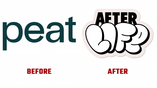
Afterlife, formerly known as Peat, recently underwent a brand transformation to breathe new life into its image and align more closely with its mission. Based in New York, the startup is known for its unique approach to sustainability, converting food waste into gourmet mushrooms. The branding overhaul was carried out in partnership with the New York office of Dragon Rouge, which aimed to rejuvenate the company’s public image.
Critics had described the old brand identity as uninspiring. The Afterlife logo now features graffiti-inspired lettering paired with bold, all-caps sans-serif fonts. While this rebrand aims for a more contemporary, urban flair, it has also stirred controversy for seeming somewhat clichéd and lacking depth. This new logo draws from New York’s “sticker culture,” but the inspiration falls flat for some who see it as a superficial take on an intricate art form.
The new color scheme aims to encapsulate the vivid hues found in different mushroom species and street signs. Although aesthetically appealing, the palette’s execution has led some to call for a more carefully considered approach. The primary typeface, Power Grotesk by Power Type, complements the brand’s new look. Still, its absence from the logo itself is viewed by some as a missed opportunity for visual cohesion.
One standout aspect of the updated brand identity is its focus on high-quality photography. The images vividly portray the rich texture and color of gourmet mushrooms, providing a stark contrast to the more stylized elements of the branding. This dichotomy has drawn some criticism, prompting calls for a more unified and captivating visual narrative.
The startup distinguishes itself with a circular business model. It procures waste from restaurants and food distributors, transforms it into gourmet fungi, and donates any remaining compost to community gardens. The new brand name, Afterlife, resonates well with this cyclical waste conversion process, a concept that has been positively received. Marketing materials from the company often employ bold phrases like “EXTRA,” “REAL,” and “SUPER” to emphasize its sustainable mission.
The brand’s new identity has ignited conversation, especially about its decision to incorporate New York City’s sticker culture elements. While some find this feature adds unique character to Afterlife’s new look, others question its depth and relevance.
In a crowded field of sustainable food startups, Afterlife aspires for its rebrand to elevate its standing, intertwining its mission with environmental responsibility, urban culture, and innovation.


