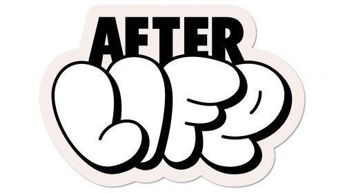
The Afterlife logo captures the essence of the brand’s mission visually compellingly. The company, focused on sustainable practices, uses food waste to cultivate more than 30 edible mushrooms. Echoing this, some of the letters in the emblem take on a bulbous shape and a white hue, resembling mushrooms. Above these letters, the word “AFTER” is written in a standard, stern font, highlighting the startup’s serious commitment to combatting greenhouse gas emissions.
The bulbous, mushroom-like letters speak to the heart of the brand’s operations. White signifies purity, cleanliness, and freshness—qualities directly associated with edible products and sustainability. The unique shapes of these letters not only grab attention but also serve as a direct representation of what the brand does: turn waste into edible mushrooms. They transform something ordinary, like the alphabet, into something extraordinary, mirroring the company’s transformative process.
The standard stern font used for the word “AFTER” at the top of the logo signals a different tone. It’s a juxtaposition that serves a purpose: to represent the serious, business-oriented aspect of the brand. This part of the emblem does not just inform the viewer that the company name is Afterlife and signals that the endeavor is not a trivial pursuit. It’s a fight against food waste and greenhouse gas emissions, and the stern font captures that gravitas.
Combining the mushroom letters’ whimsy with the stern font’s gravitas creates a balance. It’s an acknowledgment that while the endeavor is fun and innovative, it’s rooted in serious challenges that require immediate attention. The logo operates on two levels: it captures the viewer’s imagination while conveying the earnestness of a venture committed to tackling environmental issues.
In visual terms, the emblem shows excellent design principles. The contrast between the playful, bulbous letters and the straightforward, serious text above creates a dynamic visual flow. It first draws the viewer’s eyes to the serious issue and then guides them to an innovative solution.
This emblem serves as a microcosm of the brand’s ethos. The creative use of fonts and shapes conveys a message of transformation and sustainability. It emphasizes the gravity of the environmental issues that the venture aims to address, offering a brief but profound representation of the brand’s values and mission.
Afterlife: Brand overview
| Founded: | 2023 |
| Headquarters: | USA |
| Website: | afterlifemushrooms.com |
Initiated by Winson Wong and Sierra Alea in 2021, Afterlife emerged in the bustling environment of New York City with a unique approach to sustainability. Initially, The venture focused on creating a localized composting system in the city’s parking garages. Yet, due to challenges associated with scaling this model, the company pivoted its core operation toward mushroom farming.
At the heart of Afterlife’s mission is the innovative use of food scraps from eateries around the city. These collected waste products serve as a fertile ground for experimenting with and cultivating high-quality mushrooms. This dual-purpose model ensures a resourceful cycle for food waste and contributes significantly to minimizing greenhouse gas emissions, as these food remnants would otherwise end up in landfills, generating harmful gases.
The company prides itself on offering a transparent, cost-effective method for restaurants and other food-related businesses to manage food waste responsibly. By doing so, Afterlife has carved out a distinctive space in environmental conservation while providing tangible solutions for businesses eager to engage in more sustainable practices. Therefore, Afterlife exemplifies transforming a pressing ecological issue—food waste—into a resource for sustainable mushroom cultivation.


