


![]() Frontier Airlines Logo PNG
Frontier Airlines Logo PNG
The Frontier Airlines logo stands for safe travel. Promises a smooth takeoff and landing. The company prioritizes passenger safety. The emblem also hints at a special “green” offer for airlines with free transportation.
Frontier Airlines was founded in Denver, Colorado, on February 8, 1994, by former Continental Airlines employees. Its first flight took off on July 5, 1994, from Denver to North Platte, Nebraska, using a Boeing 737-200. At launch, Frontier served four routes from Denver. By 1995, it had added cities such as Albuquerque, El Paso, and Phoenix. In 1998, the airline was listed on NASDAQ.
A major fleet shift began in 1999, when Frontier ordered Airbus A319 aircraft. The first arrived in 2001, helping the airline expand to the U.S. East Coast and Mexico. In 2003, Frontier launched the EarlyReturns loyalty program. In 2006, it created Lynx Aviation, a subsidiary that operated Bombardier Q400 turboprop aircraft to serve smaller cities.
Financial pressure forced Frontier to file for Chapter 11 bankruptcy in 2008. Republic Airways Holdings brought the airline out of bankruptcy in October 2009. In 2011, Frontier moved toward an ultra-low-cost model, cutting expenses and lowering base fares. Indigo Partners acquired the brand in 2013 and further pushed the low-cost transformation.
In 2014, Frontier introduced a refreshed brand identity with different animals on aircraft tails. Fleet renewal continued in 2015 with orders for the Airbus A320neo and A321ceo. The airline announced 21 new destinations in 2017 and added its first Airbus A320neo in 2018. In 2019, it ordered 100 Airbus A320neo aircraft. By 2020, Frontier served more than 100 destinations in the U.S., Mexico, and the Caribbean with a fleet of over 100 Airbus aircraft.
Meaning and History
![]()
The history of the air transport enterprise has been divided into two periods: the first, from 1950 to 1986, and the second, from 1994 to the present. The original Frontier carried about 87 million passengers before it filed for bankruptcy and merged with Continental Airlines. The last aircraft bearing the iconic Frontier Airlines logo took off in 1986.
In the early 1990s, several former Frontier employees, along with an ex-United Airlines pilot, co-founded AeroDenver Travel Services. Almost immediately, the Denver company was renamed Frontier Airlines. In addition to the bankrupt enterprise’s name and base, she inherited its symbols. This happened in 2014 when designers gave the classic Saul Bass emblem a second life.
Old and New Frontier are two different airlines with the same name. Although the existing organization leaders have tried to connect them at the branding level, they do not have a common history. The airline’s current logo is a tribute to the classic style. It is combined with the modern design of the aircraft’s tail section, which has depicted wild animals since 1994.
The emblem has undergone several dramatic changes, as it was modernized with delays in several periods. However, the designers have tied the old and new versions of the logo together by choosing the legendary bird ‘s-wing icon to replace the letter “F.”
What is Frontier Airlines?
Frontier Airlines is an American airline based in Denver, Colorado, owned by Indigo Partners, a private equity firm. Frontier Airlines is a low-budget US territorial airline with domestic flights. More than 100 settlements are known to which it flies. Among them are Trenton, Orlando, Denver, Las Vegas, Miami, Philadelphia, Atlanta, and others. In addition, it serves 31 overseas destinations. The air carrier was founded in 1994 and is Indigo Partners’ technical brand. The air transport company is based in Denver, where it has a hub airport. The company is now in a difficult situation because it took a quarter of a million dollars to offset the financial damage caused by the pandemic. The reason is the coronavirus pandemic, which has limited movement across the country and international flights.
1958 – 1972
![]()
In 1958, Lewis Bergman Maytag, Jr. became the majority shareholder of Frontier Airlines. The oldest logo, the predecessor of the modern airline, features a flying arrow with half-segments. The halves represent the tip and tail. This special visual trick makes the arrow resemble an airplane as much as possible. Behind him, a thin golden line stretches, indicating the flight’s trajectory and the trail in the sky. The emblem also features a boomerang, a symbol of forward movement with a backward one. It is an allegory of performing round-trip flights (in two directions). This makes the logo dynamic. Below is the Frontier Airlines italic lettering in flat capital letters. The palette is borrowed from nature itself: gold (the color of the sun) and blue (the color of the sky). The new symbol was painted on the side of the Convair CV-340 in 1959. By the way, the first logo with a winged arrow appeared in 1950, but it was red-green and had a different design.
1978 – 1986
![]()
This emblem was created by renowned director Saul Bass, who has collaborated with celebrities such as Billy Wilder and Alfred Hitchcock. He also designed some of the most stylish emblems in the aviation industry, including those of United Airlines and Continental Airlines. The designer tried to make the logo of this period radically different from the previous version.
It features a stylized “F” in the form of a bird’s wing of three-wide feathers. White horizontal stripes of varying lengths are arranged within a red circle. Below is the carrier’s name, written in strict block letters, sans serif. Special emphasis is placed on the “R,” the right side of which is not connected to the left leg.
This symbol was introduced on April 30, 1978, and remained in use until 1986, when the company went out of business.
1994 – 2001
![]()
After the airline relaunched in the profile market, it kept the old name but adopted a new logo. This is understandable; its founders were a group of individuals who headed Aeroflot’s previous structure. The founders invited another specialist to create a personal identity that would make the past and modern organizations somewhat different. Therefore, the designer of this emblem is Dan Cotton. He proposed a different concept based on a dark blue rectangle with white lettering inside.
The title spans two lines. Above is the word “Frontier,” set in italics with uneven height. The “jumping” letters outwardly resemble the trail of an airplane, as seen in films and animated films. The font is semi-connected, grotesque, and individual. To emphasize the air transport company’s originality, the logo’s designer used uppercase “F” and lowercase “t,” connecting them with straight, elongated lines. In the second line, he wrote “Airlines.” It is written in a classic wide-spacing, serrated typeface.
2001 – 2014
![]()
This period is characterized by a highly legible emblem with clear capital letters. The developer changed the handwritten style to the printed style, which immediately made the inscription more versatile: it is visible and understandable at first glance, unlike in the previous version. Despite this adjustment, the authors did not use serifs; they settled on a chopped typeface with wide lines.
In addition, a dark color stands out better against a light background than a light color against a dark background. Thanks to the white backing, the logo can be opened to create a limitless effect (without frames), which is symbolic of an air transport company. The second half of the name is written in small, thin letters. The predominant colors at this time were green, black, and white.
2014 – today
![]()
At the end of 2013, the airline was acquired by Indigo Partners LLC, led by Bill Franke. The new owners decided to change their business strategy, so they simplified the tariff structure and ordered a new livery for Frontier aircraft from PS: Studios, Inc. The designers have given the Saul Bass emblem a second life to highlight the brand’s history. They included it in the inscription, using it instead of the first letter.
The icon consists of three stripes of different lengths, reminiscent of a bird’s wing. The developers used an italic font to balance the elements, but did not use the handwritten style. The inscription is still in printable sans-serif characters in geometrically proportional letters. Instead of the traditional “F,” there is a brand name. Below the word “Frontier,” there is “Airlines” in the lower-left corner, between “T” and “R.”
Font and Colors

The airline’s current symbol is a tribute to its past, even though the new brand is only formally associated with the old Frontier Airlines. Visual identity is based on the geometric F-shaped badge invented by Saul Bass in 1978.
The logo was presented in September 2014 at the presentation of the Airbus A320-214 N227FR aircraft. The designers returned the iconic Frontier F and the arrow pointing forward, referencing the original emblem, which first appeared aboard the Douglas DC-3 in 1950. The retrospective approach integrates the past and the future, although a stylized “F” in the wordmark impairs legibility.
The icon of three curved shapes is combined with the grotesque, geometric Gotham. American typographer Tobias Frere-Jones designed this font family in collaboration with Jesse Ragan. The inspiration comes from the signs on old buildings in New York. The Frontier Airlines logo features a bold version of Gotham, with the first word in italics. A slight tilt to the right symbolizes forward movement.
The first logo used a typeface reminiscent of Moki Soft with differences in the letters “F” and “R.” In modern versions, the inscription is set in fonts that closely match Magnum Sans Black and JT Leonor Extra Bold Italic.
The American airline switched to green in 1994. Designers from PS: Studios, Inc. kept this palette but chose a new shade (# 318468), close to dark turquoise. And they set the word “AIRLINES” to light gray (#9E9A97).
About Company
The roots of this airline run deep, as it was founded in 1959 and operated until 1972. Then it had a short period of stagnation, followed by a resumption of work in 1978. However, in 1986, Frontier Airlines ceased operations again, merging with Continental Airlines. Designer Saul Bass designed the logos for both airlines.
The re-creators of the aviation service were United Airlines pilot Frederick W. “Rick” Brown, his wife Janice Brown, and Bob Schulman. When Continental Airlines began reducing international flights from Denver International Airport in 1993, the three formed the charter firm AeroDenver Travel Services to meet the public’s demand for international destinations. They invited M.C. “Hank” Lund, the former CEO of Frontier Airlines. At the same time, the airline adopted its former name – Frontier Airlines. Its registration took place in the winter of 1994.
Like its prototype company of the same name, the new Frontier had a hub in Denver and, for nine years, used the motto “The Spirit of the West,” written in italics above the portholes. And the word “Frontier” was on the fuselage of all her aircraft. By the early 2000s, the carrier improved its aircraft fleet and expanded its route network. However, in 2020, the company found itself on the verge of collapse due to lawsuits alleging it failed to compensate passengers for the cost of tickets they could not fly on due to the COVID-19 outbreak.
FAQ
What is the Frontier mascot?
Frontier Airlines’ mascot is Grizwald, the bear. Grizwald exemplifies the brand’s adventurous and friendly spirit. As the face of the airline’s marketing, Grizwald appears in advertisements and social media posts to create a memorable image for customers.
Grizwald’s character appeals to families and travelers seeking a fun, affordable flying experience. The mascot is featured in stories and visuals highlighting the brand’s commitment to making travel enjoyable and accessible.
What is Frontier airline code?
The company code is F9. This code helps identify the brand in airline systems and during travel bookings. The award, issued by the International Air Transport Association (IATA), ensures proper management of bookings, baggage, and other services.
Codes are vital for organizing flight information, ticketing, and baggage handling. When you book a flight with this brand, the F9 code manages your booking and related services.
Which airline is Frontier?
Frontier is a large American ultra-low-cost airline based in Denver, Colorado. The brand flies to more than 100 destinations in the United States and 31 international destinations. It employs more than 3,000 people. The company focuses on providing affordable travel options with good service, making it popular among budget travelers. The airline’s network covers many major cities and holiday destinations.
The brand is known for its animal-themed airplane tails, which make its planes easily recognizable. This unique branding helps Frontier stand out in the competitive airline market. The company’s low fares, efficient operations, and customer-focused service have made it an important player in American aviation.
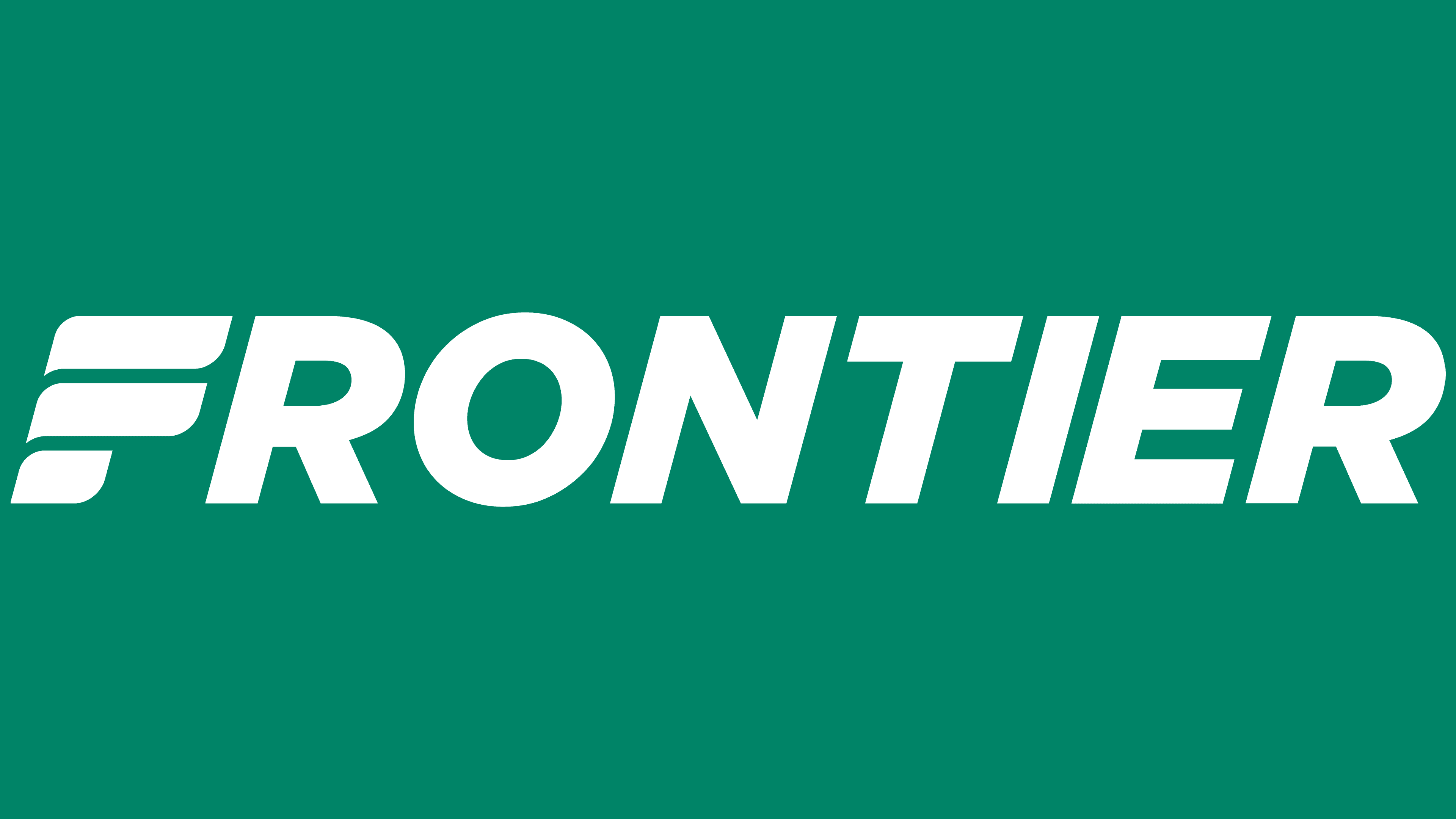
What is the logo for Frontier Airlines?
The airline’s logo is a text logo that shows its full name. The top is bold and wide, while the bottom is thin and small. Both parts use sleek sans-serif fonts for a clean, modern look.
Instead of the letter F, the logo features a winged symbol. This symbol connects the brand’s past and present, highlighting its history and evolution. The winged design emphasizes the airline’s aviation character and adds dynamism, making the logo memorable and easily recognizable in the aviation industry.
What font does Frontier Airlines use?
The airline uses different fonts for its logos. The previous logo used Franklin Gothic Heavy and Franklin Gothic Book, while the current logo uses Gotham. These fonts were chosen for their clean, modern look, which aligns with the brand’s style.
Franklin Gothic gave the old logo a bold, strong appearance. The current Gotham font looks elegant and modern. This change in fonts helps the airline maintain a fresh and professional image, reflecting its efforts to stay current and appealing to customers.