The Frydate logo captures the essence of the brand’s origins in Amsterdam and its commitment to using premium Dutch potatoes. The logo highlights the use of fresh, local ingredients and a diverse menu that caters to all, including vegetarian and vegan choices, reflecting the brand’s dedication to inclusivity and sustainability. It embodies the vibrant and welcoming atmosphere of Frydate eateries, designed to be lively and engaging, reflecting the dynamic spirit of its Dutch heritage.
Frydate: Brand overview
In 2012, Lucas van der Meer started Frydate in Amsterdam because of his love for french fries. He wanted to elevate the experience with the finest Dutch potatoes, precise cutting and frying them to achieve the perfect balance of crispy and soft. Frydate became known for its wide variety of unique sauces and toppings, catering to vegetarians.
The debut Frydate spot in Amsterdam’s De Pijp neighborhood became a favorite thanks to its quality fries, inventive flavors, and welcoming atmosphere. It attracted both locals and tourists.
By 2015, Frydate had expanded to over ten locations in the Netherlands, diversifying its menu with vegetarian and vegan options like mushroom-filled bitterballen, vegan Frikandellen, and a vegan potato salad.
Frydate locations are lively and colorful, adorned with comic art and Dutch cultural elements, providing a pleasant setting for a quick meal.
Frydate commits to being eco-friendly and community-oriented. They partner with local farmers, choose sustainable packaging, and engage in community projects. This ethos contributed to their expansion into Belgium, Germany, and the UK, introducing items like loaded potato chunks.
With more than 30 locations across Europe, Frydate continues to attract customers with its tasty fries, inventive snacks, and upbeat environment. Its emphasis on quality, vegetarian and vegan choices, and sustainability distinguishes it in the fast-food industry.
Frydate’s journey demonstrates that staying true to your principles while embracing innovation can foster success. With a growing demand for quality, responsible, fast food, Frydate is poised for further expansion, appealing to fry enthusiasts in Europe and potentially worldwide.
Meaning and History
What is Frydate?
Frydate produces and sells quick, tasty hot snacks such as french fries, chicken wings, meaty snacks, and vegetable treats. Their fries are special because they’re crispy outside and soft inside. The company uses high-quality ingredients, delicious sauces, and authentic recipes to provide fast and convenient snack options suitable for the fast food market. Frydate is a reliable supplier for restaurants, cafes, catering services, and individual consumers, offering flavorful and easy-to-prepare solutions.
2023 – today
The Frydate logo features bold, modern typography in a white set against a dark teal background. It’s designed to be easily readable, with unique details like short rectangular serifs and special cuts in the letters “F” and “E” that enhance the design’s vibrancy. These elements suggest movement and energy, reflecting Frydate’s commitment to innovation and leadership.
The dark teal color draws attention and suggests depth and a serious approach to clear communication. This darker shade makes the white text stand out, instantly drawing your attention.
The modern font style and short serifs highlight Frydate’s relevance and dependability. This design choice assures customers that they engage with a stylish and trustworthy brand.
The white text adds a level of purity, simplicity, and elegance. By choosing white for its text, Frydate aims to appear straightforward, honest, and focused on quality. The white text attracts attention, especially against a dark background, making the brand name immediately noticeable.
The logo combines colors, typography, and design to convey Frydate’s values of reliability, clear communication, and modernity. This thoughtfully designed logo aims to connect emotionally and intellectually with viewers, making the brand memorable in a competitive market.
Frydate Emblem
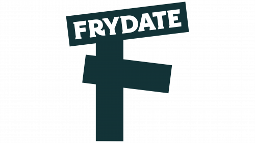
The Frydate emblem, designed by the Belgium-based agency SKINN, has a fun and playful look. It centers around an ‘F’ of three French fries arranged to look like they’re standing up and leaning together, giving the logo a friendly feel. The letters of the Frydate name are in a retro style that fits well with the French fry ‘F,’ adding to the logo’s charm.
The French fry ‘F’ might be hard to see when the logo is small, but the main point is to make Frydate’s brand easy to recognize. The goal is a logo that people can spot immediately, making Frydate’s snacks stand out in a crowded market.
Font and Colors
The “FRYDATE” logo features a bold sans-serif font emphasizing the brand’s modern and dynamic nature. The uppercase letters are evenly spaced, reflecting the company’s straightforward and structured approach. This design aligns with contemporary graphic design trends and enhances the logo’s visibility and recognition.
The logo’s font lacks italics or decorative elements, highlighting the brand’s simplicity, accessibility, and reliability. All characters are uniform in style, color, and size, giving the logo a harmonious and cohesive appearance.
The logo’s color palette uses white letters on a dark background, creating a striking and memorable image. This contrast ensures excellent legibility from a distance, which is crucial for marketing and branding. White text on a dark background increases clarity and draws attention, directing consumer focus directly to the brand name.
The chosen font and color scheme of the “FRYDATE” logo create an elegant and professional image that aids in easy brand recognition among consumers and enhances its market presence.
FAQ
Who created Frydate?
Lucas van der Mer started Frydate in Amsterdam in 2012. He loved fries and wanted to make them special, not just a side dish. He aimed to change the snack world by making fries a gourmet choice. Lucas built Frydate to offer top-notch food and a unique eating experience.
To stand out, Lucas picked the best Dutch potatoes, uniquely cut them, and fried them to be crispy outside and soft inside. He also added homemade sauces and vegetarian-friendly snacks to the menu, making Frydate different from regular fast-food places. Thanks to his efforts, Frydate grew from one spot to a popular chain across Europe. People love it for its tasty fries, unique snacks, and fun atmosphere.
How is Frydate prepared?
At Frydate, making fries is taken seriously. They’ve dedicated years to mastering the perfect fry. It all begins with choosing the right potatoes because their quality affects how the fry tastes and feels. They slice the potatoes into 9mm thick pieces. They found this thickness to be the best for making fries that are crispy outside and soft inside.
The frying involves two steps. First, they fry the potato slices at 138 degrees Celsius to cook them thoroughly without burning. Then, instead of serving them immediately, there’s a second frying at 162 degrees Celsius. This final fry ensures the fries turn out golden and crunchy on the outside but stay soft inside.
What kind of packaging does Frydate have?
Frydate is changing its approach to packaging for the betterment of the planet. They have discontinued the use of disposable plastic packaging that damages the environment. Now, they opt for materials that decompose naturally. This change significantly reduces waste and pollution. “Frydate” is dedicated to being environmentally friendly in all aspects, including its food packaging. Their goal is to minimize the reliance on single-use plastics. By selecting biodegradable alternatives, they aim to lessen their environmental footprint. This approach ensures that their packaging does not end up lasting hundreds of years in landfills or oceans.
