


![]()
Frydate, a Belgian culinary venture specializing in premium fries, has inaugurated its marquee location in Knokke-Heist, adding a fresh flair to the local fast-food scene. While fries take center stage, the menu extends to burgers, skewers, and croquettes, all served in a space that nods to classic Belgian friteries.
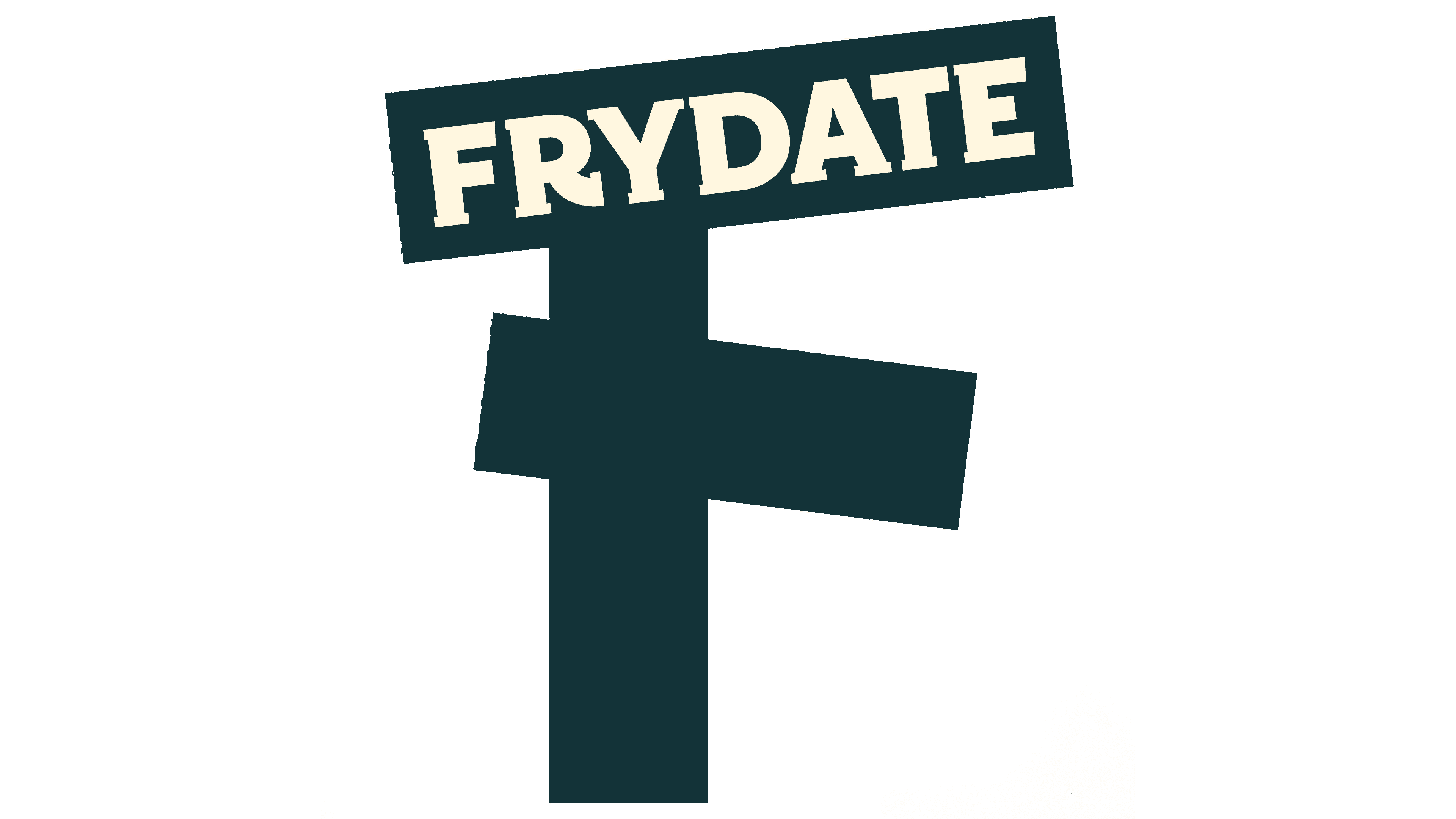
Crafted by SKINN, a Belgium-based design agency, the Frydate logo captures the brand’s playful spirit. It showcases an ‘F’ shaped from three artfully skewed French fries. The wordmark, styled in a retro varsity-letter form, blends seamlessly with the logo’s fries. Although the stylized ‘F’ risks reduced legibility at smaller sizes, the design choice aims for immediate brand identification.
Not just resting on its whimsical logo, the brand identity mixes a select yet lively color scheme with strong typography—Freigeist X Condensed Black in uppercase. The brand’s character comes alive through expertly shot food photos and lively stop-motion animation. The latter visual technique simulates fries sizzling and tumbling in a basket, a dynamic effect mirrored in the brand’s typography and various graphic elements.
Inside the restaurant, the setting strikes an elevated fast-casual chord akin to popular chains like Chipotle. While the design doesn’t fully emulate the high-energy hues of the Frydate logo and branding, this intentional subtlety sets the stage for an exceptional dining experience, setting it apart from conventional fast-food joints.
Frydate’s branding navigates between the enduring and the novel, readying the chain for potential expansion. The brand message—exceptional fries served in an engaging environment—is succinctly and effectively conveyed through its design elements, solidifying Frydate’s position in a competitive market.