


![]() Full House Logo PNG
Full House Logo PNG
Despite its simplicity, the Full House logo is easily recognizable because it is associated with the popular family sitcom. The emblem reflects the warm relationships between the main characters and conveys the cozy home atmosphere at the heart of the plot.
Full House began as a different kind of project. Jeff Franklin, who had worked on Laverne & Shirley and Bosom Buddies, first pitched ABC a sitcom called House of Comics, about three single stand-up comedians sharing a home. ABC wanted a family series closer to NBC’s hit The Cosby Show, so Franklin rebuilt the idea around widowed father Danny Tanner, his three daughters, and two men helping him raise them.
The show premiered on ABC on September 22, 1987, in a difficult Friday 8 p.m. slot. Critics were skeptical, and the first season barely reached the top 75. Bob Saget played Danny Tanner, John Stamos played Uncle Jesse, and Dave Coulier played Joey. At the same time, Candace Cameron Bure, Jodie Sweetin, and twins Mary-Kate and Ashley Olsen formed the children’s cast. The Olsen twins were only seven months old when filming began.
The ratings changed in season two, after ABC placed the series after Perfect Strangers. From 1989, Full House became a core part of the TGIF Friday block alongside Family Matters and Perfect Strangers. Miller-Boyett Productions and Jeff Franklin Productions produced the series, first under Lorimar, then under Warner Bros. Television after 1993. Though set in San Francisco, most filming took place in Los Angeles.
By 1995, production costs had risen, and ABC closed the show after eight seasons and 192 episodes. The WB offered to continue it, but Stamos declined to move from a major network. Full House later remained visible through syndication on NBC Daytime, ABC Family, Nick at Nite, and TBS. In 2016, Netflix revived the property as Fuller House, which ran for five seasons until 2020 without the Olsen twins.
balance domestic responsibilities with work, he seeks help from his brother-in-law and best friend. For eight years, viewers watch the children grow and the challenges their caregivers face.
Meaning and History
![]()
Although the old Full House logo lacks symbolic elements, it is still associated with the show’s friendly atmosphere because its on-screen appearance was always accompanied by melodic music. There is also a new emblem created for DVDs and merchandising. Presumably, it was introduced on February 8, 2005. Both versions share a similar structure: they contain the sitcom’s name, use a rounded font, and feature a shading effect. The soft design of the letters emphasizes the importance of warm family relationships, as reflected in the series’s eight seasons.
What is Full House?
Full House is a sitcom about single father Danny Tanner, who, along with his brother-in-law and childhood friend, raises three daughters of different ages. It aired on ABC from 1987 to 1995. A total of 192 episodes were produced. The series was negatively received by critics but liked by viewers. In 2016, its sequel, Fuller House, featuring the same actors, was released.
1987 – 1995
![]()
This logo was used throughout the period the sitcom was aired. It debuted alongside the first episode on September 22, 1987. Jeffrey Steven Franklin likely designed it based on an individual font. The inscription appears to be hand-drawn. The glyphs consist of uneven strokes with both convex and smooth sections.
In the vertical version of the emblem, the words “Full House” are centered on two lines. The mustard-warm color creates a warm and cozy atmosphere characteristic of a family television series. Meanwhile, the letters have black shadows concentrated at the bottom and left. This style gives the text a three-dimensional effect.
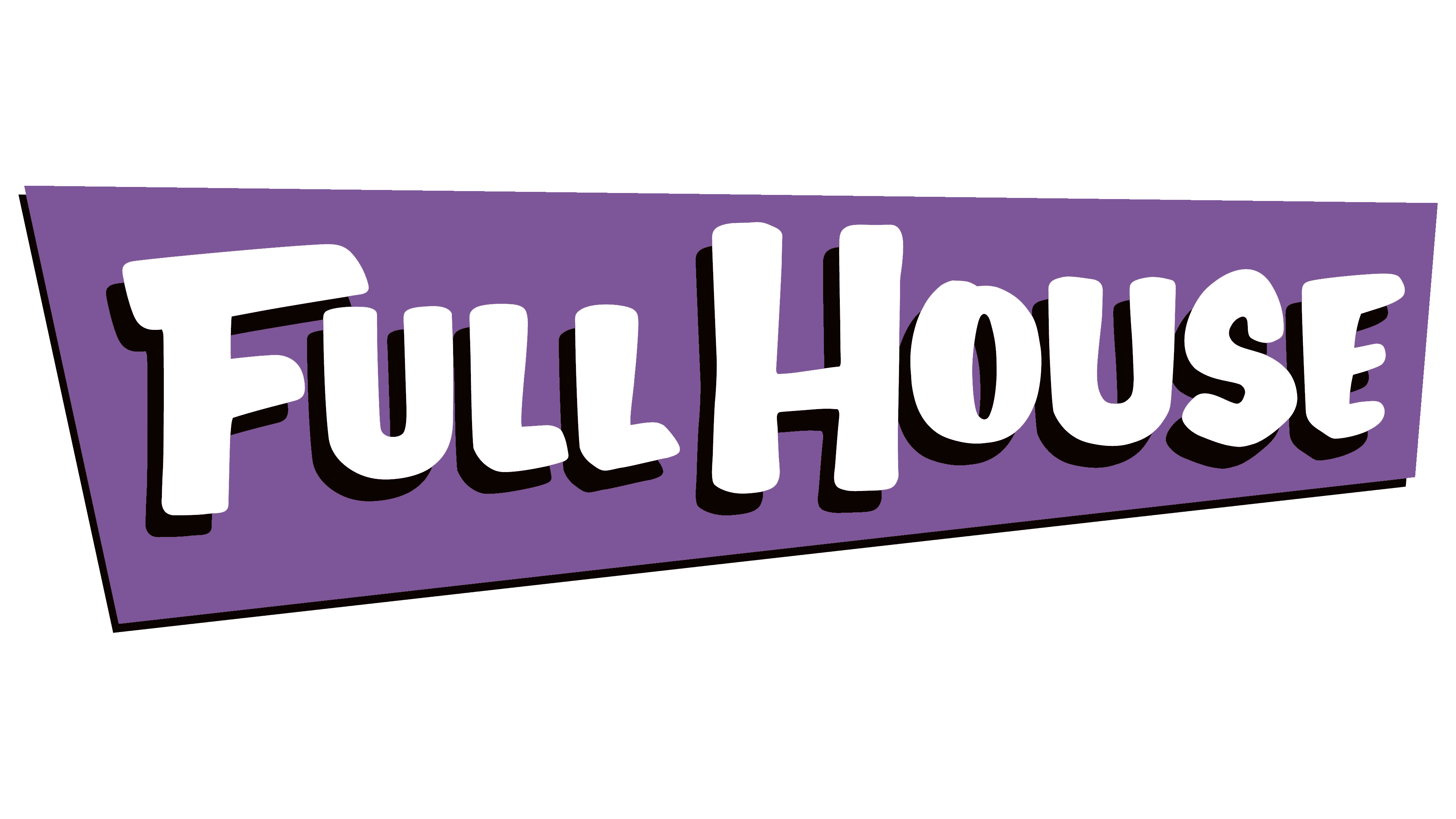
2005 – today
![]()
On February 8, 2005, the first season of the sitcom was released on DVD. The disc cover featured a new logo, presumably not seen before. An unknown designer used the original logotype as a template, slightly altering the shape of the glyphs to make them bolder and rounding all corners. Now, the inscription occupies one line, but it’s not positioned horizontally: the right side is slightly raised. The uneven trapezium, which contains the series’ name, also has a diagonal slant at the bottom, so it seems to rest on a single sharp protrusion. The geometric figure is painted in pale orange. Against this background, the white letters, casting brown shadows, are clearly visible.
Font and Colors
The sitcom’s logo uses a custom set of glyphs that look drawn. They are all uppercase, but the initial “F” and “H” are additionally enlarged. Inspired by this design, John Manjiro created a similar font named Full House.

While the original version of the emblem featured a mustard-yellow inscription, the later variant set the series name in white against a pale orange background. In both cases, the letters have shadows: black in the first case and brown in the second.