


![]()
Full Pin, a Montreal-based urban mushroom farming company, has unveiled a new logo and visual identity that reflect its growth and modern approach. The rebranding highlights the company’s ambitions in the sustainable agriculture market and commitment to innovation.
The organization has earned a reputation for producing high-quality mushrooms using eco-friendly urban farming techniques. Known for its focus on sustainability and creative solutions, the updated identity is designed to strengthen its position in a competitive market and signal a forward-thinking outlook.
![]()
The new logo represents a bold shift from the previous design, introducing a more modern and dynamic aesthetic. The updated typeface features bold, angular lines, giving it a strong, industrial feel. This contrasts with the softer, rounded look of the old logo, presenting a more ambitious and contemporary image.
One major change in the design is removing the semi-circle element, which was previously used to symbolize a natural connection to mushrooms. Instead, the focus is on sleek typography and integrated details that suggest motion and progress. Fused letters and sharp line elements in the new logo add to the impression of energy and innovation.
The design retains a black-and-white color scheme, maintaining its minimalist appeal while enhancing its boldness with heavier forms and precise geometry. These features ensure it remains impactful across different platforms and media.
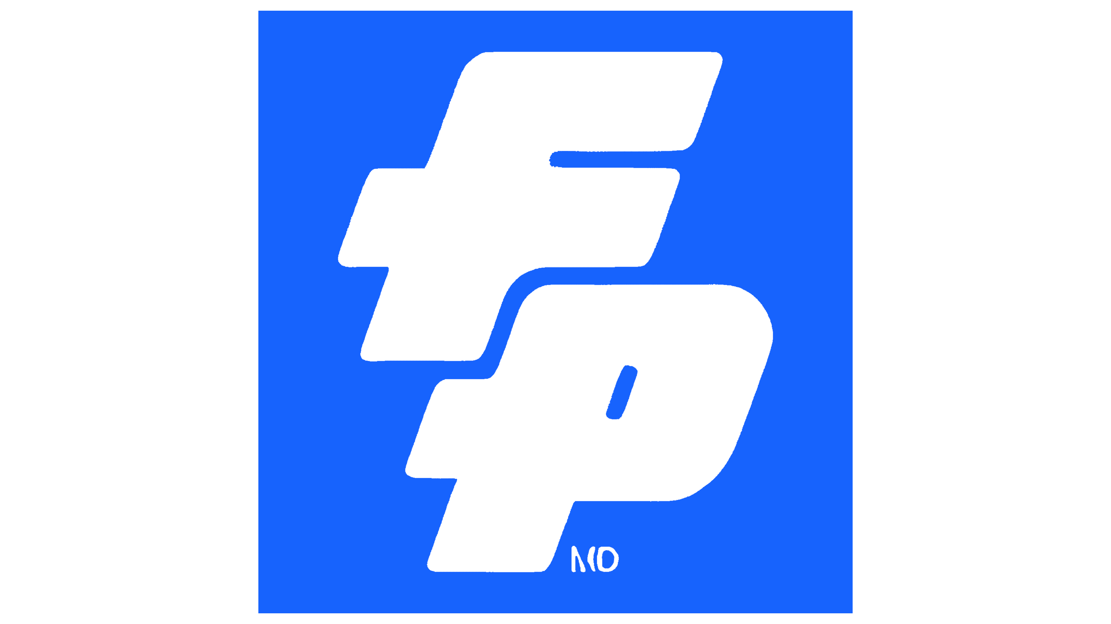
The new design’s composition simplifies the presentation by focusing solely on the name and eliminating additional graphics or taglines. This streamlined approach increases recognition and reinforces the logo’s striking visual presence.
The refreshed identity reflects the company’s commitment to advancing urban agriculture through technology and innovation. The strong typeface and dynamic design capture the brand’s energy and modern outlook.
In comparison to the previous logo, which leaned on themes of nature and organics, the new design feels more cutting-edge and energetic. This change aligns with positioning itself as a leader in urban farming and sustainable agriculture.
![]()
This rebranding underscores the company’s dedication to growth while staying true to its sustainable values. The updated logo conveys readiness to embrace challenges and seize new opportunities, reinforcing its role as an innovator in the agricultural sector. The transformation marks a fresh chapter for Full Pin, combining a bold visual identity with a renewed vision for the future.