Amazon stands for functionality and usability more than design appeal. Logos, icons for applications are made in a minimalistic style using basic colors and elements. The new icon impressed users with its design until they started drawing parallels with famous personalities.
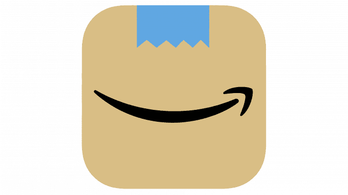
The app icon design consists of a branded smile or arrow placed on a brown background that resembles a cardboard box. You can see a piece of blue tape at the top, which is used to seal the parcels. Successful use of colors, especially light brown with reference to real boxes, will set the icon apart from other applications made according to the standard principle: white background and bright inscriptions. Also, a branded smile evokes warm feelings in users and is also their most famous symbol.
It would seem, what might surprise users since the company drew a parallel with real messages that reach consumers? It’s all about the blue ribbon, which looks like a mustache, especially when placed a little closer to the Smile. This combination reminded them of Adolf Hitler. Opinions were divided: some users are delighted with the icon, while others find similarities with a famous person. In any case, the company needs to either remove the so-called mustache or supplement it with one more element to avoid active condemnation.
Despite all the guesswork, the icon has no hidden meaning. The corporate Smile is a famous symbol of the company, which personifies joy and focuses on delivering positive emotions to the consumer. Amazon also donates money to those in need to its charity branch, Smile. If we consider the symbol as an arrow, then the logo takes on a different meaning – achieving its goals and moving forward.


