


![]() Funimation Logo PNG
Funimation Logo PNG
The Funimation logo indicates friendliness and the presentation of information through animation. The presence of a certain amount of fantasy. The emblem hints at an analogy, fairy-tale characters, and a sense of a good time on the screen.
Funimation began in the early 1990s with a call between engineer Gen Fukunaga and his uncle Nagafumi Hori, a producer at Toei Animation. Hori offered him the US rights to Dragon Ball if he could form a company and raise funding. With backing from Daniel Cocanougher’s family, FUNimation Productions was registered on May 9, 1994, and then moved to Texas.
The first years were difficult. Funimation worked with BLT Productions, Ocean Studios, Pioneer, and Saban Entertainment to dub and distribute Dragon Ball and Dragon Ball Z. Two early attempts to place Dragon Ball Z on US television failed. The turning point came in 1998, when Cartoon Network added Dragon Ball Z to Toonami. The series became the block’s top-rated program and turned Funimation into a serious anime distributor. Viz Media, focused mainly on manga, was not its main rival in animation.
In 2003, Funimation released the dubbed Dragon Ball GT. In 2005, Navarre Corporation acquired the company for $100.4 million in cash and stock, and the company became Funimation Entertainment. In 2008, it acquired Geneon’s titles after that company exited the US market.
In 2011, Fukunaga and investors bought Funimation back from Navarre for $24 million. In 2013, the company licensed Attack on Titan and several Sunrise titles after Bandai reduced US anime licensing.
In 2016, Funimation partnered with Crunchyroll and launched FunimationNow. Sony bought 95% of Funimation in 2017 and ended the Crunchyroll partnership in 2018 after AT&T acquired Crunchyroll. In 2019, Sony grouped Funimation with Wakanim and Madman Anime Group. Sony bought Crunchyroll from AT&T in 2021, and in 2022, Funimation Global Group became Crunchyroll, LLC. Funimation’s streaming service closed on April 2, 2024.
Meaning and History
![]()
What is now known as Funimation was at first Gen Fukunaga’s risky experiment. Following his uncle’s advice, the businessman decided to license the Dragon Ball media franchise. But he had no money, so he convinced the Daniel Cocanougher family to sell their main source of income, the feed mill, and put all the money into the common cause. This is how FUNimation Productions was born, sold to Navarre Corporation in 2005, and renamed FUNimation Entertainment. After a few more resales and a couple of global rebrands, the anime distributor got its current name. All these changes are reflected in his logos.
What is Funimation?
Funimation is a US company specializing in the production, dubbing, promotion, and sale of anime and other entertainment media products. Its founders are spouses Fukunaga, Gen, and Cindy. They set up the studio in 1994.
1994 – 1996
![]()
The platform’s first emblem was nicknamed “Texas Shapes” and “The Lone Star” because it features one white star, the same as the flag of the American state of Texas. There is a red circle behind the five-pointed shape and a blue rectangle just behind it. In the animated version, they are three-dimensional, and in a static form, they become two-dimensional. On the right is the text containing the company name. The inscription is written in jagged black letters, the font resembling handwriting.
1996 – 2004
![]()
In 1996, the company introduced a new logo, “The Lone Star II.” It contains the same set of shapes as the previous version, but the rectangle and circle have acquired a light gradient. The words “Funimation Productions” were initially positioned to the right of the picture and, after a few years, moved down. The font has also changed: the designers have made it smoother and more legible.
2004 – 2005
![]()
The “FUNimation Bubbles” badge became part of the corporate identity in 2004, but was not used for long until the Navarre Corporation service sale. The gradient disappeared from the geometric shapes, but thin black outlines appeared. The letters have taken on a white sheen. By the light spots’ location, you can guess that the invisible light source is in the upper right corner. In the animated version, bubbles fly behind the logo, reflecting the black lettering and multi-colored graphic composition.
2005 – 2009
![]()
In 2005, the Navarre Corporation acquired Funimation from its creators. The new owner immediately rebranded to showcase its presence. This is how the anime streaming service, Funimation Entertainment, got its name, along with an emblem bearing the corresponding inscription. As a result of the global design work, The New Lone Star was born.
The geometric shapes have an unusual arrangement: the blue rectangle has become a jagged, horizontally elongated quadrangle. The red circle is right there (on the left) but slightly out of bounds. There is also a reduced white star.
The name of the service is also placed inside the polygon: “FUNIMATION” is written in jumping white letters in the first line, and in the second is “ENTERTAINMENT.” The phrase “A NAVARRE CORPORATION COMPANY” has been moved outside the blue background. For the word “NAVARRE,” the designers used a stylized font with voids in place of some of the lines.
2007 – 2011
![]()
In 2007, the company changed its headquarters to Flower Mound. She marked her “housewarming” with a new logo that differed only slightly from the old one. The colors are darker and have a gradient, and the geometric shapes have thin frames. The parent company’s name, on the other hand, brightened a little.
2011 – 2016
![]()
In 2011, designers developed the most minimalistic version of the Funimation wordmark. This happened after the Navarre Corporation sold the brand to a group of investors led by Gen Fukunaga. The designers removed all elements except the first word and repainted it black. The “jumping” arrangement of letters has been preserved. An additional “F” icon has also appeared.
2016 – 2024
![]()
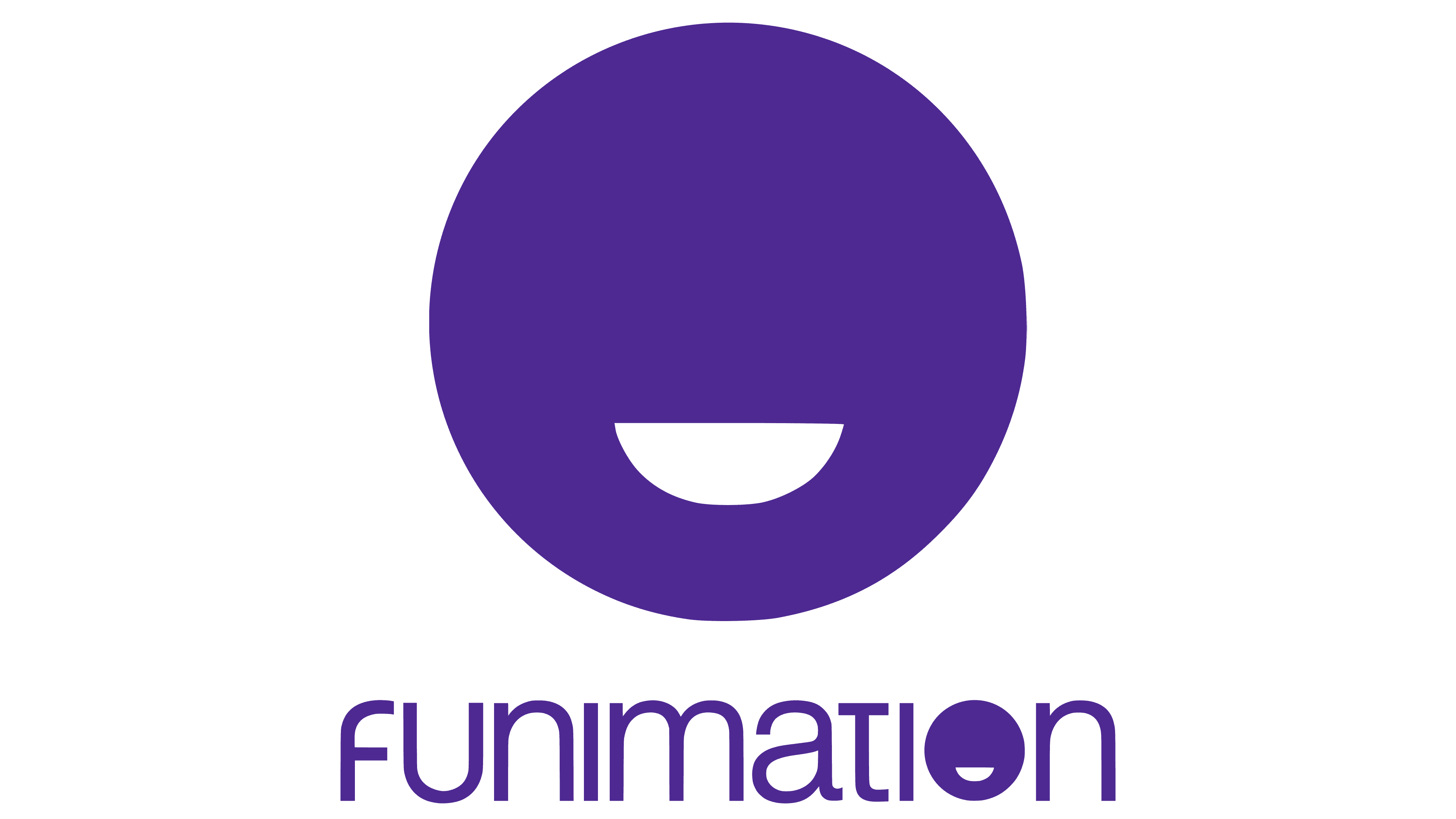
The anime licensing and streaming service entered 2016 with a new logo. The public liked the redesign because it solved the technical problems of the old brand. The developers have changed the design of the word “Funimation,” using a mixture of uppercase and lowercase letters in purple. In place of “O” is a circle with a white semicircle resembling a smile. It is nicknamed “The Smiley Face” and is used as an icon on its own.
Font and Colors
Funimation has the word “fun” in its name, so the designers rendered it an unusual logo. She conveys energy and excitement before watching new anime episodes. It is a symbol of the changes that the company underwent in 2016.
The font for the logo was custom-designed. The basis was Helvetica Light, modified by typographers beyond recognition. And for the previous wordmark, the typeface Eurostile, designed by the Italian Aldo Novarese, was used.
The key color is purple (#45298F), which is similar to Blue Gem. Designers chose it because it can be easily converted to blue or red.
FAQ
What does the Funimation logo mean?
The Funimation logo features the company name in lowercase, using a custom version of the Integral CF font. This design gives the logo a modern and friendly appearance. The cropped “t” with a shortened top bar is a distinctive touch.
Another notable detail is the “o,” which is drawn as a white circle resembling a smiley face. This playful element reflects the brand’s focus on entertainment and anime, symbolizing happiness and enjoyment. The custom font and playful elements make the logo recognizable to fans and viewers.
How did Funimation get started?
Funimation began thanks to Nagafumi Hori from Toei Animation. Hori suggested the idea to his nephew, Gen Fukunaga, an American businessman. He said that if Fukunaga could raise enough money to start a studio, he would help get the license for the Dragon Ball franchise.
Seizing the opportunity, Fukunaga focused on raising the necessary funds. The brand launched with Hori’s help and the promise of a major anime license. This moment marked the start of what grew into a key player in the anime industry, bringing popular titles to audiences in the United States and beyond.
Where is Funimation based?
Funimation Productions, LLC is based in Flower Mound, Texas, USA. This town in the Dallas-Fort Worth area is where the brand handles its business, including licensing, production, distribution, and marketing of anime content.
Being in Flower Mound is due to the area’s strong infrastructure and accessibility, which help with logistics. Texas’s growing tech and entertainment sectors make it easier to find talented staff and build industry connections.
From its Texas headquarters, the brand has successfully reached fans across the United States, bringing popular anime titles to a wide audience. The headquarters is home to key departments and staff who work hard to keep the brand thriving in the competitive anime industry.
In addition to its main base in Flower Mound, the brand has partnerships and collaborations worldwide.
What color is the Funimation logo?
The official color of the brand’s logo is purple. According to creative director Bob Robinson, this choice has several reasons.
First, purple is versatile and easily changes shades. This makes it adaptable for different uses and designs.
Second, purple matches the brand’s color palette, ensuring the logo fits well with other design elements. This helps maintain a consistent visual identity.
Finally, purple is vibrant and eye-catching. It stands out and grabs attention, making the logo memorable.