


![]() Game of Thrones Logo PNG
Game of Thrones Logo PNG
The Game of Thrones Logo is arguably one of the most distinguished visual identifiers in the realm of television series. It’s a combination of a wordmark, typically presented independently in either black or silver, and a lavishly detailed emblem filled with symbolic richness, often set as a backdrop.
Immerse yourself in the thrilling fantasy world of HBO’s Game of Thrones, a drama series created by David Benioff and D.B. Weiss, based on George R.R. Martin’s best-selling A Song of Ice and Fire novels.
In 2006, Benioff and Weiss fell in love with George R.R. Martin’s novels and decided to turn them into a television series. After pitching the idea to HBO, they were thrilled to find out that the network had purchased the rights in 2007.
The premiere of Game of Thrones on HBO on April 17, 2011, shook the world of television. The show quickly skyrocketed to critical acclaim, captivating millions of viewers each episode and creating an ever-growing, passionate fan base.
Despite its widespread popularity, the series sparked controversy when its final season aired in 2019, with mixed reviews from both fans and critics.
Game of Thrones has revolutionized television, ushering in a new era of award-winning and critically acclaimed series and inspiring a wave of streaming services. But its reach extended beyond the small screen, with passionate fans creating their own theories, writing essays, and a plethora of merchandise celebrating the show. Game of Thrones has become a true cultural phenomenon, leaving an unforgettable legacy as one of the most influential TV series of all time.
Meaning and History
![]()
The show’s branding is firmly anchored in its unique fantasy elements. The series has a distinct visual style, seen in the iconic opening sequence that maps the various territories of Westeros, a crucial component of the brand’s identity. The Iron Throne, a central symbol in the series, is also a key element of the brand’s visual identity, often associated with power, betrayal, and the relentless pursuit of dominion.
Not only does the series boast strong visual markers, but it also excels in the auditory department. The show’s theme music, composed by Ramin Djawadi, has become synonymous with the series, contributing significantly to the overall brand experience. This melody resonates with fans worldwide and further strengthens the brand’s identity.
The brand is also well-known for its impactful taglines. Phrases like “Winter is Coming” and “Valar Morghulis” have infiltrated pop culture, emphasizing the series’ pervasive influence. It is these elements – the visual, auditory, and verbal components – that have collectively built a brand as compelling and unforgettable as the series itself.
What is Game of Thrones?
Game of Thrones, created by David Benioff and D. B. Weiss for HBO, took the world by storm with its intriguing plotlines, intricate character development, and elaborate fantasy settings. Debuting in 2011, this American fantasy drama television series soon rose to global prominence, etching its place in the annals of the most celebrated television series. Derived from the ‘A Song of Ice and Fire novels by George R. R. Martin, the series is set in the fictional continents of Westeros and Essos. It follows the power struggles among noble families as they vie for control of the Iron Throne of Westeros. Its rich narrative and unpredictable twists kept millions of viewers worldwide captivated for eight seasons.
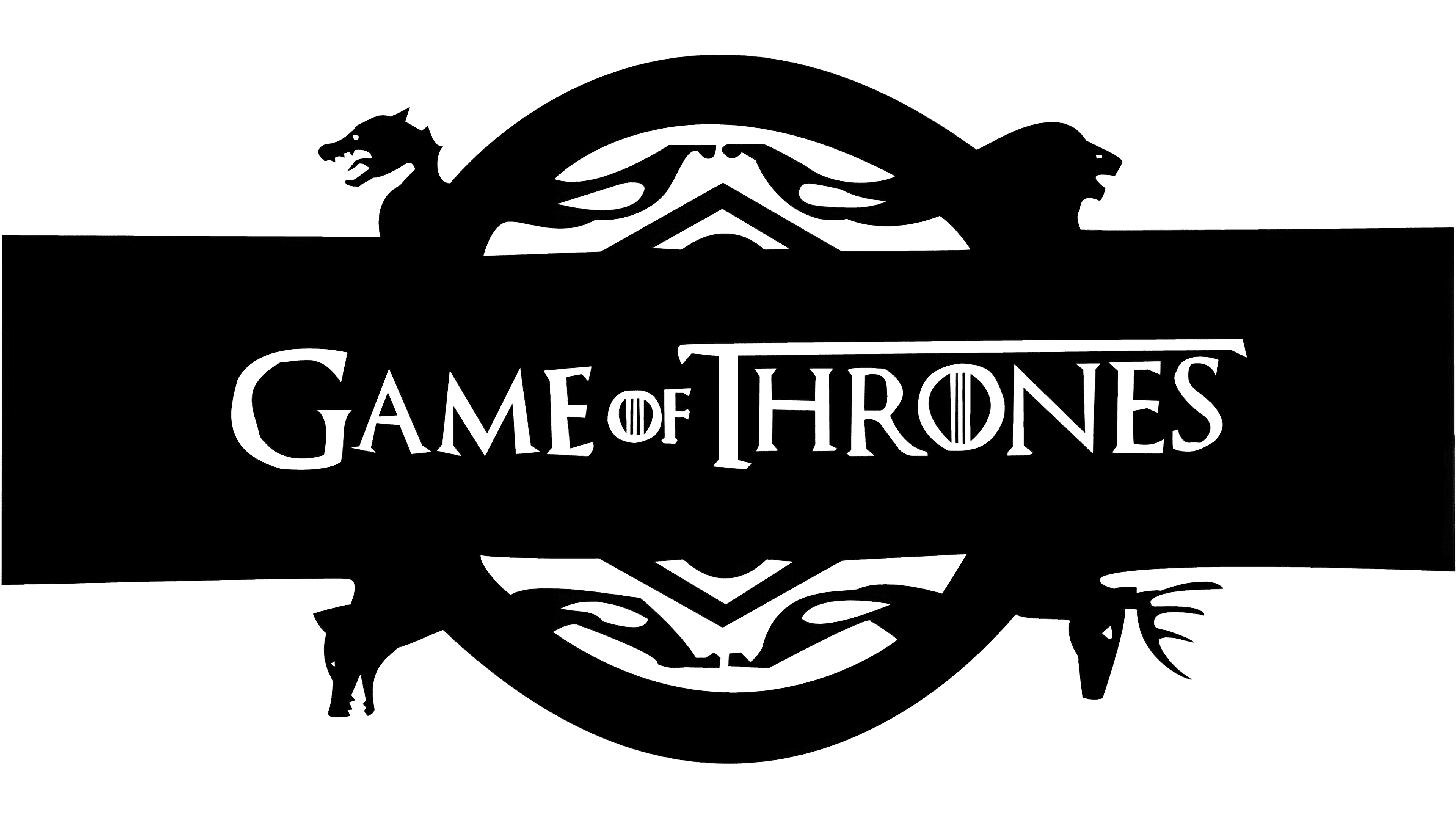
The TV series title is set in the classic Trajan Pro font, mirroring the original Roman characters, resulting in a tastefully balanced, powerful, and elegant logo. Unique aspects of this design include the letter “O,” which houses three slender vertical lines, and the extended horizontal bar of the “T,” which extends beyond the “S” in “Thrones.”
In the logo, the capitalization of all letters, the enlargement of “G” and “T,” and the diminution of “Of” further enhance the logo’s striking aesthetic. Beyond the typography, the emblem, an intricate circular badge resting on a horizontally positioned rectangle, brings depth to the logo. From this circle, four animal heads emerge, each pointing in a different direction.
These animals are symbols associated with the series’ famed houses: the wolf represents House Stark, the lion signifies House Lannister, the dragon stands for House Targaryen, and the deer symbolizes House Baratheon. Thus, the Game of Thrones logo serves as an eye-catching visual identifier and a rich source of symbolism, embodying the intricate narrative and power dynamics of the series.