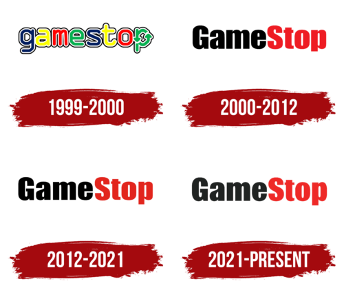
The GameStop logo is an example of the contrast between real and gaming life. The emblem shows the moment when the game stops being a fantasy and becomes very real. “Don’t play games, live them and enjoy them,” the company tells users through its logo.
GameStop: Brand overview
| Founded: | 1984 |
| Founder: | Leonard Riggio, Daniel DeMatteo, Richard Fontaine |
| Headquarters: | Grapevine, Texas, U.S. |
| Website: | gamestop.com |
GameStop is a retail chain that sells video games and related products. It appeared in 1984 as a software store. The Dallas firm was founded by three entrepreneurs: Leonard Riggio, Daniel DeMatteo, and Richard Fontaine. Its headquarters is located in Grapevine, Texas (USA), and it owns more than 5,500 trading platforms around the world.
This sprawling network began with a humble pavilion called Babbage’s. The company got its name in honor of Charles Babbage, a mathematician-philosopher and the first ideologist of digital programmable computers. Soon, it quickly reorganized itself to sell video games, focusing on customer requests. In 1991, the new assortment brought her two-thirds of her total income.
The business owners were Gary M. Kusin and James McCurry, former classmates at Harvard Business School. To get the store, they asked for financial assistance from Ross Perot, who became their investor. The marketplace then went through several mergers and renames until it became GameStop. It happened in 1999.
Meaning and History
Babbage, a Dallas software company, started GameStop. Its founders were two graduates of Harvard Business School: classmates Gary Kusin and James McCurry. They named their company after the scientist who developed the idea of a programmable digital computer, Charles Babbage. It received its current name in 1999.
The new name carries an element of shock that attracted a lot of buyers in the beginning. It seems to say: stop playing – start playing for real! The rebranding gradually turned into a redesign because the management wanted to use a modernized name for the logo. And since it contains the main meaning of the brand, it was decided not to add graphics. The text plays its role. To emphasize the concept, the developers put two words together and colored them in different colors. Today there are four emblems.
What is GameStop?
GameStop is the largest video game retailer. It was founded in 1984 as Babbage’s and only received its current name in 2000. The company has its headquarters in the United States and operates more than 4,400 stores in various countries, including Australia and Canada. Customers can buy games for Nintendo, PlayStation, or Xbox and the consoles themselves. The brand was owned by Barnes & Noble until 2004.
1999 – 2000
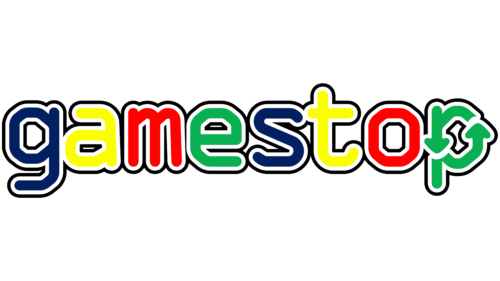
The logo is designed in playful colors – attractive, alluring, and bright. Among them: are green, red, yellow, and blue. They are used in succession. And to make the glyphs stand out better against a light background, the designers circled them with a black line, keeping a small indent between the edge and the middle. The result is another frame – white. All characters are lowercase, and “p” is formed from two circular arrows. This style fits well with the theme of the game.
2000 – 2012
The transition to the 21st millennium was a turning point for the company and required a transformation. The cardinal decision resulted in the emergence of a completely different concept of the logo, emphasizing “Game” and “Stop.” By combining the two foundations, leadership got the opposite meaning, which confused, pushed to buy and check – is it so? As a result, “Stop” (prohibition, stopping) gave a start to an increase in interest. Simultaneously, the emblem itself is quite simple: a horizontal inscription made in two “fatal” colors – black and red.
2012 – 2021
In this version, the developers kept the previous logo design as much as possible, playing a little with the color. They removed the excessive colorfulness and made the inscription black (“Game”) and dusty red (“Stop”).
2021 – today
The modern logo has changed not only the color but also the typography. Now the place of black was taken by dark gray and red – muted burgundy. In addition, the designers changed the font in the second part of the name: “S” and “o” got smooth transitions and rounding, while “t” had a shorter lower segment.
GameStop: Interesting Facts
GameStop is a famous store that sells video games, electronics, and gaming gear.
- Beginnings: GameStop started in 1984 in Dallas, Texas, as Babbage’s, a small software shop. Over time, it grew into GameStop by buying from other companies. It used to have thousands of stores around the world.
- Used Games: GameStop is known for letting customers trade in used games and consoles. This made games more affordable and became a big part of their earnings.
- Game Informer Magazine: GameStop owns Game Informer, a big gaming magazine that features game reviews, news, and previews.
- Changing with the Times: GameStop started selling online and adding mobile devices and collectibles to its inventory as gaming went digital. It tried to become a community spot for gamers.
- Digital Gaming Challenge: The move to digital games was tough for GameStop, which was big on physical games. They’ve been trying to sell more online and find new money-making methods.
- 2021 Stock Drama: In 2021, GameStop’s stock went through a crazy rise because of small investors on Reddit. This made the news everywhere, shooting up their stock price for a while.
- A Place for Gamers: GameStop stores were where gamers hung out, especially for midnight game releases and special events.
- Worldwide: GameStop also has stores in other countries like Canada and Australia, where it’s known as EB Games.
- Rewards Program: Their PowerUp Rewards gives points for buying and trading. These points can be used for discounts later.
- Looking Ahead: With a changing market, GameStop is trying new things to stay relevant, like focusing on online sales and creating more store experiences.
GameStop’s journey from a small shop to a big name in gaming and its involvement in a major stock market moment shows its ability to adapt to new trends and challenges.
Font and Colors
This logo has no graphic part – the informational inscription is of paramount importance. Text is present in both variants, highlighting the main product range. If before the word was classic, now it looks original. This was made possible by two factors. The first is uppercase “G” and “S” at the beginning and end of the name. The second is a two-tone palette. She very well conveys the emotional intensity of a person and reflects two extremes – all or nothing, as is customary in the world of games.
For the word “GameStop,” the developers chose the Impact typeface. Massive and wide letters look indestructible. “P” has a shortened leg, while “m” and “t,” on the contrary, are elongated. Although the two different stems are fused, their borders are highlighted in capital letters and color. The left side of the name is colored black, the right side – red. They symbolize the peak of emotional stress. The inscription was made in a thin font with white characters in the debut version, so it almost did not attract the eye.
GameStop color codes
| Eerie Black | Hex color: | #1b1e1c |
|---|---|---|
| RGB: | 27 30 28 | |
| CMYK: | 10 0 7 88 | |
| Pantone: | PMS 419 C |
| Pigment Red | Hex color: | #ef2623 |
|---|---|---|
| RGB: | 239 38 35 | |
| CMYK: | 0 84 85 6 | |
| Pantone: | PMS Bright Red C |

