


![]() Gartic Phone Logo PNG
Gartic Phone Logo PNG
The Gartic Phone logo visually reflects the challenges of transmitting multiple pieces of information over the phone from one user to another. There is a big risk of distorting the initial data. The emblem attracts everyone who enjoys communicating, encouraging them to pick up the phone and start the game.
Brazilian studio Onrizon Social Games was founded in 2008 in Belo Horizonte and focused on browser-based multiplayer games. Its first project was Gartic, an online drawing-and-word-guessing game inspired by Pictionary. For years, it remained mainly a Portuguese-language product with a strong Brazilian audience.
The international turn came in 2017 with Gartic.io, which added multilingual support and later reached 25 languages. Growth accelerated in 2020 during lockdowns, when daily app downloads rose from 5,000 to 80,000 in one week. That surge pushed Onrizon toward a new project based on the children’s game “telephone.”
Gartic Phone was released in late 2020. Players alternated between writing prompts and drawing images, then watched the chain distort by the end of the round. Its key technical difference was simultaneous play, which removed long waiting times and made the format better suited for groups.
The idea had predecessors, including Broken Picture Telephone from 2007, while Skribbl.io had already popularized browser-based drawing games in 2016. Gartic Phone spread faster on Twitch and YouTube, where streamers used private rooms to interact with viewers. By mid-2021, the game had over 700,000 Twitch followers. In 2022, Onrizon launched OnrizonTV with Words on Stream and Gartic on Stream. In 2023, Gartic Phone was added to Discord as a free voice-channel activity and later became a permanent Discord Nitro feature.
Meaning and History
![]()
Given that the Gartic Phone project was launched relatively recently, it is not surprising that the site’s logo has not changed so far. Thus, the developers try to make it recognizable among the target audience. It is not surprising that, immediately after the launch and with minimal advertising, the Gartic Phone became popular among potential players worldwide. For many gamers, this is nostalgia for the times when they had fun with friends, passing the word to each other, hoping to get an interesting and original version. A new game can be created by sending a link to friends or by joining a random game room from the list published on the site. For customers’ convenience, the Gartic Phone resource is available in many languages. Interestingly, in addition to the function of transmitting a word, the player can also draw it. Every day, more than 200 thousand users worldwide take part in the transmission of words.
For the logo, the project representatives chose a spectacular, modern color palette of purple and white. The name and home phone logo are combined into a single continuous element. Not a modern smartphone was chosen as the phone, but a home phone used at the end of the last century.
What is a Gartic Phone?
First of all, it is an opportunity to have fun with friends. An intuitive interface and an engaging game let you immerse yourself in a positive atmosphere.
Unpopular today, the phone type was not chosen by chance. Thus, the creators tried to tap into the nostalgia of users who had this game as a favorite in their childhood. The phone is depicted in purple. The inscription “Phone” is an indispensable part of the phone, made in bold white letters with purple outlines. An interesting move by the representatives of Gartic Phone was stylizing the letter “O” as an old-style phone dial-in device. The inscription “Gartic” is half the size of “Phone.” Thus, the main emphasis was placed on the “phone” element and the project logo. This part of the name is also in white letters, set in a rounded sans-serif typeface. It is located above the phone’s main unit but under the handset.
Gartic Phone approached the logo’s creation responsibly, complementing it with unique elements. These should include the handset part located above the letter “r” in the word “Gartic.” It is depicted as a lightning bolt, hinting at the game’s nature and the participants’ skills.
Font and Colors
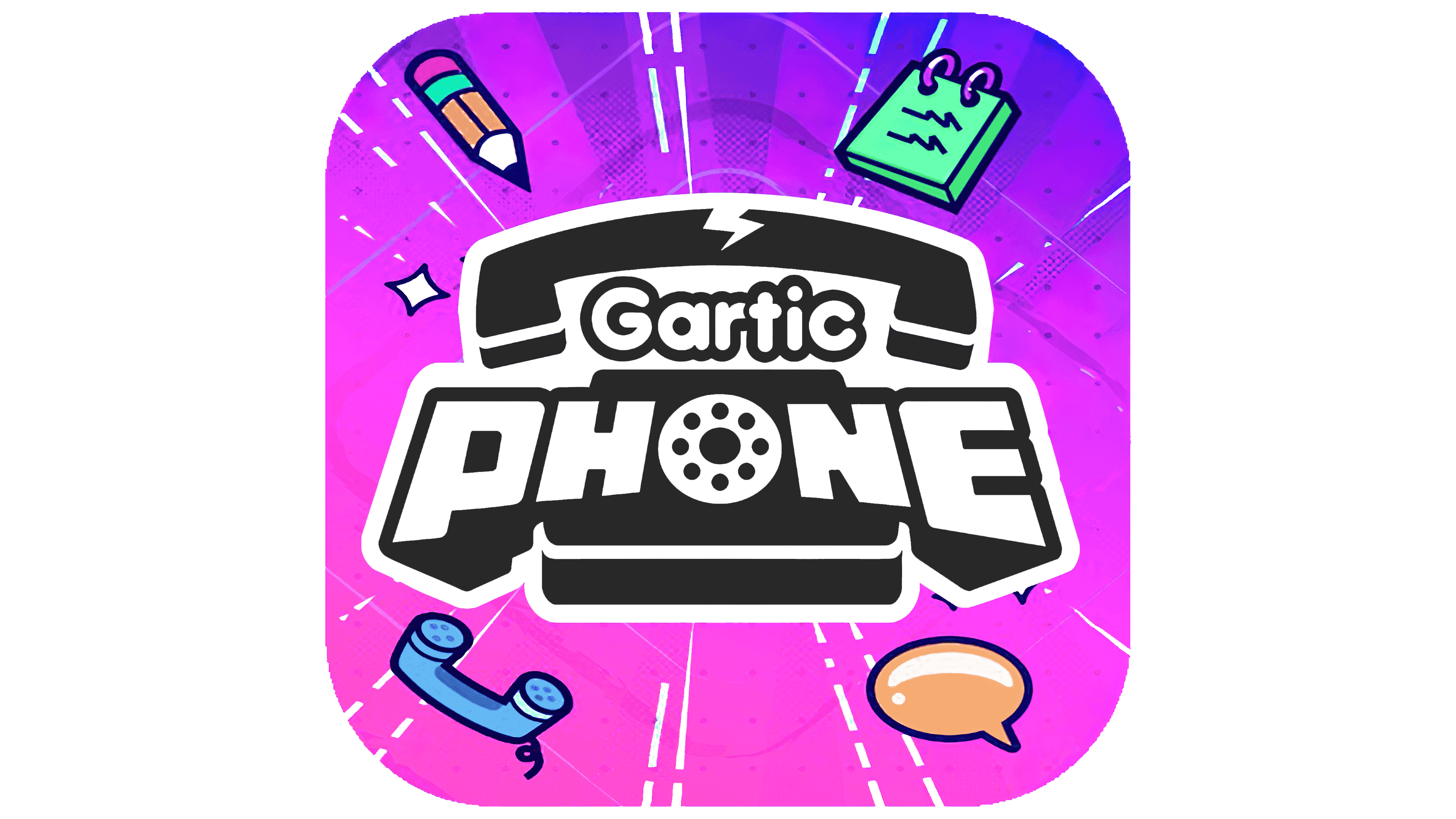
The main inscription is set in a classic, bold, serifless font with rounded corners. Each character has a shadow. Thus, there is a feeling that the name “Gartic Phone” is voluminous.
The white-violet palette was not chosen by chance. After all, they made it possible to create a bright, modern logo for a seemingly classic, outdated game. Even without visiting the company’s website, a potential participant in the game process can see the project’s direction and objectives. In sum, the combination of these colors reflects the game’s artistic nature and the need for creativity and proactivity. The purple color conveys the project’s stability and prospects, while white reflects loyalty to the participants in the process.