The GB Airways logo represents the airline’s commitment to reliability and excellent service. It reflects the core of their operational ethics and their aim to enhance travel experiences. The logo connects to local culture, fostering a sense of familiarity and trust among passengers. The design elements chosen for the logo strengthen the airline’s reputation as a provider of quality services and its role in connecting various destinations.
GB Airways: Brand overview
The history of GB Airways traces back to the establishment of Gibraltar Airways, a small airline created to connect Gibraltar and Tangier by air. Due to Gibraltar’s geographical constraints and the absence of a proper runway, seaplanes were initially used.
After World War II in 1947, the company expanded and rebranded as Gibraltar Airways (1947) Limited, signaling its post-war growth ambitions. Transitioning to land-based aircraft enabled it to widen its route network and increase flight frequency.
In 1989, a significant milestone occurred as Gibraltar Airways (1947) Limited rebranded to GB Airways, reflecting its expansion beyond Gibraltar and aim for a more universal brand. The focus was on developing its route network, particularly in popular Mediterranean tourist destinations.
The pivotal moment came in 1990 when the company entered a franchise agreement with British Airways, allowing it to expand operations significantly. Under this agreement, its planes operated in British Airways livery and under the BA code, granting access to British Airways’ extensive route network and booking system. Throughout the 1990s, under the British Airways franchise, the airline continued to grow its route network, operating flights from London to various Mediterranean cities. It experienced rapid expansion and fleet growth during this period.
In the 2000s, the company thrived under the British Airways franchise, modernizing its fleet with Airbus A320 family aircraft to enhance operational efficiency and passenger service quality. A pivotal moment occurred on October 25, 2007, when British Airways announced the sale of the airline to easyJet for £103.5 million. This marked the end of the longstanding partnership between the two companies.
On March 29, 2008, the airline operated its final flight under its brand before fully integrating into the easyJet structure. The acquisition was officially completed on March 30, 2008, leading to the discontinuation of the original brand.
Throughout its 77-year history, the airline evolved from a small local airline to a significant player in the Mediterranean charter and scheduled flights market, ultimately becoming an attractive asset for easyJet.
Meaning and History
What is GB Airways?
It is a British airline headquartered in Crawley, England. It operated as a franchise partner of British Airways, providing flights to destinations in Southern Europe and North Africa. It offered scheduled and charter flights. Its fleet consisted of Airbus aircraft and its operations were integrated with British Airways’ systems, allowing passengers to benefit from the airline’s wider network and services. The airline was acquired by easyJet.
Old
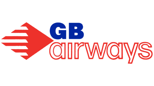
The airline’s emblem is light and airy, reminiscent of the water near Gibraltar and flight. The main element is a diamond split into two halves: a solid red and a striped red-and-white. The composition resembles several images:
- A peculiar fish. The company feels as natural in the air as a fish does in water. The symbol emphasizes the country’s coastal location.
- A kite. The design is airy. The airliners soar in the sky, following the air currents. Flying with GB Airways is truly enjoyable.
- A stylized airplane. The wings of the giant are spread wide. It flies very fast, leaving a white trail in the air.
- Flaps. By raising and lowering elements, the airplane improves its glide. The company successfully manages the movement of its fleet and maneuvers in the market among competitors. The symbol represents development and success.
The color palette in English shades highlights flights to Great Britain as the primary focus. The design of the large blue letter ‘G,’ resembling an arrow, adds dynamism to the inscription. The white ‘Airways’ with a red outline alludes to the red and white flag of Gibraltar.
1989 – 2008
The GB Airways logo, used before the company closed down, served as the basis for the new one. Designers transformed the red diamond-shaped arrow into wavy stripes, symbolizing rapid forward movement. The dark blue text conveys energy with letters that combine long serifs, rounded edges, and sharp corners.
The wavy stripes evoke a sense of fluidity and speed, which is essential in aviation. These stripes represent quick movement, aligning with the brand’s vision of progress and efficiency. The dark blue text presents the company name and embodies dynamism. The font’s design, featuring long serifs, rounded edges, and sharp corners, blends tradition and modernity.
Transforming the red diamond-shaped arrow into wavy stripes maintains the essence of rapid movement while adding a contemporary touch. This design symbolizes the airline’s smooth and swift service, reinforcing the brand’s commitment to a seamless travel experience.
The choice of dark blue for the text adds sophistication and reliability. This color is associated with trust and professionalism, which are crucial for an airline. The font design, with long serifs, rounded edges, and sharp corners, reflects a balance between tradition and modernity, aligning with the airline’s mission to combine heritage with forward-thinking approaches.


