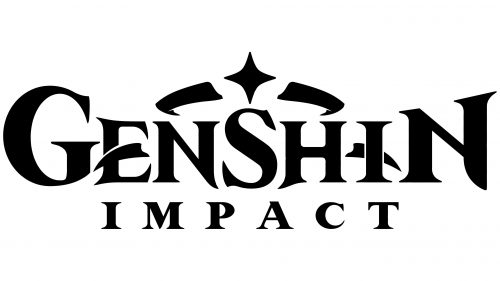
The Genshin Impact logo is magical and majestic. The emblem represents an amazing country filled with magic and unusual abilities. The sign reads like a theme of fantasy, witchcraft, and adventure.
Genshin Impact: Brand overview
| Founded: | September 28, 2020 |
| Founder: | miHoYo |
| Headquarters: | China |
| Website: | genshin.hoyoverse.com |
Meaning and History
The emblem is done in an Eastern style, associated with fairy tales and the world of fantasy. The logo hasn’t changed in the three years of development and the three years after the game’s release. The sign combines the main features of a magical country. The idea of coronation speaks of the gods who rule the world—the transformation of letters points to legendary battles and fights for increasing power. And the alternation of ordinary and uppercase elements demonstrates the characters’ gradual growth and development.
What is Genshin Impact?
It is the world’s most popular Chinese role-playing action game, where the user carries out missions, fighting and overcoming obstacles with one of the available characters. The game is based on the story of an alien who searches the lands of the world Teyvat for a twin brother lost upon landing.
2020 – today
The game’s emblem consists of an inscription and a wreath sign.
The name is placed on two levels. Translated from Chinese, the name speaks of the first gods. Each of the seven nations living in the fairy Teyvat is governed by a certain element and god. Therefore, the game’s characters have unusual abilities and superpowers unavailable to ordinary people. The story and world order in the game is reminiscent of myth, with the attraction of folklore, fairy tales, and legends of different nations.
In the title, three capital letters are used: the first, middle, and last, indicating the division of the world into different nations, each headed by separate rulers. The letters also hint at the control of elements: water, plants, fire, ice, wind, stones, and electricity. Each character is given their skills. Such abilities make the participants unusual.
Above the inscription is a wreath with a four-pointed star. It hints at superpowers and divine control of the world. The tiara indicates the highest energy that fills the earth and its items. Therefore, players can draw strength, health, and magic from ore, food, Statues of The Seven, and other elements.
The wreath also resembles the halo of the main character’s companion, Paimon.
The four-pointed star symbolizes the game’s internal currency – Primogem.
Two claws are placed on the letters E and I to emphasize the battles and the unusual abilities of the players. Along their path, characters encounter special places, Domains where they can fight monsters to gain strength. The claws embody these opponents. They also point to the participants’ natural abilities: elemental and explosive.
Font and Colors
The logo is monochrome. The black color represents the earth, the game world in which events unfold. The shade points to the basics of life, simple needs like food, sleep, and development, which the game process focuses on. The color encodes the power and strength of the participants—the elemental struggle.
The font of the inscription is unique due to the transformation of glyphs. Separate elements of the letters resemble different weapons.
- The stick of the last N looks like a sheath.
- The ends of S are like spear tips.
- The angle of the first N is like a sword blade.
- The stick of E is a knife blade.
The participant improves the characters’ attack and defense items during the game. This happens in battles, mining ore, or purchasing in stores. Combat battles are one of the game’s main elements, so they are emphasized in the emblem.
The word Impact is simpler. It was executed in a font similar to Marcelo’s. The widely spaced symbols are like separate characters. Initially, the player’s set includes 4 of them. He can replace participants during the mission to use their abilities to achieve the goal.
Genshin Impact color codes
| Black | Hex color: | #000000 |
|---|---|---|
| RGB: | 0 0 0 | |
| CMYK: | 0 0 0 100 | |
| Pantone: | PMS Process Black C |


