


![]()
Although the Genshin Impact logo does not contain obvious symbols, gamers associate it with exciting adventures and unique characters. The emblem demonstrates how much attention miHoYo pays to detail in video game development and how skillfully it combines different fantasy elements.
The developers of Genshin Impact drew on Gnosticism, anime style, and the heroic atmosphere of The Legend of Zelda: Breath of the Wild. They created the colorful world of Teyvat, inspired by picturesque corners of our planet, such as Zhangjiajie National Forest Park. The nations inhabiting it also have analogs in the real world. Some are connected to Scandinavian mythology, others to Middle Eastern culture, and others to steampunk. The game’s creator is miHoYo. They undertook this project in 2017 and introduced the beta version three years later.
Meaning and History
![]()
The game’s action takes place in the fantasy world of Teyvat, so the logo conveys an atmosphere of magic and fairy tales. Designers achieved this effect using a minimal number of elements, among which the most important is the name Genshin Impact. It is also associated with magic, although not so obviously. The first word was taken from the Japanese term “genshin kai” (“world of fantasy”), invented by writer Kenji Miyazawa. In Chinese, “Genshin” can be depicted in two characters: “原神.” They are interpreted as “original spirit” or “primordial god,” a reference to the creation story in Chinese mythology. By the way, in the game itself, there are also several main gods: seven Archons governing different nations of Teyvat.
What is Genshin Impact?
Genshin Impact is a video game that combines RPG and action elements. It was created by the Chinese company miHoYo Network Technology Co., Ltd. and released in 2020. The game’s storyline revolves around The Traveler, who is forced to search for their twin sibling in the fantastic world of Teyvat. Gamers can control different characters, participate in battles, complete quests, gather resources, and acquire food and weapons. The game is translated into several languages and available on PC, PlayStation, and mobile devices.
2020 – today
![]()
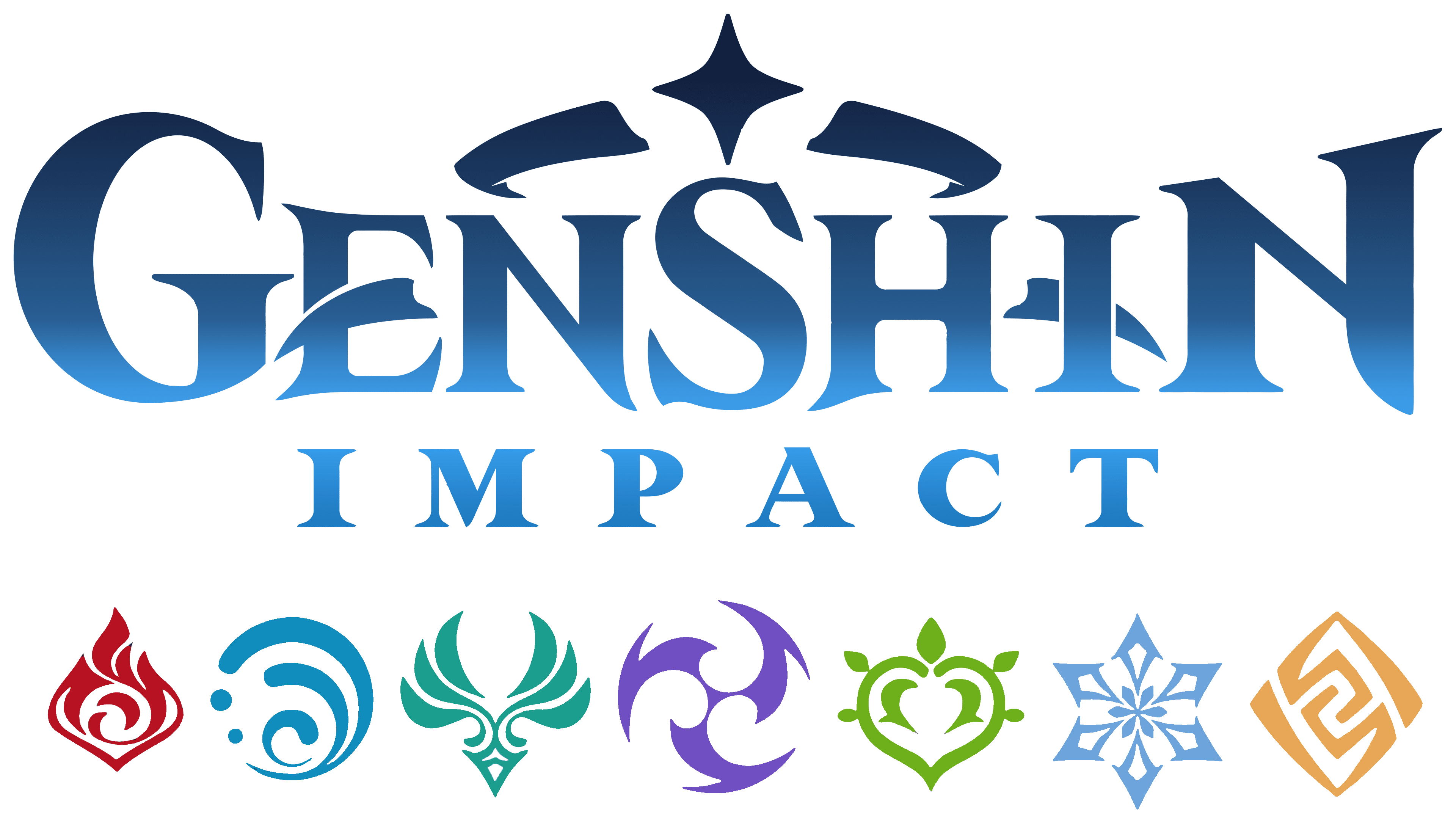
Designers split the name “Genshin Impact” into two parts, each with a different design. The word in the top line appears convex due to the difference in letter size: the initial “G,” central “S,” and final “N” are noticeably enlarged, with the right vertical of “N” higher than the left. It creates the impression that the inscription smoothly flows from side to side. Sharp serifs also support the dynamics, especially when they are extended upwards or downwards. These informal details convey the atmosphere of the fantasy world. This task is also fulfilled by two figures resembling the fangs of predatory animals. One replaces the middle stroke in “E,” and the other is depicted behind “I.”
As for the word “IMPACT,” it appears on the second line and looks much simpler than “GENSHIN.” It uses an uppercase font with the same sharp serifs as in the first case. To compensate for the small size of the inscription, the designers expanded the spacing between letters. All glyphs are of equal height and have varying stroke thickness, making them more legible.
Above the game’s name is a unique “diadem,” consisting of a four-pointed star and two curved strips. It also evokes the atmosphere of fairy tales and symbolizes the Archons’ power. By the way, such a star is often found in the world of Genshin Impact.
- This is how the in-game currency Primogems looks like a precious stone used to purchase various items.
- Such a symbol is often found on the characters’ clothing and in building interiors.
- On the game map, the four-pointed symbol appears in places where items to enhance the Statues of the Seven are hidden.
- Their star-shaped pupils can identify pure-blooded Khaenri’ahns.
Font and Colors
In the Genshin Impact logo, only the font of the second word can be identified. It is a contrasting antiqua with long, thin serifs, somewhat similar to Marcelo by Din Studio. The designers used wide letter spacing to compensate for the inscription’s small size.
For “GENSHIN,” a custom glyph set was developed. They vary in height and have an asymmetrical form, evident in the uneven size of elements. Here, the serifs are not aligned horizontally, as in the word “IMPACT,” but are directed in different directions. This reflects the uniqueness and originality of the world of Teyvat, where the game’s main events take place.
Unlike the typography, the emblem’s color is monochrome. In the final version presented in 2020, a monochrome combination of black and white is used. Behind the deceptively calm logo lies an entire universe of bright colors and fantasy characters.