


 George Mason Patriots Logo PNG
In its modern interpretation, the George Mason Patriots’ newest logo symbolizes the program’s ongoing development and expansion, as well as its growing achievements and aspirations. The bright, colorful identity reflects the team colors and accompanies George Mason University’s modern athletes.
The George Mason Patriots program took shape in 1972, when George Mason University became independent in Fairfax, Virginia. Students chose the Patriots’ name to reference George Mason, while green and gold had already been approved in 1965.
Men’s basketball reached NCAA Division I in 1979 and competed in the Colonial Athletic Association. Tournament appearances in 1989, 1999, and 2001 ended early, leaving the program on the margins of national attention. A shift came in 1997 with the arrival of head coach Jim Larrañaga.
The 2005–06 season changed the trajectory. After 23 regular-season wins and a Top 25 ranking, the team entered March Madness as an at-large selection. Victories over Michigan State, North Carolina, and Wichita State led to a regional final against Connecticut, where George Mason won 86–84 in overtime and advanced to the Final Four, only to lose to Florida.
The run brought a surge in exposure, with university estimates placing media value at $677 million and reporting a major increase in applications. The team returned to the NCAA Tournament in 2008 and 2011.
In 2013, the program moved to the Atlantic 10 Conference, facing stronger competition from schools such as Dayton and Richmond. By the 2024–25 season, the program had won five conference titles. Today, the department includes 15 Division I sports, with football competing in the Mid-American Conference.
Meaning and History
What is George Mason Patriots?
The George Mason Patriots are the sports department at George Mason University and comprise 22 student teams. They compete in intercollegiate programs, representing the university in NCAA Division I. Athletes also compete in the Atlantic 10 Conference, the Mid-American Conference (for wrestling), and the Eastern Intercollegiate Volleyball Association (for the men’s team). The university is located in Fairfax, Virginia.
1980 – 1995
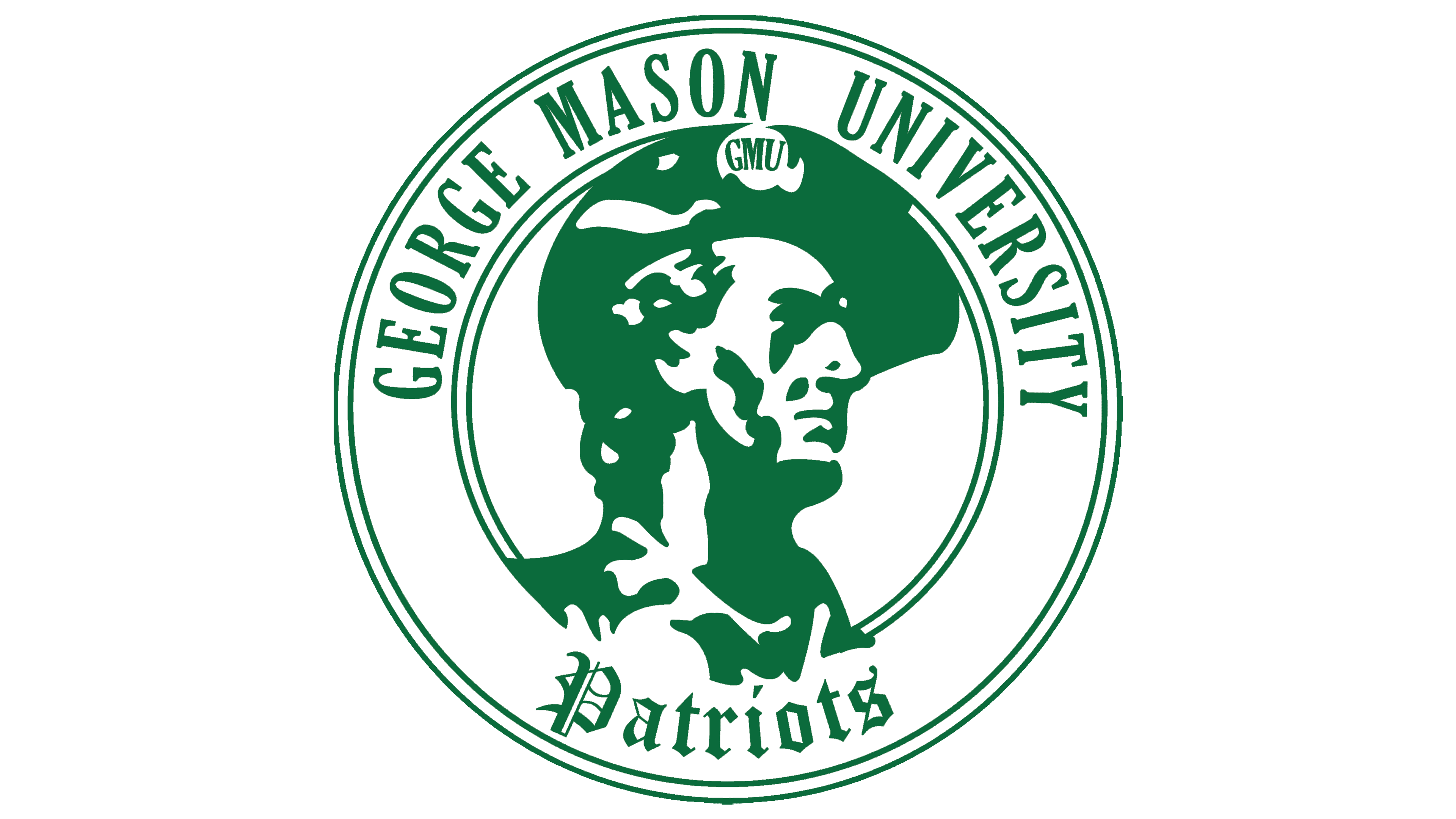
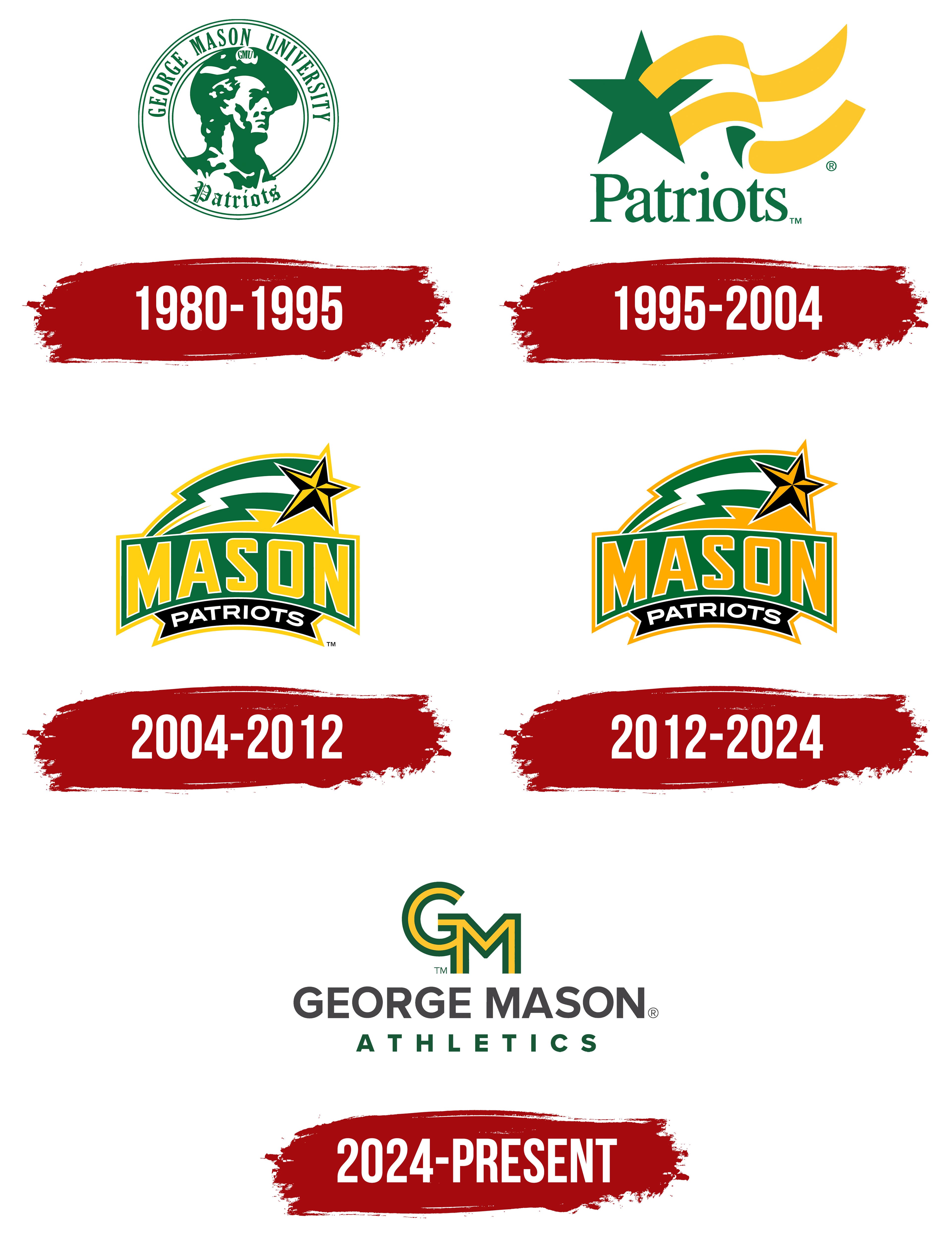
The George Mason Patriots athletic emblem used from 1980 to 1995 depicted a patriot in colonial-era clothing. Its circular frame and arched lettering gave it the appearance of a university seal. The design brought together the institution’s full name, the GMU abbreviation, and the Patriots nickname, which emerged from student life in the 1960s.
The George Mason Patriots represent George Mason University in Fairfax, Virginia. The institution’s name was approved on December 12, 1959, while it was still a college within the University of Virginia. It honored George Mason, author of the 1776 Virginia Declaration of Rights. The Patriots nickname grew out of the expanding college’s search for a distinct athletic name.
The first basketball teams competed as the GM Chargers. In November 1965, the student newspaper The Gunston Ledger announced a naming contest with a $5 prize. Patriots was among the suggestions. In January 1966, the editors explained the name as a commitment to a cause, love of country, and defense of one’s convictions. The basketball team nevertheless played as the Marauders for a time. By November 1968, Patriots was appearing in football coverage, and on December 13, the newspaper used it for the men’s basketball team. From 1969 onward, it appeared regularly in athletic reporting.
The colors were adopted before the shared athletic nickname. In a 1965 student vote, 103 of the college’s 360 students participated and chose green and gold as the official colors. By the following year, the combination appeared in the Advocate yearbook and on baseball uniforms. Voter Ann Walker Sparks later connected the students’ preferences to high school rivalries. Many had attended local schools and opposed adopting the colors of former opponents. Green and gold remained through subsequent logo changes, though their shades varied.
The circular 1980–1995 logo was green and white. The patriot’s head faces right, with GMU on his tricorn hat. Solid green shapes separated by white spaces define his face and clothing. Several thin concentric lines frame the portrait. Tall uppercase serif GEORGE MASON UNIVERSITY lettering follows the upper arc. Patriots fills the lower portion in blackletter, with angular strokes and decorative terminals. The full university name and athletic nickname sit on opposite sides of the portrait.
1995 – 2004
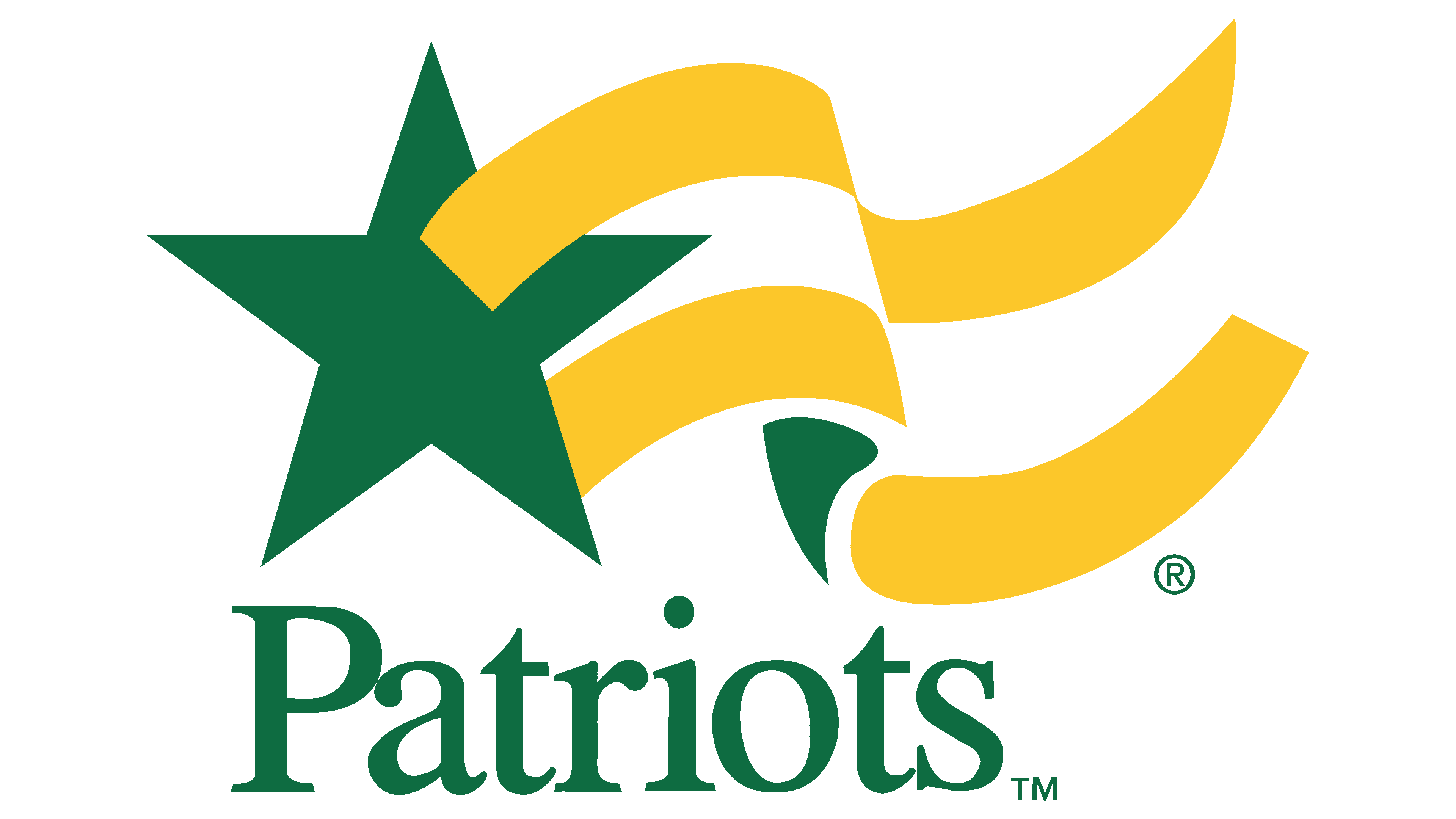
From 1995 to 2004, a star-and-ribbon emblem represented the George Mason Patriots, replacing the circular portrait. The GMU initials and full university name disappeared, leaving only the athletic nickname.
A green five-pointed star occupied the left side. Two gold bands curved to the right, suggesting a flowing banner. Green and gold replaced the earlier green-and-white combination.
Green Patriots lettering appeared beneath the image. A serif typeface with contrasting thick and thin strokes paired an uppercase “P” with lowercase letters. The team nickname preserved a connection to the previous emblem.
2004 – 2012
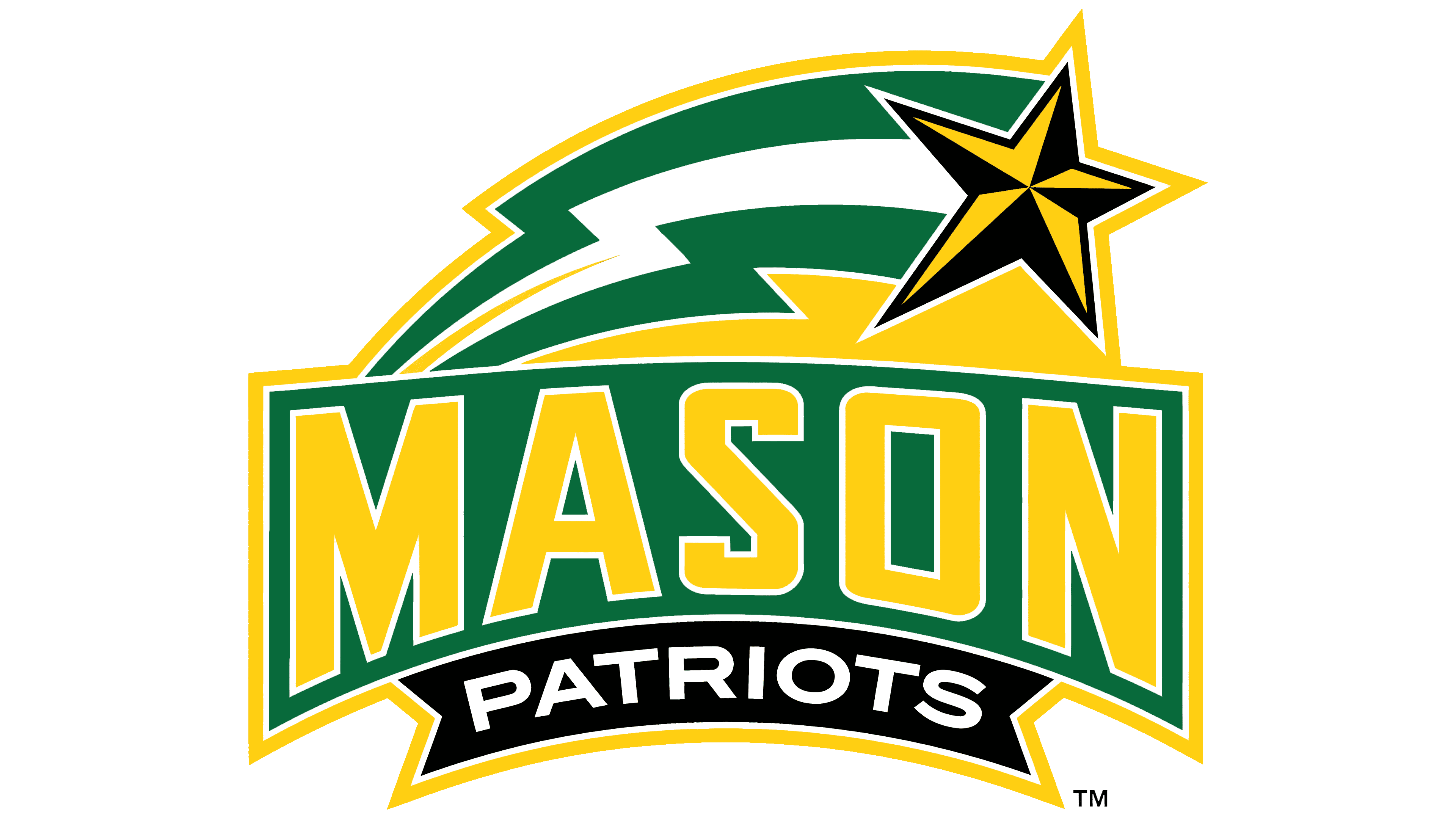
Mason became the focus of the updated athletic emblem in 2004. President Alan Merten had criticized the previous version for identifying the teams only as the Patriots. The university was being confused with other institutions, and its name was frequently misstated. The unveiling cited errors such as George Madison, James Mason, and the abbreviation GW. Large MASON lettering was intended to resolve that confusion while reflecting how students used it. The shortened name was already common in conversation and on apparel.
Merten and vice president for university relations Helen Ackerman began preparations in 2003. Separate committees for the academic and athletic identities included students and faculty. The agency Grafik studied university emblems, conducted interviews, and visited campus. As part of the broader project, it reworked the athletic star while retaining a connection to the earlier design. A separate academic emblem combined an “M” with a stylized quill.
The athletic department announced the update on May 14, 2004, with plans to introduce it by the start of the academic year. In the Star Bolt version used from 2004 to 2012, large MASON lettering spanned nearly the full width of the logo. Gold uppercase sans-serif letters with white outlines sat on a green background. A black ribbon bearing white PATRIOTS lettering ran beneath them. The difference in scale gave the university name priority over the athletic nickname.
The star appeared in the upper right, its points divided into black-and-gold facets. A curved green-and-white trail with sharp bends extended behind it. A shared gold outline connected the upper image to the wordmark.
Star Bolt gained national recognition after the men’s basketball team reached the NCAA Final Four in 2006. Merten later recalled seeing the athletic logo on the front pages of numerous newspapers. After the tournament, the star and curved trail became associated with the university’s basketball success. However, work on the emblem had begun several years earlier.
2012 – 2024
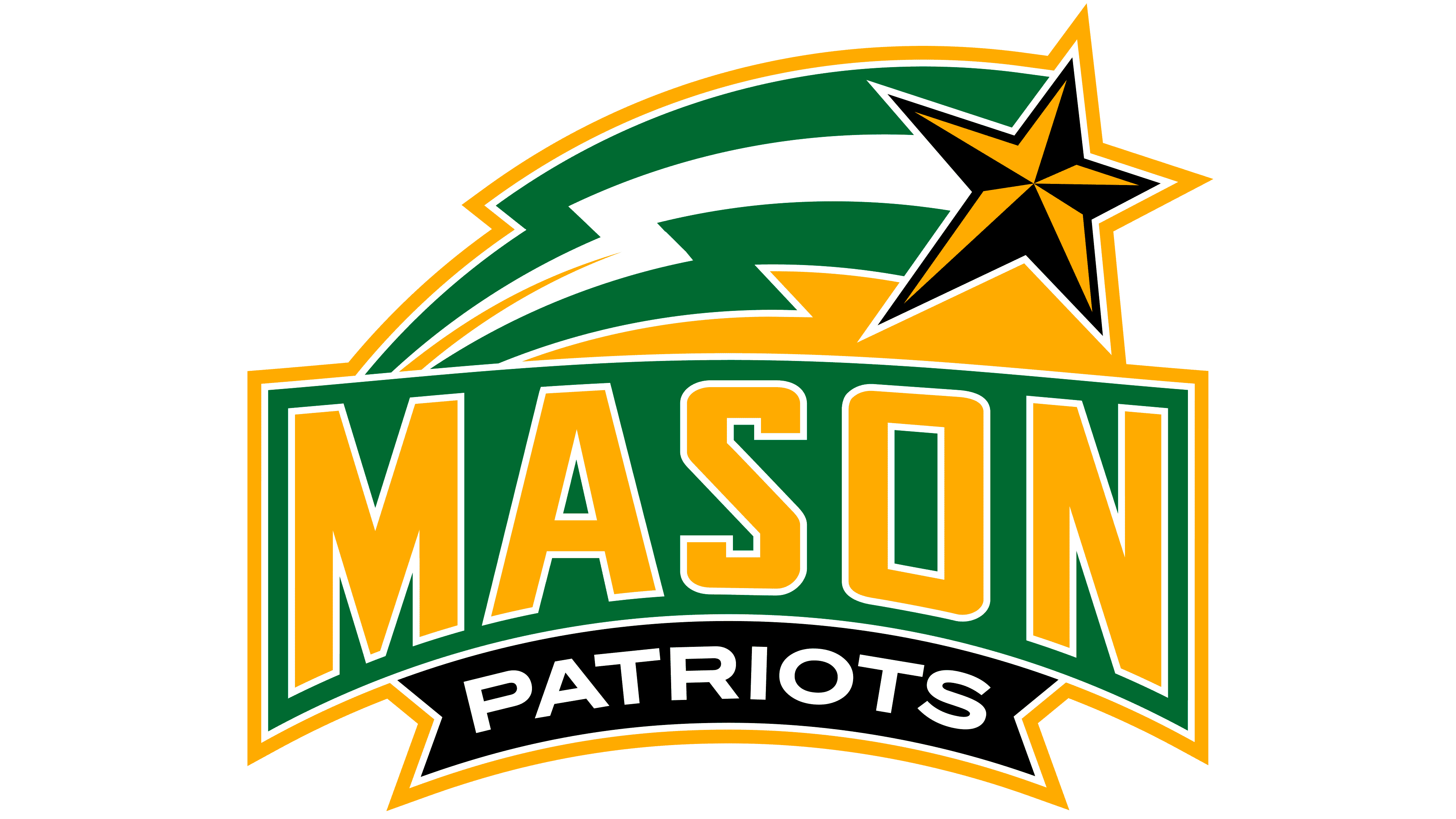
The George Mason Patriots’ Star Bolt received a color update in 2012 while retaining its arrangement. Gold became richer and more orange-toned in the MASON letters, star facets, outer border, and areas beneath the trail. The green background, white dividing lines, black facets, and lower PATRIOTS ribbon remained unchanged.
The primary version stayed in use until 2024. The collection included compact alternatives. One retained MASON and the star with its trail but omitted the lower line. The star and trail could also appear alone. A text-only version read MASON PATRIOTS.
2024 – today
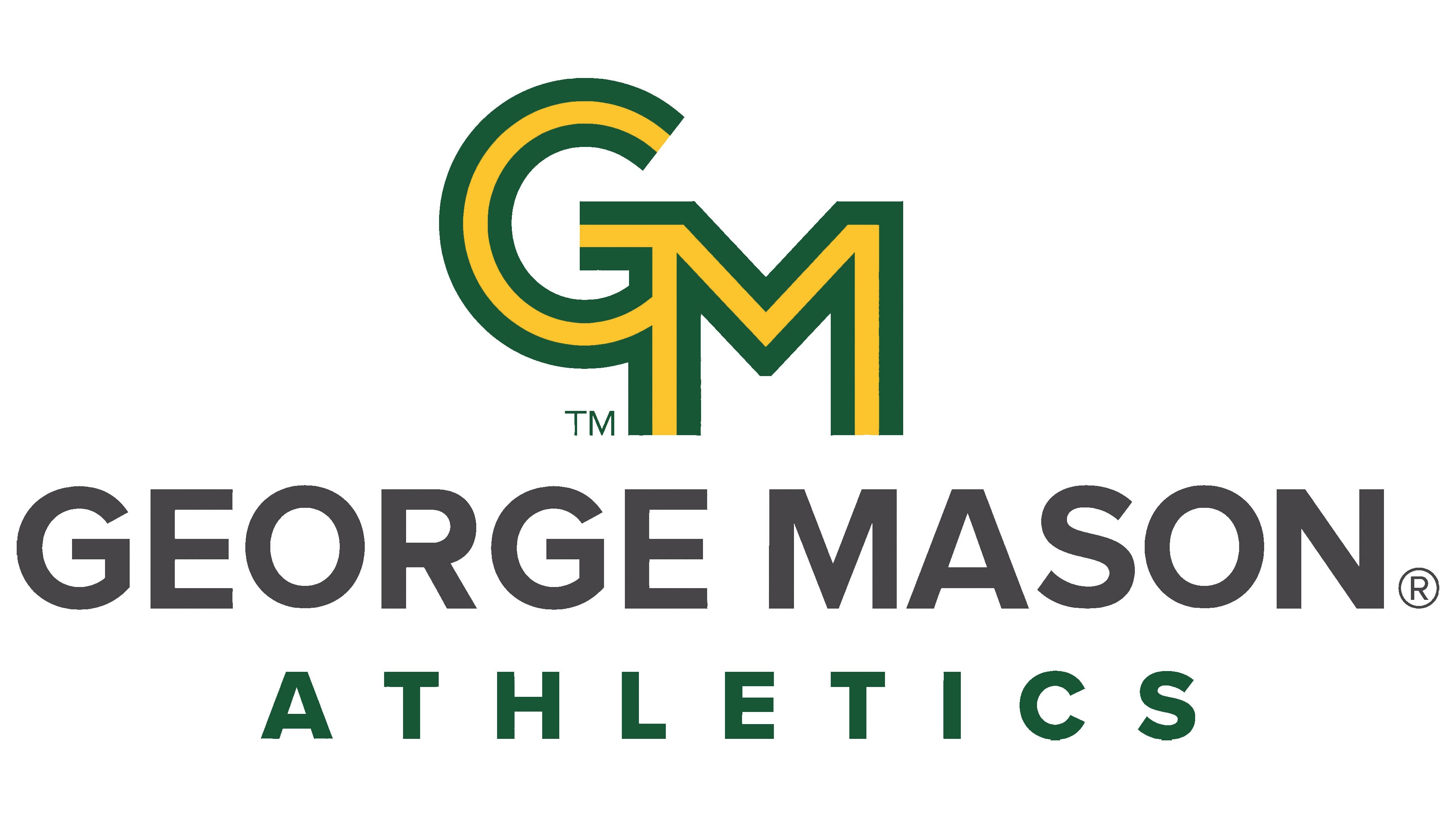
On April 25, 2024, George Mason unveiled a shared logo system for academic units and athletic teams. The rebranding initiative began in 2021, with Ologie and the university’s Office of University Branding developing the identity. Using two separate emblems had made it difficult to coordinate materials, so the university united both areas around a common GM monogram for the first time.
The primary wordmark restored the full George Mason name, familiar to audiences beyond campus. Bold uppercase sans-serif lettering appears beneath the monogram. The athletic version adds a widely spaced ATHLETICS line. The collection includes vertical and horizontal arrangements, sport-specific versions, and a PATRIOTS wordmark.
The monogram interlocks two contrasting letterforms. A rounded “G” occupies the upper left, while an angular “M” sits lower and to the right. A gold band runs through the center of the thick green strokes and remains open at the letter ends. The university interprets these open ends as different paths to enrollment and achievement. The gold space between the green sides represents people from different backgrounds participating in a shared university community.
Pantone 357 C green became the primary athletic color, supported by Pantone 123 C gold, Pantone Black 7 C, and white. Star Bolt moved into the historic marks collection. It may be used for selected events with athletic department approval.