 Getinge Logo PNG
Medical equipment for hospitals includes sterilization systems, operating room devices, and intensive care solutions. Such technologies ensure safety and control of conditions in medical facilities. The Getinge logo represents a company that develops healthcare equipment and systems, including sterilization and critical process support.
In 1904, entrepreneur Olander Larsson founded a manufacturing business in the Swedish town of Getinge that produced agricultural equipment. Three decades later, in 1932, the company began producing sterilizers for medical institutions.
In the 1960s, the company became part of Electrolux, which enabled access to international markets. After Swedish investors Rune Andersson and Carl Bennet bought it out in 1989, Getinge became independent again. During this period, it began a series of acquisitions in the medical technology sector.
In 1993, the company was listed on the Stockholm Stock Exchange. In 2000, Getinge acquired the German company Maquet, known for its surgical innovations and for developing the first motorized operating table.
In 2003, Getinge acquired Jostra and the Siemens LSS division. In 2008, the company entered the cardiovascular surgery market and acquired Datascope and Boston Scientific divisions.
In 2017, the company unified all brands under the single name Getinge. That same year, the company spun off Arjo as an independent entity. In 2023, despite technological challenges, Getinge achieved record financial results and continued integrating new assets.
In 2024, the company focused its strategy on developing innovative therapies and improving the efficiency of medical processes. In September of that year, Getinge acquired Paragonix Technologies.
The company maintained positive momentum. Sales growth reached 4.1 percent, with operating profit increasing to 9.5 percent. It reaffirmed its annual growth forecast and long-term goals to increase profitability and expand its global presence.
Meaning and History
What is Getinge?
A Swedish manufacturer of medical equipment specializing in integrated solutions for healthcare and scientific institutions. The company produces systems for operating rooms, intensive care units, sterilization, and infection control. Its product range includes ventilators, surgical tables, sterilizers, disinfection units, and cardiac-surgery equipment.
1906 – 1900s
Getinge’s history began in 1904 in a small town in southern Sweden. Entrepreneur Olander Larsson opened a manufacturer of agricultural equipment and named it after the town. The Getinge name therefore has a geographic origin. The company entered the medical industry in 1932 when it began producing sterilizers for healthcare facilities. Electrolux took control of Getinge in the 1960s. Rune Andersson and Carl Bennet acquired the company in 1989.
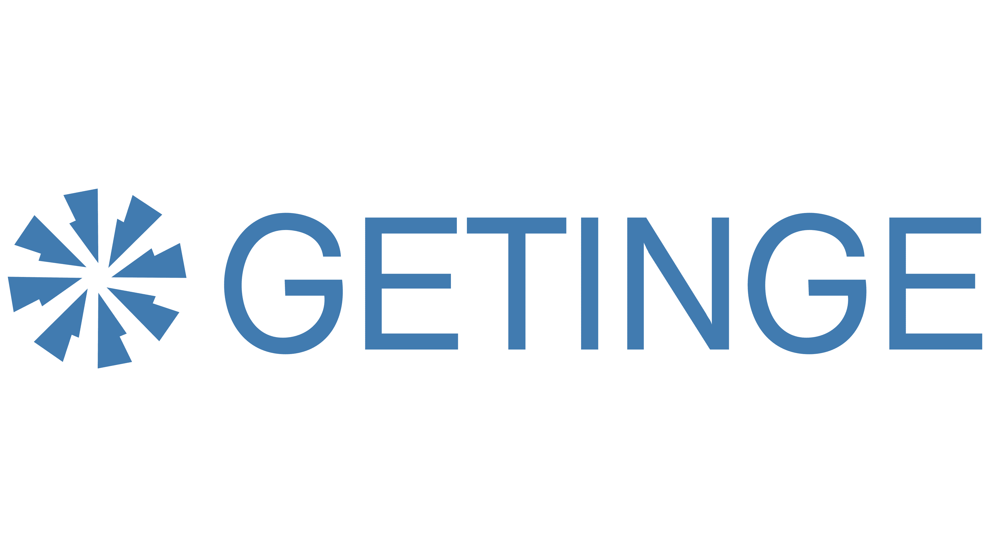
The early Getinge logo combined a large GETINGE wordmark with a radial emblem. The figure appeared on the left, while the name stood on the right. A shared color and formal geometry united both components in a horizontal composition.
The emblem contained 8 elongated wedges meeting at one point. Narrow ends joined in the middle, while expanded outer edges created a multi-ray star. Cutouts along the inner sides made the contour more complex and resembled a technical drawing or medical diagram. Gaps between the wedges kept the components separate, while the radial arrangement gave the figure a dense appearance.
The name used uppercase sans-serif letters. Even lines, consistent stroke thickness, and restrained proportions complemented the emblem’s geometry. The large wordmark occupied most of the logo’s width. A light blue shade close to cobalt united the lettering and symbol. The horizontal format worked across documents, medical equipment, and other Getinge applications.
1900s – 2017
Acquisitions of medical companies expanded Getinge’s structure and created a group with a large brand portfolio. Maquet joined the group in 2000. Getinge acquired Jostra and the Siemens Life Support Systems division in 2003. Getinge later added Datascope, Atrium, and other businesses. Maquet, Lancer, and Atrium operated as independent brands under Getinge.
During the late 20th century and the 2000s, GETINGE formed the foundation of the corporate identity. The logo consisted of the company name. It occupied the leading position and represented the group during an active period of expansion through acquisitions in the medical industry.
The name appeared in large uppercase beige-gray letters. The sans-serif typeface had narrow vertical lines, formal geometric forms, and wide letter spacing. Open space made the long word easier to read, while the large size increased its role in the composition. The letterforms and proportions served as Getinge’s primary visual identifier.
By 2015, management had developed the One Getinge program. The group was transitioning from separate companies to a single corporate model. Maquet, Lancer, Atrium, and other brands remained within the portfolio. At the same time, Getinge gradually became the shared name for the entire organization.
2017 – today
The expansion of the acquired brand portfolio led Getinge to update its corporate system. On March 20, 2017, the group introduced an architecture based on one master brand. Maquet and other company names remained in use for product families, while products gradually transitioned to the shared Getinge logo. The changes developed the One Getinge program and united different operations under the group name.
Sweden’s Paradigm Brand Consultancy developed the project. The agency studied Getinge’s previous identity and competitors’ visual materials before connecting the new system with the promise “Passion for life.” The project included a logo, application guidelines, imagery, brand communication rules, and an internal implementation program. Paradigm created the brand’s appearance and a process for moving divisions into the shared system.
Getinge explained the emblem’s origin on March 21, 2017. The Star of Life, an international medical symbol associated with healthcare professionals, lifesaving work, and emergency care, served as its foundation. The 6 rays represented the group’s areas of expertise united to help patients and improve quality of life. Combining the emblem with the name identified Getinge’s medical specialization and focus on people.
Paradigm constructed the emblem from 3 short angular segments. Their sides form 6 rays that meet at a central point. White gaps separate the sections and retain the Star of Life reference while creating an original construction. Alternating blue surfaces give depth to the flat figure. In the horizontal version, the emblem appears to the right of the name. It completes the composition with a medical symbol.
GETINGE appears in broad uppercase sans-serif letters. The custom characters have straight lines, openings, and slanted terminals. Consistent stroke thickness corresponds with the angular emblem. Rich blue became the identity’s foundation. Paradigm created additional shades and guidelines for their use. The standard logo appeared in blue against light backgrounds and in white against dark ones.