


![]() Electrolux Logo PNG
Electrolux Logo PNG
The Electrolux logo symbolizes the quality and consistency of excellence of the well-known global electrical equipment manufacturer. The company’s graphic image is succinct and legible, demonstrating a commitment to harnessing the achievements of modern technology.
Electrolux traces its roots to 1908, when Swedish salesman Axel Wenner-Gren saw a heavy American vacuum cleaner in Vienna and identified a demand for a lighter household machine. He began selling Elektromekaniska AB units across Europe and became central to the company.
On August 1, 1919, Lux AB and Elektromekaniska AB merged in Stockholm to form Aktiebolaget Elektrolux. Wenner-Gren became president and main shareholder. In 1957, the name was standardized as Electrolux.
In 1921, the company introduced the Lux V, a five-kilogram cylinder vacuum with ski-like runners. It directly competed with Hoover’s upright models. Sales relied on door-to-door demonstrations and installment plans, while offices opened across Europe in Denmark, France, the Netherlands, Switzerland, Belgium, Germany, the UK, and Finland.
In 1923, Electrolux acquired Arctic. By 1925, it had launched an absorption refrigerator based on work by Baltzar von Platen and Carl Munters. The company went public in London in 1928 and in Stockholm in 1930. Washing machines followed in 1951, dishwashers in 1959.
A major shift came in 1967 under Hans Werthen, formerly of Ericsson. Over two decades, the company expanded through acquisitions, including Facit in 1974, Husqvarna in 1976, and Zanussi in 1978.
In 1986, Electrolux acquired White Consolidated Industries, owner of Frigidaire, strengthening its position in the US. By the late 1980s, it had become the largest appliance producer by unit volume.
In 1994, the company acquired AEG Hausgeräte. An attempt to buy Maytag in 2004 was blocked, and the brand later went to Whirlpool. In 2020, Electrolux Professional was spun off. Today, Electrolux sells around 60 million products annually in over 120 countries under the Electrolux, AEG, and Frigidaire brands.
Meaning and History
![]()
Its logo resembled a handwritten name in the first half of the brand’s existence. The font was in italics. However, graphic symbols appeared many years later, in 1962. All subsequent versions were built on its basis with minor changes.
What is Electrolux?
Electrolux is a manufacturer of dishwashers, electric stoves, vacuum cleaners, refrigerators, microwave ovens, and other household appliances. It also produces kitchen equipment for hotels, cafes, and restaurants. The company has been around since 1919 and is based in Sweden. It owns several popular brands, including Zanussi and Frigidaire. The company’s products are known for their stylish design and progressive features.
1919 – 1920
![]()
The very first emblem of the electrical company was a handwritten inscription. The text was cursive, executed in a single stroke, without line breaks; each letter was closely connected to the preceding and subsequent ones. Despite being a handwritten font, it wasn’t italicized: all characters were straight, without slant. Overall, they were individual and thread-like. The background of the name was plain white.
1920 – 1922
![]()
After reorganization, the company underwent a redesign. It shifted from handwritten text to print, as the emblem still consisted of only one inscription: the word “Electrolux.” It was typed in a bold geometric sans-serif font. The characters were in uppercase, lined up in a single row, and placed within a horizontal red rectangle.
1922 – 1924
![]()
In 1922, the old logo design was restored. The name was once again written in a handwritten font, but now italicized, slanted to the right. The letters were adorned with ornate elements, such as curved and elongated lines. For instance, they appeared on the letters “E,” “t,” and “x.” Such an addition made the emblem exceptionally delicate and light. The inscription used lowercase letters and one capital (the first, according to grammar). The word was colored yellow, the background blue.
1924 – 1926
![]()
This year, the emblem received its first graphic element. It was a circle with three even stripes. It featured the electrical company’s name in uppercase. The letters were thin and grotesque. The ring covered only part of them, while the rest were placed to the left (“ele”) and right (“lux”) of it. This resulted in the circle’s diameter starting with “c” and ending with “o.” The inscription was slightly raised at the edges, resembling a semicircle.
1926 – 1928
![]()
Again, an attempt was made to switch to italic text, but not handwritten this time, but printed. The word “Electrolux” became bold for the first time and received classic serifs. The elongated red rectangle from the 1920s was brought back as a background.
1928 – 1934
![]()
In 1960, designers offered a new vision for the logo. They added a globe pattern with a thin black line along the edge, followed by a wide white one. In the center, an arc covered the word “Electro.” After the transfer from the upper line, the second part of the name was written in lowercase: “lux.” The background for it was a semicircle from which sharp rays diverged in different directions. The letter “E” was so wide that it covered two rows. The upper part of the emblem contained a map of the planet, drawn with parallels and meridians, while the lower part was black.
1934 – 1939
![]()
In 1934, designers used full-fledged graphics, a stylized image of a potential buyer carrying a vacuum cleaner of this brand. The figure was drawn sideways, showing that the person was moving from right to left. On it, the name “Electrolux” was written in italics in the style of the debut logo but with a more legible inscription. All elements were silver, outlined and encircled by a thin line that formed a blue circle.
1939 – 1941
![]()
Developers removed the buyer from the logo and expanded the circle’s borders, creating a rectangle with convex top and bottom edges. The company’s name was read and typed in serif letters. The letters and frame were white, and the background was blue.
1941 – 1947
![]()
An attempt to stylize the logo resulted in a mirrored script effect. This is explained by the fact that, unlike the previous emblem, the background and text colors were swapped: the letters became blue, and the background became light. However, there was also an opposite variant. Moreover, designers chose the brand name font used in 1922. But they still trimmed the ornate lines to get a practical version of the logo.
1947 – 1954
![]()
In 1947, experiments began with handwritten identity. First, designers focused on calligraphic branded italics with clearly delineated letters. Almost all symbols were disconnected and stood on their own. The only exception was the syllables “lec” and “lux,” which had an inter-letter connection. The letters “t” and “l” had pointed tops.
1954 – 1957
![]()
The script became rounded: each letter became streamlined, with the same curved connection at the bottom, resembling a calligraphic font. Despite being handwritten, the signs were held upright. Additionally, developers used a branded uppercase “E” rather than a lowercase “e”.
1957 – 1962
![]()
The emblem creators straightened the inter-letter connections so that the written symbols resembled a single line. Additionally, they returned the italic to the emblem, placing the red inscription in a yellow elongated horizontal oval.
1962 – 1990
![]()
This emblem was based on a combination of graphics and inscriptions. Then, the company acquired a name vaguely reminiscent of a side triangle with open corners. Two of its sides were lunated, one straight. The dark figure was located within a white circle inside a black square. Below it was the name of the electrical company, written in a thin font.
1990 – 2015
![]()
That year, the household appliance manufacturer received a new trademark. Designers based it on the previous version, swapping elements and adjusting their scales. Since then, the geometric figure has become smaller and has been placed before the word “Electrolux.” The font was enlarged, and serifs were added.
2015 – today
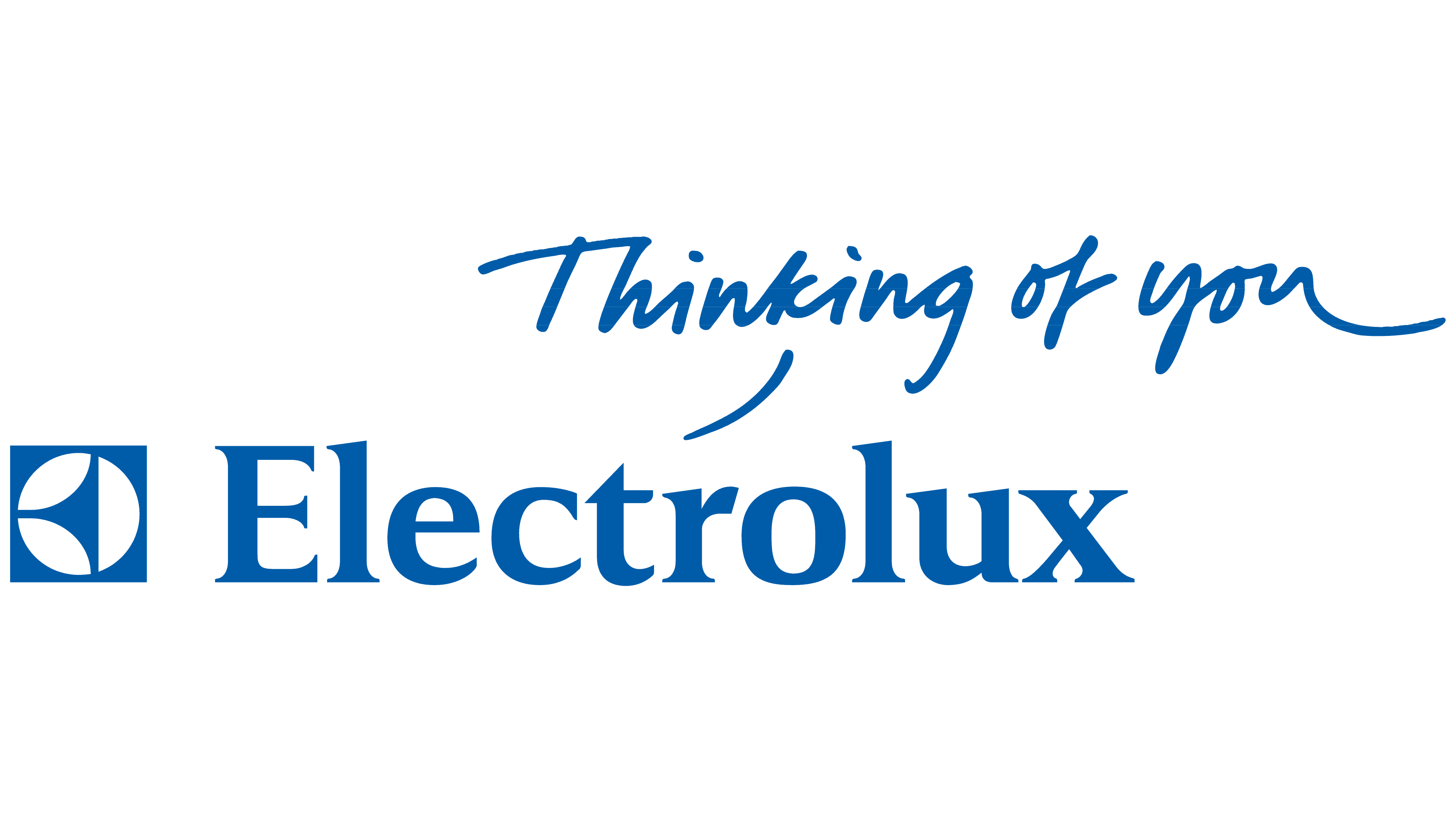
![]()
After the 2015 redesign, the company began using a more modern logo: succinct, simple, and easily legible. Specialists from Prophet’s London office undertook this. They removed the slogan “Thinking of you” and changed the color.
Font and Colors

Throughout its history, Electrolux has had numerous emblems. Initially, they consisted exclusively of text. Then, a graphic icon was added, but it did not last long because the company decided to emphasize the simplicity and accessibility of its products for consumers. For this, it chose a logo with the name. It is located on one line and executed with separate printed letters. “E” is rounded at the bottom left, and the “t” has a third of its lower part and half of its upper segment cut off. To the left is a miniature icon, a technical symbol of the manufacturer.
The trademark’s brand style is clear geometry, present in all versions of the logo; changes mainly concerned the word part. Initially, the word was set in the Pantone Combination System font, then replaced with Electrolux Sans. Branding is now presented in three variants: regular, light, and bold. The predominant colors are white and black (at first) and white and blue (now).