


![]() Ghostbusters Logo PNG
Ghostbusters Logo PNG
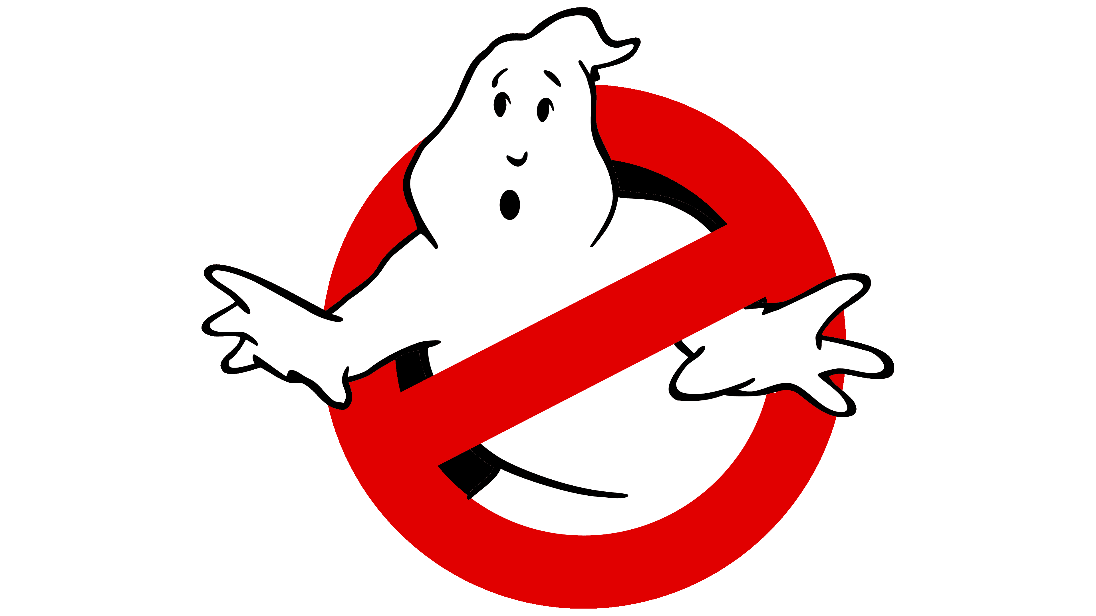
For monsters and ghosts, the passage is closed, and it says the Ghostbusters logo. The emblem promises that all otherworldly creatures will be caught and safely locked away. There is no place for the abnormal and frightening in people’s lives, and the sign speaks ambiguously about this.
Ghostbusters began with an idea from actor and comedian Dan Aykroyd, inspired by his interest in paranormal stories and occult research. In the early 1980s, he developed a screenplay about ghost hunters working across dimensions. After the death of his friend John Belushi in 1982, Aykroyd and Harold Ramis reworked the concept into a more grounded comedy set in New York.
Director Ivan Reitman joined the project, while Bill Murray, Aykroyd, and Ramis played the central trio of paranormal investigators. Sigourney Weaver and Rick Moranis completed the main cast. Filming started in 1983, combining comedy with large-scale visual effects unusual for the period. Released on June 8, 1984, the film earned more than $290 million worldwide from a $30 million budget.
The success quickly expanded into a media franchise. The Real Ghostbusters premiered in 1986 and ran until 1991, followed by Ghostbusters II in 1989. During the 1990s and 2000s, the brand continued through comics, video games, and the animated series Extreme Ghostbusters. Many fans later treated Ghostbusters: The Video Game from 2009 as an unofficial third movie because it reunited the original cast.
A reboot with an all-female cast arrived in 2016, reigniting debate around the franchise. In 2021, Ghostbusters: Afterlife continued the original storyline under the direction of Jason Reitman, Ivan Reitman’s son. The ghost-in-a-red-sign logo and the slogan “Who you gonna call?” remained central to the franchise’s identity across films, toys, clothing, comics, and theme park attractions.
Meaning and History
![]()
Viewers remembered the first film for its expensive special effects, timeless single, and classic No-Ghost emblem. The iconic icon deserves special attention because it mocks ghosts and teaches you to treat them as mundane, even though they look intimidating in Ghostbusters episodes. A cute graphic makes up for the frenzy. Moreover, it was used on posters and in the comedy as the main characters’ business logo.
This emblem was invented by the original scriptwriter, Dan Aykroyd. He worked on the project for several years, inspired by an article on parapsychology and quantum physics. Dan originally wanted to star in the film with his friend John Belushi, but he didn’t live to see filming. The story was later completely redone to become the world-famous Ghostbusters.
The script described the logo in just a few phrases, and the art director, Michael C. Gross, had to elaborate on it. He worked with his colleagues from the art department to work through several unfortunate concepts. As a result, Gross only slightly changed the ghost’s shape, then turned to the artist Brent Boates, a consultant on the design of otherworldly creatures, for help. Brent immediately proposed the final version.
Now, the No-Ghost symbol is the most recognizable element of the media franchise. He hardly changed after the release of the following films.
What is Ghostbusters?
Ghostbusters is a fantastic comedy about supernatural beings, events, and phenomena. It first appeared in 1984 and was directed by Ivan Reitman. Harold Ramis and Dan Aykroyd wrote the film.
1984 – today
![]()
1984
![]()
Initially, it was assumed that the logo would be used only in the Ghostbusters plot; that is, viewers would see it on the main characters’ special uniforms and on the side of the Ecto-1 car. But by the time the first teaser was needed, Columbia did not have the rights to the film’s title: the Ghostbusters brand belonged to an unpopular TV show. To avoid leaving the poster empty, the developers decided to depict the final emblem, which was intended to decorate the main characters’ scenery, costumes, and props.
The comedy creators were so eager to avoid legal problems and find a temporary replacement for the film’s title that they overlooked an important detail. As it turned out, the ghost in the logo looked a lot like Fatso from the Casper cartoon. The art department did not take this seriously because no one imagined the symbol would be used in an advertising campaign. As a result, the Columbia studio was sued by Harvey Comics. The court sided with the film crew because the copyright in the characters had expired with the publisher, Casper.
This is how No-Ghost became the film’s logo and appeared in its title: a ghost trapped inside a prohibition sign replaced the letter “O” in the word “GHOSTBUSTERS.” The designers have blacked out the lettering and opted for an elegant sans-serif typeface.
1989
![]()
2016
![]()
In 2016, the third film, Ghostbusters, was released and was unrelated to the plots of the first two. Its creators tried to preserve the original symbol, only making it three-dimensional using a gradient and white reflections. The prohibition sign has a silvery border, and the inscription has wide gray shadows. At the same time, the letters themselves turned white, and the spacing between them decreased significantly.
The logo’s creators were inspired by the universal prohibition sign, which features a red ring and a diagonal line of the same color. The International Organization for Standardization developed this symbol. However, the designers of the Ghostbusters logo did not use the original version with a stripe that goes from the lower-left corner to the upper-right corner; instead, they used a mirrored, inverted version. The “correct” mark only appears on film posters in Europe.
Inside the circle, a cartoon ghost is depicted. His name is Mooglie. Dan Aykroyd (the idea’s author and performer of one of the main roles) and Ivan Reitman (the director and producer) gave him this nickname.
2021
![]()
2024
![]()
Font and Colors
Ghost Busters logo
The emblem is used in the wordmark instead of the letter “O.” The rest of the lettering is set in a custom short-serif typeface. Regarding the color scheme, the prohibition sign is always red, and the ghost is white. Only the color of the word “GHOSTBUSTERS” is different. At first, the film’s title was black, but the designers made it the same white as Mooglie, with gray shadows along the edges.
FAQ
Can I use the Ghostbusters logo?
The logo is a registered trademark owned by Sony Pictures. It is a creative work of art and a trademarked image that Sony Pictures uses to brand its products and media. It is protected by copyright and trademark laws designed to prevent unauthorized use that could confuse consumers or dilute the brand’s value.
Unauthorized use of the logo, especially if it implies affiliation or endorsement by Sony Pictures, may result in legal action. The logo can be used in some contexts under the fair use doctrine of copyright law for academic or journalistic purposes when discussing the brand or criticizing its marketing. Permission must be obtained directly from Sony Pictures for commercial use or business activity.
What does the Ghostbusters symbol mean?
The logo is simple and features a ghost in a red circle with a slash, the universal sign of prohibition. This logo is a brand identifier with a deeper symbolic meaning related to the series’ themes.
The logo design uses the prohibition symbol to indicate that ghosts are prohibited. A prohibition sign above a frightened ghost shows that the Ghostbusters are in control. A safety sign suggests that the Ghostbusters protect the everyday world from supernatural influences.
The logo skillfully embodies the entire series concept: ordinary people solve unusual supernatural problems. It promises action, humor, and a touch of creepiness to match the film’s tone and content. The ghost within the logo, with its cartoonish, non-threatening appearance, suggests the film’s comedic approach to ghost hunting.
What is the name of the ghost in the Ghostbusters logo?
Director Ivan Reitman and screenwriter Dan Aykroyd named the ghost in the iconic logo “Moogly.” Although Moogly is not a film character, his playful and distinctive design is key to the brand’s identity.
Moogly is a white ghost with a mischievous, slightly scared expression, depicted within a red prohibition symbol. The cartoonish appearance lends a whimsical, approachable feel to the franchise. It represents the supernatural elements that the team seeks to control. The friendly design of the ghost softens the potentially frightening aspect of the supernatural, in keeping with the film’s comedic, light-hearted spirit. It has become a symbol of the brand and is recognized worldwide. The logo is used on merchandise, promotional materials, and fan art, further cementing its place in popular culture.
Who created the Ghostbusters logo?
Michael Gross, a talented graphic designer, created the logo. Gross is known for his parody illustrations for National Lampoon magazine, where his sharp wit and clever visual style earned him recognition in the industry.
The logo design needed to be instantly recognizable and combine supernatural themes with comedy. Gross used the universal “no” symbol and added humor by placing a cartoon ghost behind it. The final design featured a chubby, scared ghost peeking from behind a red prohibition sign, conveying the franchise’s ghost-catching theme and comedic tone. Since its creation, the logo has become a cultural icon recognized worldwide.