 Ghostemane Logo PNG
The Ghostemane logo is a stylized esoteric symbol of Monas Hieroglyphica. The original sign was created by John Dee, a British astrologer, alchemist, and mathematician born in 1527. He developed the glyph from lines, arcs, and circles, and the contemporary rapper used this composition as the basis for his emblem.
Eric Whitney was born on April 15, 1991, in Lake Worth, Florida, and grew up in West Palm Beach. His parents had moved from New York a year before his birth. As a teenager, he played football, studied well, and became involved in hardcore punk. After his father died when Whitney was 17, music took a larger place in his life.
Whitney played in Florida bands Nemesis and Seven Serpents. During Nemesis rehearsals, another member introduced him to Memphis rap, with Three 6 Mafia as a key reference. Rap gave him control over writing and production in a way band work did not. After earning a degree in astrophysics, he worked in B2B sales while continuing to record music. In 2014, as Ill Biz, he released Blunts n Brass Monkey and Taboo, the latter of which was influenced by Marilyn Manson and Nine Inch Nails.
In 2015, Whitney moved to Los Angeles, left his job, and focused on music. He met JGRXXN and joined Schemaposse, alongside Craig Xen and Lil Peep, before leaving in April 2016. That year, he released Blackmage and the video for “John Dee.” His single “Andromeda” later passed 50 million video views. At the same time, Plagues and Rituals placed Ghostemane near $uicideboy$ and Bones in the SoundCloud underground.
In 2017, TRASH GANG made the animated video for “Mercury Retrograde,” which passed 278 million views. That year, he released “1000 Rounds” with Pouya and the album Hexada. On October 10, 2018, Ghostemane released N/O/I/S/E through Blackmage Records, drawing on industrial and nu-metal influences. In 2020, ANTI-ICON became his eighth full-length album in five years.
Meaning and History
Eric Whitney adopted the pseudonym Ghostemane in 2014 when he was 23 years old. When he started this project, he simply wanted to earn money to pay bills and travel. However, success didn’t come to the rapper right away. At one point, he even threw away all his recorded CDs, disappointed in his abilities. Collaborations with other artists, such as $uicideBoy$, Pouya, and Schemaposse, helped him rise to fame.
Ghostemane seamlessly combines rap and rock in his songs. His work is very depressing and contains references to mystical practices. The artist’s lyrics reflect insecurity and anxiety, which may have been influenced by events from his childhood: a tyrannical, disabled father, poverty, and a lack of friends. When Eric got a little older, he quit his tiresome office job and turned to spirituality.
Whitney admits that astrophysics is the foundation of everything for him. It is possible that this influenced the choice of the main Ghostemane logo, which takes the form of the esoteric symbol Monas Hieroglyphica, as the original hieroglyph symbolizes the unity of the Cosmos. All other emblems are simply gloomy inscriptions styled in different ways.
What is Ghostemane?
Ghostemane and Eric Ghoste are pseudonyms of an American rapper and songwriter whose real name is Eric Whitney. Born and raised in Florida, he began his music career there. However, the online platform SoundCloud brought him particular fame, making a significant part of his fan base listeners from Eastern Europe. In addition, Ghostemane gained popularity through his viral music videos, which featured a dark atmosphere reminiscent of horror short films.
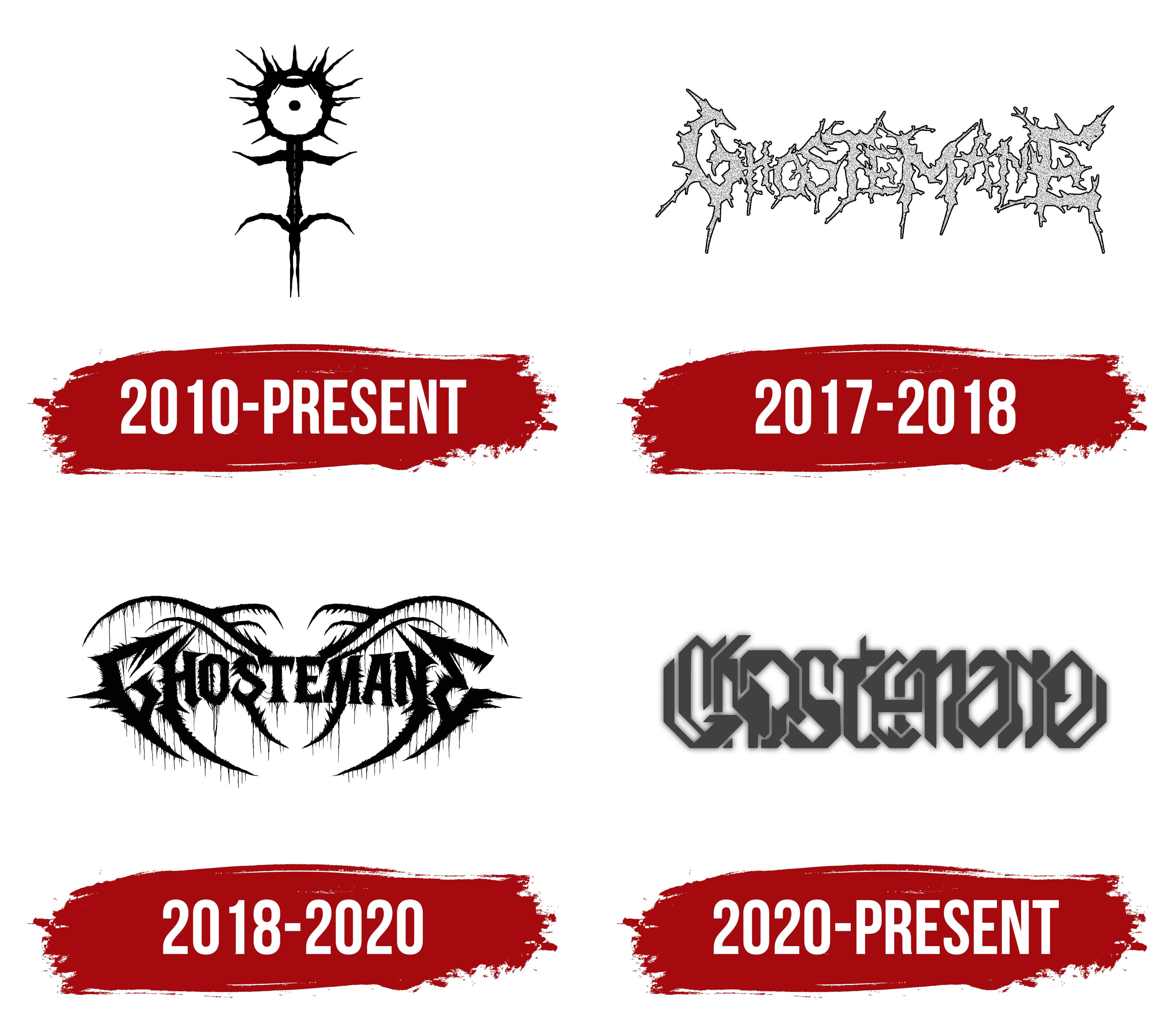
2010 – today
The rapper’s main logo resembles a human silhouette. It has a round head that resembles an eye because of the point at its center, an unevenly thick body, arms spread to the sides, and two pairs of legs, one at the bottom and the other on the sides. The head looks like a white circle outlined by a wide black stripe, with sharp, long spikes. At the top, there is a stylized crown. Like all other elements, it is colored in deep black. On the emblem on the album cover of Blackmage (2016), the album’s title is written in thin white vertical lettering against the background. The letters are stacked on top of each other.
This symbol is based on the Monas Hieroglyphica glyph, about which its creator, John Dee, wrote an entire treatise in 1564. It is known that the original is associated with esotericism and represents the unity of the Cosmos: the connection between the moon, sun, elements, and fire. At least, that is the interpretation Dee gave in his book. However, he did not provide details on each part of the emblem, saying only that he could explain everything in a personal meeting. This means the full meaning of Monas Hieroglyphica remains unknown. But this did not prevent Ghostemane from using it as inspiration for the logo, as the rapper adheres to the religious-philosophical system known as “thelema” and loves all things mystical.
2017 – 2018
The cover of the studio album Plagues (2016) featured the pseudonym Eric Whitney, designed in an individual style. All the letters were uppercase, uneven, and connected. From them, protrusions went in different directions, resembling spikes or short branches.
2018 – 2020
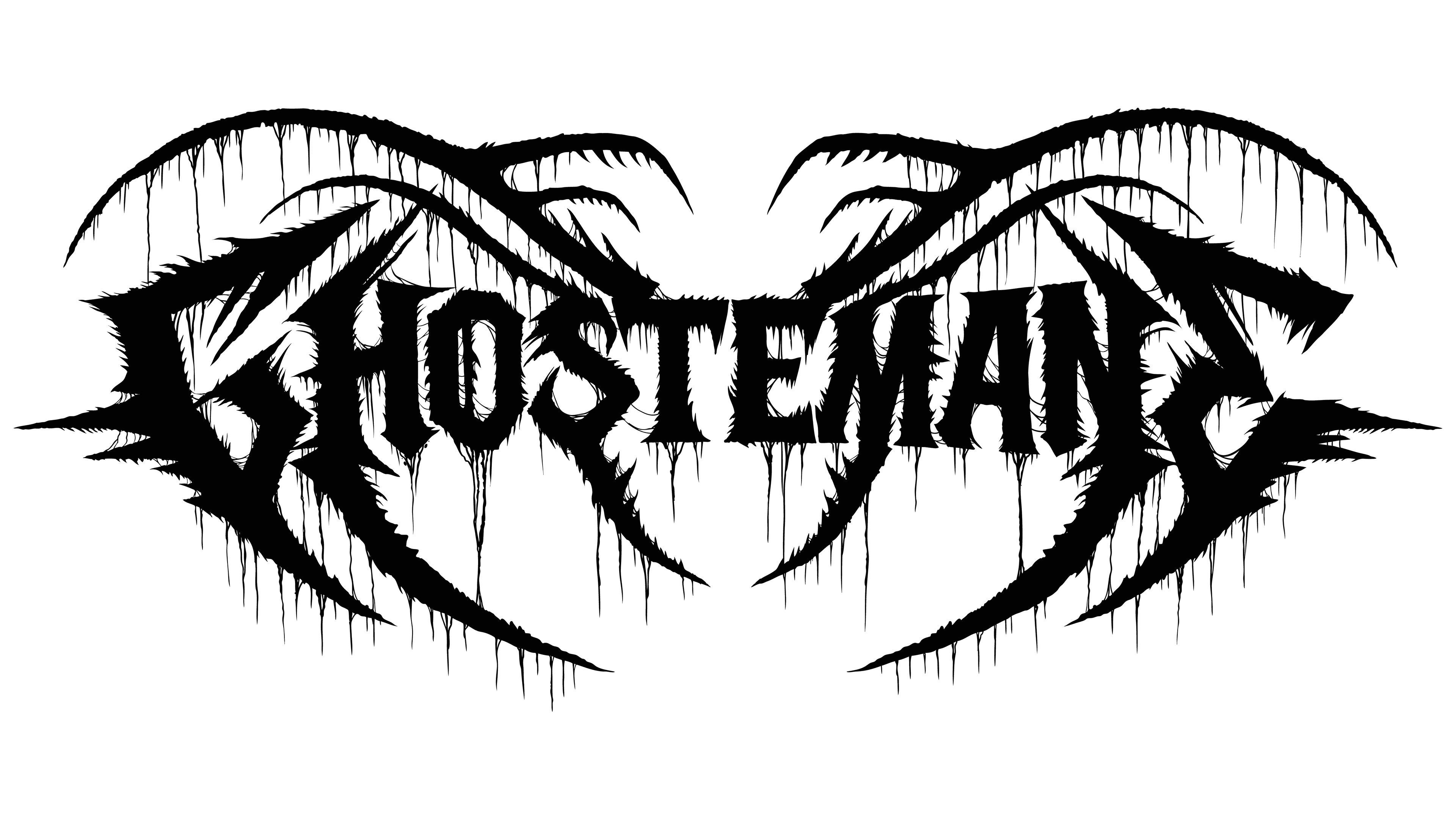
The release of the N / O / I / S / E album (2018) was accompanied by the introduction of a new logo design. The word “GHOSTEMANE” was written in black letters, from which long strips with sharp ends stretched. The pattern was symmetrical: on the right and left, it was mirrored. In this case, the protrusions resembled lianas or huge insect claws.
2020 – today
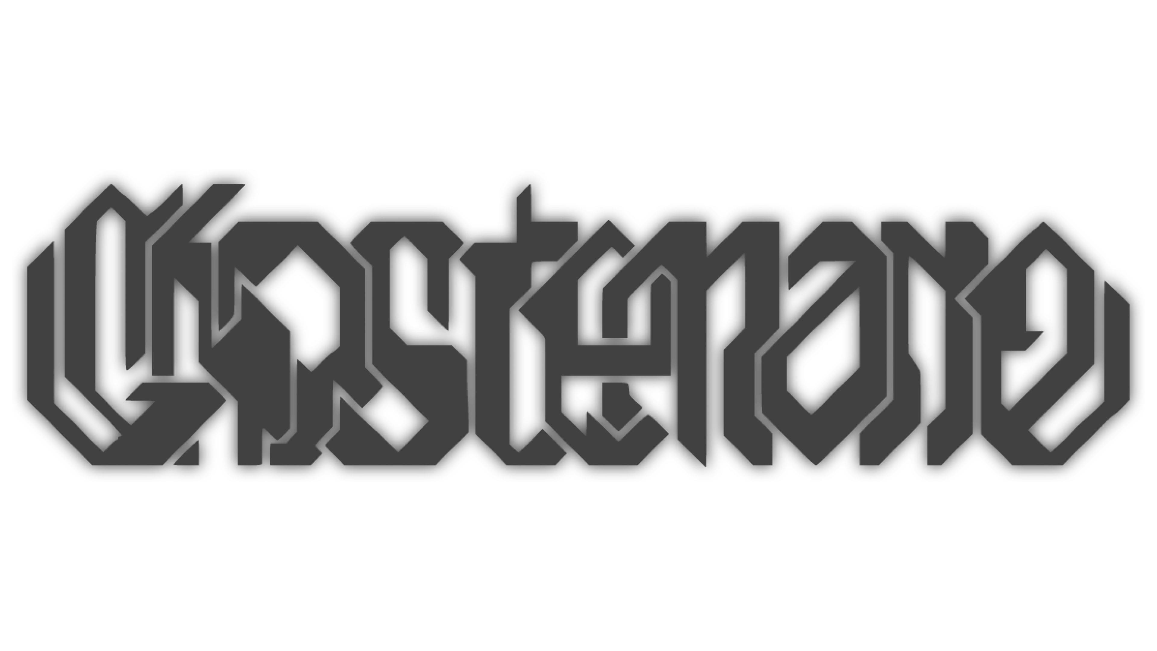
The inscription became dark gray and extremely illegible. Now the letters not only connect, they intricately intertwine and bend, forming one large horizontal monogram. The thin light outlines prevent the lines from merging.
Since the Ghostemane emblem originates from the medieval esoteric symbol Monas Hieroglyphica, it has a similar meaning. What looks like a crown on the head is actually an inverted moon. The ring with a dot in the center is none other than the sun. The central cross formed by the torso, arms, and vertically arranged legs represents elements mentioned in John Dee’s book, the creator of the Monas Hieroglyphica symbol. The two arcs at the bottom symbolize fire. The combination of all components shows the unity of the Cosmos, which has proved a suitable metaphor for the rapper, who is passionate about astrophysics, philosophy, and occultism.
Font and Colors
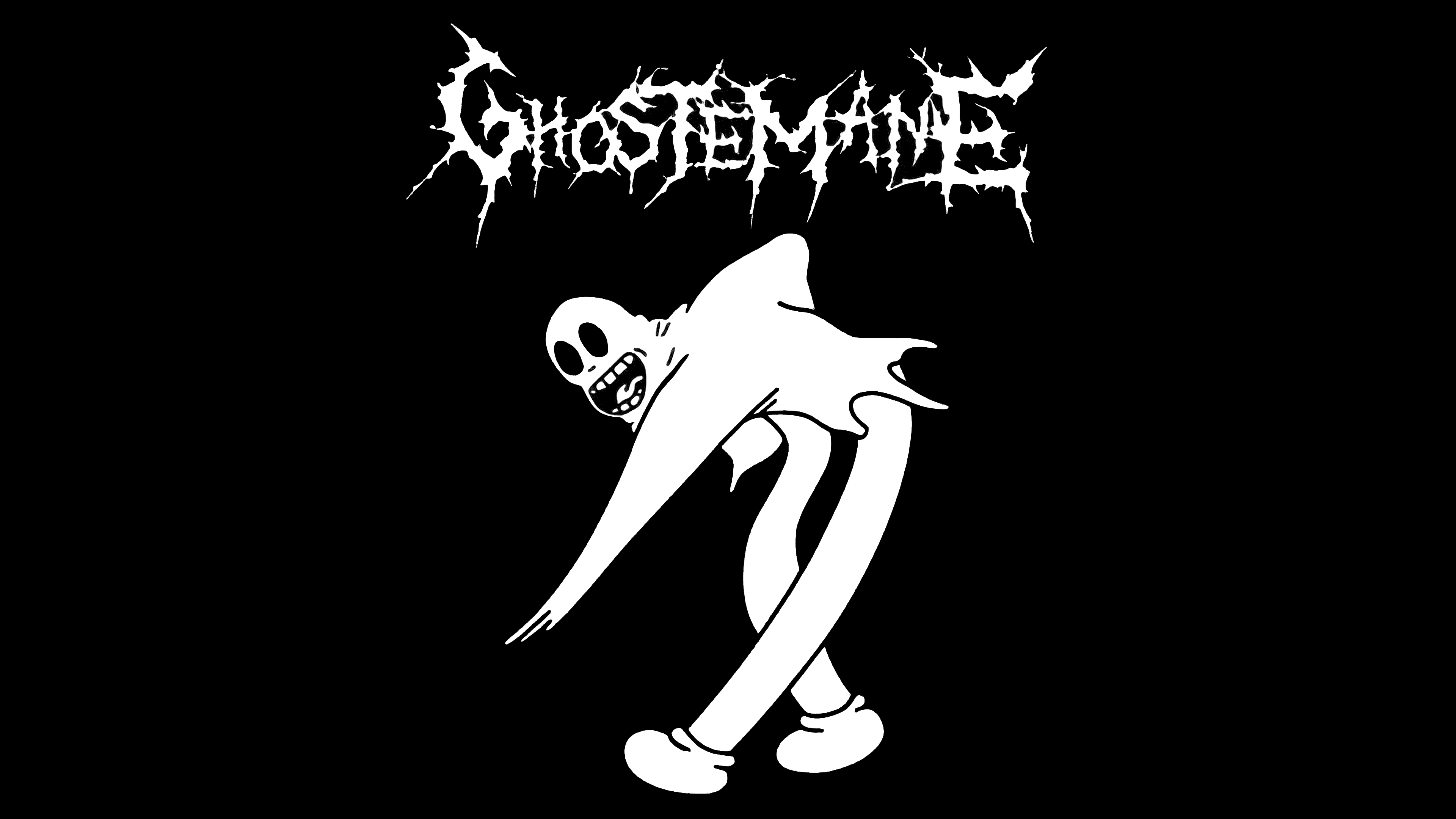
Throughout the history of this project, Ghostemane’s logos have used whimsical fonts with individual designs. Thin elongated letters from the Blackmage album cover, gloomy inscriptions with spikes, or futuristic glyphs of illegible shape- all versions correspond to Eric Whitney’s depressive-mystical creativity. The color scheme of the emblems is limited to black, gray, and white.