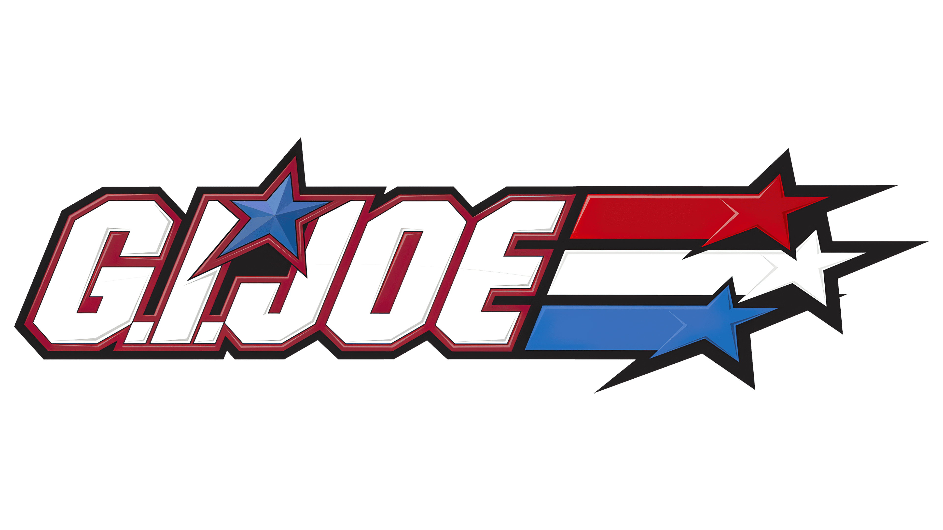
![]() GI Joe Logo PNG
GI Joe Logo PNG
The dynamic logo of GI Joe reflects the active events that unfold in the eponymous franchise. The essence of the military sci-fi theme is represented in movies, toys, comics, video games, and series. Peak energy intensity is conveyed through most elements: every glyph and every line reflect maximum tension.
Meaning and History
![]()
Work on the franchise began long before the plans to create the film series. The starting point was children’s toys – soldiers from America’s Movable Fighting Man series, first introduced by Donald Levine. Hasbro began producing miniature figures in 1964, which included soldiers from the main branches of the military. The toys became so popular that they were inducted into several Halls of Fame in 2004 at the National Toy Hall of Fame at The Strong (New York) and in 2019 at the Pop Culture Hall.
Work on the films of the GI Joe universe began much later in 2003. However, for various reasons, the project was postponed and resumed closer to 2009. The franchise’s logo remains the same so that it can be seen in movies, comics, and toys. Each time a new film is released, the logo changes, retaining the main detail, the name. All emblems also feature internal dynamics, peak tension, and high authority. These qualities are manifested in the style, speed lines, and color palette.
What is GI Joe?
GI Joe is an American military sci-fi media franchise. It covers several directions, including movies, toys, cartoons, comics, video games, and a series. The franchise began with a film directed by Stephen Sommers, released in 2009. However, it is based on the action figures of soldiers children’s toys produced by Hasbro since 1964. The creator of the image is Donald Levine.
1964 – 1976
![]()
The GI Joe emblem consisted of a name stylized as a stencil inscription like the ones usually used to mark boxes with military supplies. This style was chosen intentionally, as the logo was related to the set of toy soldiers that gave the franchise its name. The fact is that such movable dolls were innovative and caused a real boom, as their arms and legs could be easily bent, and there were many accessories and clothes. Each box with soldiers was marked with a red stencil-style inscription.
The name featured in the logo is a general designation for an American soldier and their equipment and basic items. It originated a long time ago and stems from the G.I. code, where this abbreviation stands for several terms:
- Government Issue;
- General Issue;
- Ground Infantry.
Furthermore, during World War I, this stamp marked everything made of galvanized iron. However, the emblem’s main feature was different: a soldier’s head was used instead of the dot over “j.” The letter itself was much lower than the others and extended beyond the general boundary. The glyphs were elongated and smooth, without serifs.
1982 – 2005
![]()
The logo featured a different design with a star and a tri-color flag stylized as a speedline. The broad lines were positioned behind the franchise’s name, adding visual dynamism. The internal energy was especially concentrated in lines of varying lengths, in italics, and in the slightly tilted star. The emblem’s theme remained the same: militaristic, strict, and businesslike.
The new logo’s base font was different. It was more brutal and military, as evidenced by block letters with cut-off corners. Instead of the soldier’s head, a blue five-pointed star appeared, replacing the dot over “j.” To make the elements distinct, the designers used a dark background and a black horizontal rectangle. The dots in the abbreviation “G.I.” were inconspicuous, creating the impression that the inscription consisted of one part instead of two.
2005 – 2020
![]()
The logo was redesigned. It adopted the style of superhero emblems from American comics. The merged inscription “GIJOE” was complemented by a left-leaning slant. The dots in the abbreviation became even smaller, and the letters were wider. Designers separated the star from the name, so it went beyond the rectangle with rounded corners. The letters were colored in silver with a bronze hue. The text was within a thin frame on a black background.
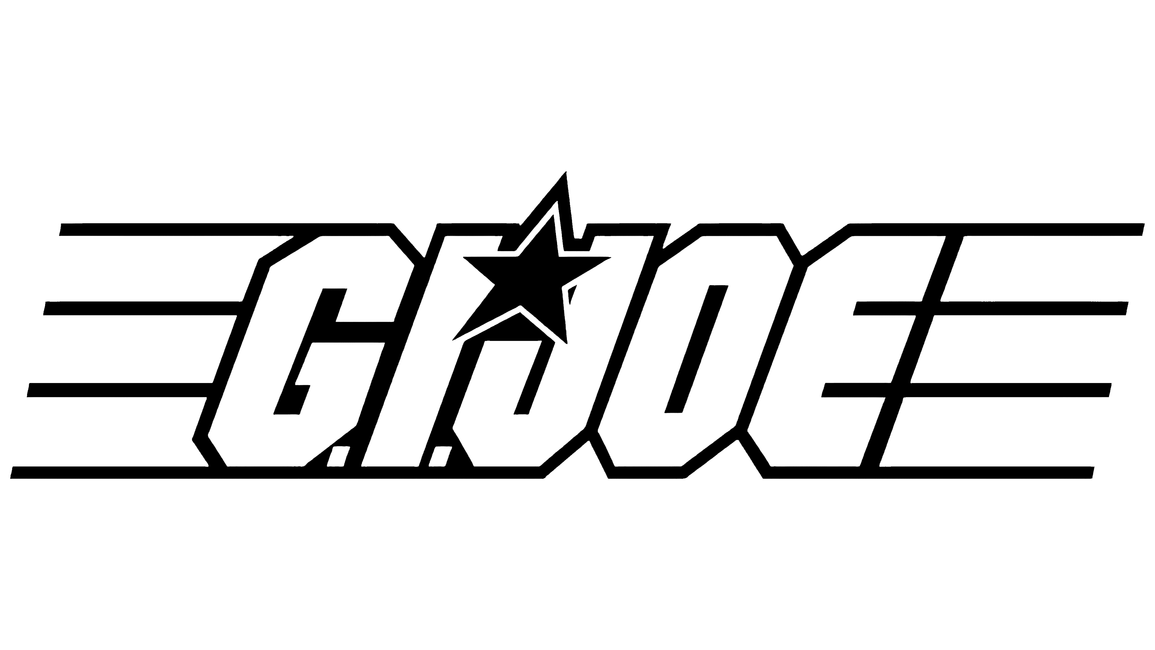
2020 – today
![]()
This GI Joe logo is a combination of the two previous versions. On the one hand, the designers used an italic font with tall, block letters; on the other hand, they placed the star above the curve. To fit it compactly into the composition, the authors diagonally cut off the tops of the two neighboring glyphs: “I” and “J.” Thus, the star does not touch them at all. Also, a three-stripe speedline was introduced. The emblem is monochrome.
Font and Colors
A stencil font and a bold geometric grotesque with angular, smooth edges were chosen for the military-themed logo. Later, based on the wordmark, Neale Davidson created the Action Force font, which imitates the design of drawn symbols.
The color scheme consists of an active palette, bringing dynamics and energy to the emblem. These are red, black, blue, and white. A silver metallic with a transition to a bronze shade was also used.