The GitHub logo refers to the union of single professionals located in different parts of the globe. With service, their abilities and knowledge are put in the spotlight. The emblem conveys that new impressive projects are born thanks to joint work.
GitHub: Brand overview
| Founded: | February 8, 2008 |
| Founder: | Tom Preston-Werner, Chris Wanstrath, P. J. Hyett, Scott Chacon |
| Headquarters: | San Francisco, California, U.S. |
| Website: | github.com |
Meaning and History
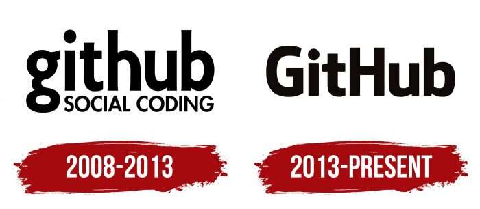
The hosting logo is now well recognizable, although, in its debut version, it was only a word mark and did not contain graphic symbols. But the color palette has remained subdued since the appearance of the emblem. The developers believed that in this way, it attracts attention and does not distract to extraneous details. In general, over the years of its existence, the web service has had two versions of the logo.
What is GitHub?
It is a software developer and hosting web service that provides users worldwide with a platform for collaborating on IT projects. It appeared in the United States in 2008 and is headquartered in San Francisco.
2008 – 2013
Since IT services were a new business direction, its owners wanted to convey the essence to potential customers. Therefore, the first option is based on a verbal image. It included the name of the company and the slogan “Social coding.” The font is bold, Sans Serif. Letters are lowercase, simple, rounded. But the motto, on the contrary, is written in capitals, but in a smaller size, in the Github font. It maintains contrast while adding visual interest to the compositional structure of the brand name.
2013 – today
In 2013, the designers updated the letters in the emblem to tie the name to its origins. To do this, they increased the “G” and “H,” making them capital letters. The corrected version has become more concise since there is only one word left in the verbal part. The slogan was removed for irrelevance because the IT service gained popularity, so users were already aware of its services. Consequently, the developers got rid of information “garbage.”
Picture!!!!!!!!
Another innovation is the white silhouette of a cat on a black background. True, it was an octopus with a cat’s head at the very beginning, and only over time, it acquired its usual appearance. Simon Oxley created the logo. After the logo was renamed from Octopuss to Octocat, the company registered it and made it part of the branding. This is how the outline of a cat was created, sitting inside a circle, under which it is written GitHub.
GitHub: Interesting Facts
GitHub is a key part of how software is made and shared today. It’s a platform that lets developers control versions and work together, making it easier to handle code. Since it started, GitHub has become the biggest place to find source code.
- Starting Point: In April 2008, Chris Wanstrath, P.J. Hyett, Tom Preston-Werner, and Scott Chacon created GitHub. It’s a place for developers to keep, manage, and collaborate on software projects using Git, a system made by Linus Torvalds in 2005.
- Quick Growth: GitHub quickly caught on because it was easy to use, made working together efficient, and was powerful. By 2011, it was more popular than Google Code and SourceForge.
- Bought by Microsoft: In June 2018, Microsoft bought GitHub for $7.5 billion in stock, which shows its strong support for open-source work.
- Huge User Base: Millions of developers and organizations use GitHub for all programming languages and projects, from small personal ones to big business software.
- The Mascot—Octocat: GitHub’s mascot is the Octopus, a cat with octopus legs that symbolizes teamwork.
- GitHub Universe Event: Every year, GitHub holds a big event called GitHub Universe. It’s a chance for developers and tech enthusiasts to learn about new tools and trends in software.
- New Tools: GitHub keeps adding helpful tools, like GitHub Actions for automation, GitHub Pages for website hosting, and GitHub Copilot, an AI that helps write code.
- GitHub Education: This program gives students and teachers free access to some of GitHub’s paid features, like private project spaces. It’s meant to help with learning and teaching coding.
- Supporting Open Source: GitHub is vital for open-source projects. It offers tools like issue tracking and wikis to help these projects run smoothly.
- Global Impact: GitHub has changed the software world, making it possible for anyone, anywhere, to participate in open-source projects, learn from real code, and work with others worldwide.
GitHub’s growth from a small startup to a crucial platform in software development shows its impact on tech innovation, teamwork, and learning. It continues to update with new features and remains important in the tech world.
Font and Colors
The mascot, unofficially renamed Octocat, took the leading position in the brand’s symbolism. As a result, it turned out that its modification became the basic transformation of the logo because, at first, there was an octopus with a cat’s head on the round badge. He, as before, remained in the negative – black and white. Below the developers have posted the word “GitHub,” made in a corrected version – with large “G” and “H,” while all other letters are in lower case. Such a structure gives a reliable idea of the service and its services without violating either the graphicality or the concept. That is, everything new is well forgotten old.
The emblem text is written in a typeface from the Sans Serif family – smooth, simple, grotesque (sans serif). The word consists of combined letters – uppercase (“G”, “H”) and lowercase (“i”, “t”, “u”, “b”). They are mostly aligned in height, except “u,” which is the lowest.
The logo color scheme has always been monochrome and represents the classic black and white combination. Such a palette creates the effect of a “negative” image – like on photographic film.
FAQ
What is the GitHub symbol?
The symbol is an anthropomorphized “octocat” with five octopus-like arms. Graphic artist Simon Oxley created this character, originally named Octopuss. It was initially designed as clip art to be sold on iStock, a site for royalty-free digital images.
The brand chose this illustration to represent its brand and renamed it octocat. The octocat’s playful and memorable design makes it an effective mascot. The character blends the features of an octopus and a cat, reflecting the creativity and mix of elements in GitHub’s platform.
What is the mascot of GitHub?
The brand’s mascot is Octocat, a unique character with a cat body and five octopus-like arms. This design represents the brand’s creativity and versatility.
Graphic artist Simon Oxley created Octocat, originally intended as clip art for iStock. The company chose this quirky character to symbolize its innovative and collaborative platform.
Octocat is now a well-known symbol in the tech community. It represents the spirit of collaboration and open-source development that the brand promotes. The playful design makes the brand more relatable and engaging for users.
Over time, Octocat has appeared in various forms and costumes, reflecting different themes or events. This flexibility keeps the mascot fresh and relevant while maintaining its core identity.
Why is a cat the logo for GitHub?
The logo idea came from the “octopus merge,” which combines three or more development branches. The designer, Simon Oxley, considered naming his creation “Octopuss,” blending octopus and pussycat. This design shows how merging complex code can create unique results.
The octocat character, with a cat-like body and octopus arms, symbolizes creativity and versatility. The brand wanted a mascot that embodied the complexity and fun of coding, and the octocat fits this perfectly.
By choosing such a unique character, the brand highlights its focus on creativity and the power of combining different elements to create something special.
What is the GitHub logo?
The logo features Octocat, a mix of an octopus and a cat. Designed by Simon Oxley, who initially named it Octopuss, this character captures the idea of combining different elements into one.
Choosing Octocat as the logo shows the brand’s focus on innovation and teamwork. This unique mascot makes the brand more relatable and memorable. It highlights the open-source environment that the brand promotes, where developers worldwide can collaborate and share ideas. This playful yet powerful symbol embodies the spirit of the brand and its role in software development.
How do I add a logo to GitHub?
To add a logo to a GitHub repository, follow these steps:
- Go to the main page of your repository on GitHub.com.
- Click on the “Settings” tab under the repository name.
- Scroll down to the “Social preview” section.
- Click the “Edit” button.
- Click the “Upload image” button.
- Select the image you want to use as your logo from your computer.
- Make sure the image looks correct in the preview.
- Click “Save changes” to apply the new logo to your repository.
This sets the logo for your repository, which will appear when your repository is shared on social networks and in other previews.
Is the GitHub logo copyrighted?
Yes, the logo is copyrighted and trademarked by GitHub. It is registered with the US Copyright Office. This protection means that the brand has exclusive rights to its use.
Using the Octocat logo without permission can lead to legal issues. The company has specific guidelines for using its logo to ensure it’s used correctly. If you need to use the logo, you should follow these guidelines and possibly seek permission from the brand.
What color is the GitHub logo?
The classic logo is black and white. It features a dark circle with a white space shaped like an Octopus. The contrast between the black circle and the white Octopus makes the character stand out.
This simple color scheme highlights the logo’s unique design and makes it easily recognizable. The black and white colors give the brand a clean, professional look, while the Octocat adds a touch of creativity. This combination helps the brand maintain a strong and memorable identity.
