


![]() Glitch Logo PNG
Glitch Logo PNG
The Glitch logo is fun and friendly. It indicates platform creativity and teamwork. The emblem symbols invite the user to work together. Ideas and collaborative work will help create the perfect site.
Glitch grew out of Fog Creek Software, founded in New York in 2000 by Joel Spolsky and Michael Pryor. After the dot-com bubble burst, the company shifted to its own software products. Spolsky, a former Microsoft Excel manager, had already built a strong developer audience through Joel on Software. Fog Creek’s first major product was FogBugz, a web tool for bug tracking and project management. Unlike many tech firms of that period, Fog Creek grew without venture funding.
In 2008, Spolsky and Jeff Atwood created Stack Overflow. In 2010, it became Stack Exchange Inc., funded by Union Square Ventures. In 2011, Fog Creek launched Trello, a visual task-management tool. Trello became a separate company in 2014 and was bought by Atlassian in January 2017 for $425 million. By 2016, Fog Creek needed a new direction. Joel Spolsky named Anil Dash as CEO and introduced a collaborative coding platform first called HyperDev, then Gomix.
The idea was to let users copy, remix, and publish web apps without having to handle hosting or deployment. The product later became Glitch. On September 25, 2018, Fog Creek Software officially became Glitch, Inc., focusing on the platform and its growing app community. In 2020, Glitch employees moved to unionize through the Communications Workers of America, and the company voluntarily recognized the union.
In May 2022, Fastly acquired Glitch. Anil Dash became Fastly’s vice president of developer experience. In July 2025, Glitch announced its shutdown, ending a platform rooted in Fog Creek’s long history with FogBugz, Stack Overflow, and Trello.
Meaning and History
![]()
Glitch is backed by Fog Creek Software, founded in 2000 by entrepreneurs Michael Pryor and Joel Spolsky. At first, she worked in consulting, but over time, she transitioned to creating advanced Internet technologies, from useful tools to smart bots.
Fog Creek has been a hub of innovation for 18 years. Then he had a new product, Glitch, which was part of the Creek Week hackathon, where team members shared their ideas. In early 2018, the Glitch creative platform emerged from beta and quickly became popular in the programming community. A few months later, the startup owners admitted that this was the future of Fog Creek. They renamed their project to Glitch Inc. and carried out a large-scale rebranding.
What is Glitch?
It is an American content and project management software company. It was founded in 2000 and is located in New York. The glitch was formerly called Fog Creek Software.
2000 – 2018
![]()
The debut logo consists of two elements that harmoniously complement each other in color and a restrained style. On the left, in two lines, are the inscriptions “Fog Greek” (top) and “SOFTWARE” (bottom). Although written in lowercase letters, the first phrase is large except for the initial characters (F and G). The second word is printed in small characters but in all capital letters.
If you pay attention to the color ratio, you will notice that, first, on the left, there is emerald, then gray. However, in the picture on the right, the upper element is painted in light graphite, and the lower is in dark aquamarine. This is because the icon depicts a sea wave, and, accordingly, it is at the bottom. A closed habitat is a square, the gray part framed in dark and separated from the impromptu water by a cap of white foam.
2018 – today
![]()
In September 2018, the company said goodbye not only to its old name but also to the logo, which consisted of blue lettering “Fog Creek” (left), a gray word “SOFTWARE” (below), and a light gray square with a dark border (right ). Instead, the software developer has a new emblem: two colorful fish swimming in one direction.
The unusual icon matches the style of the Glitch iconography. It’s as simple, straightforward, and fun as the community-friendly design. According to the company owners, the Internet should be a place for creativity, not consumerism.
The logo has another version: white dots resembling shiny scales and dark gray ‘Glitch’ lettering. In both variants, the fish are composed of colored blocks: the bottom is pink, and the top is blue or purple. However, in the second case, the palette is slightly different: it has more dark shades, affecting the gradient.
Font and Colors

The fact that the two fish swim in the same direction speaks of the consistency of their actions. It is a symbol of unanimity, teamwork, and the achievement of a common goal, which are the basic principles of Glitch. As you know, platform users work together and use the source codes of other people’s applications to implement their projects.
The emblem looks friendly, showing another side of Glitch: the company wants to be welcoming to experienced IT pros and newbies who are recently getting familiar with JavaScript. Funny, colorful fish hint that programming is not difficult and that creating applications is both creative and partly a game.
The Glitch word mark is a combination of several fonts. The capital “G” looks like the “G” from Questa Sans Bold, although the match is imperfect. The lowercase “c” is very similar to the “c” from Heltar DemiBold or Woolworth Bold, released by The Northern Block in the early 2010s. The “t” resembles the “t” from the Core Sans E 75 Extra Bold and Stevie Sans Bold typefaces. The “l,” “i,” and “h” have a lot in common with the corresponding letters from Stevie Sans Bold, Heltar DemiBold, and Core Sans E 75 Extra Bold. Their boldness and lack of serifs unite all of these fonts.
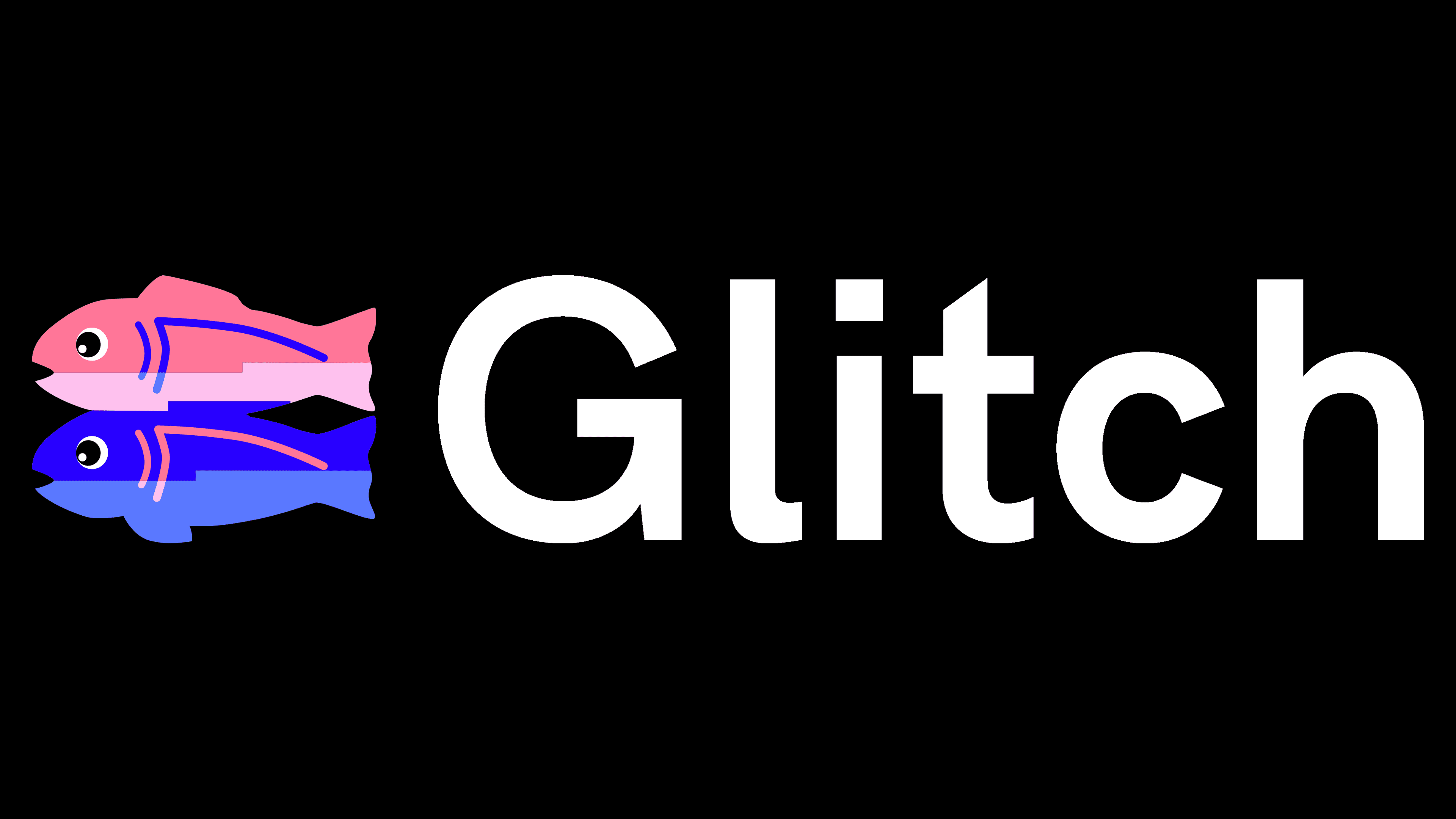
If the inscription is just black, then the fish are incredibly colorful. The Glitch logo’s color scheme features a gradient of blues, pinks, purples, and lilacs. The only monochrome elements are white eyes with black pupils.