


![]()
Global Colors has carried out a large-scale visual refresh and introduced a new logo that more accurately reflects its positioning in the international market and the specifics of its business. The previous emblem, which was outdated and associated with regional brands from the late 1990s, has been left behind. It has been replaced by a contemporary image that matches the status of a major global player.
![]()
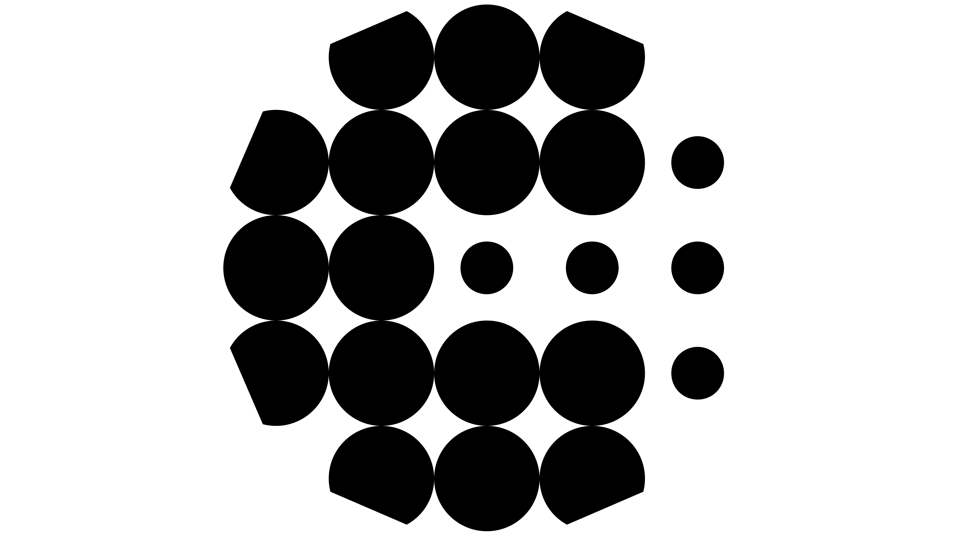
The new mark is composed of twenty-one circles. They symbolize masterbatch granules. This is the company’s core product, used to color and modify plastics. The circles converge into a single structure, with references to the letters C and G apparent. The use of two different dot sizes and precise cuts along the outer contour enhances the sense of form and echoes the granules’ physical appearance.
The wordmark is set in the sans-serif typeface Silka. The lettering appears restrained and clean. Special attention is drawn to the modified letter r, which softens the overall geometry and adds an association with material flexibility, a logical choice for a company working with polymers.
There are questions around the secondary typography. The Camera typeface was selected for headlines, featuring cutouts in the letterforms that recall older screen technologies. The designers link this approach to the dots in the emblem, but the parallel feels superficial and does not strengthen the overall brand style.
Despite this point of debate, the refreshed identity makes a strong impression. The new Global Colors design looks cohesive and appropriate for a company of this scale. The emblem has become cleaner and clearer, moving away from outdated devices and now conveying authority, scale, and the brand’s international ambitions.
![]()