Cowboy Space changed its former name, Aetherflux, to a bolder, more memorable name. The new name brings together space, solar energy, and the cowboy frontier. The brand launched in 2024. Robinhood co-founder Baiju Bhatt founded it. The project is building a space-based power grid for rising energy demand driven by AI.
The Stampede satellite constellation is intended to operate in low Earth orbit. The satellites will collect energy from constant solar radiation and transmit it to Earth. Along with a $275 million Series B round, the brand introduced an identity by Philadelphia-based Smith & Diction.
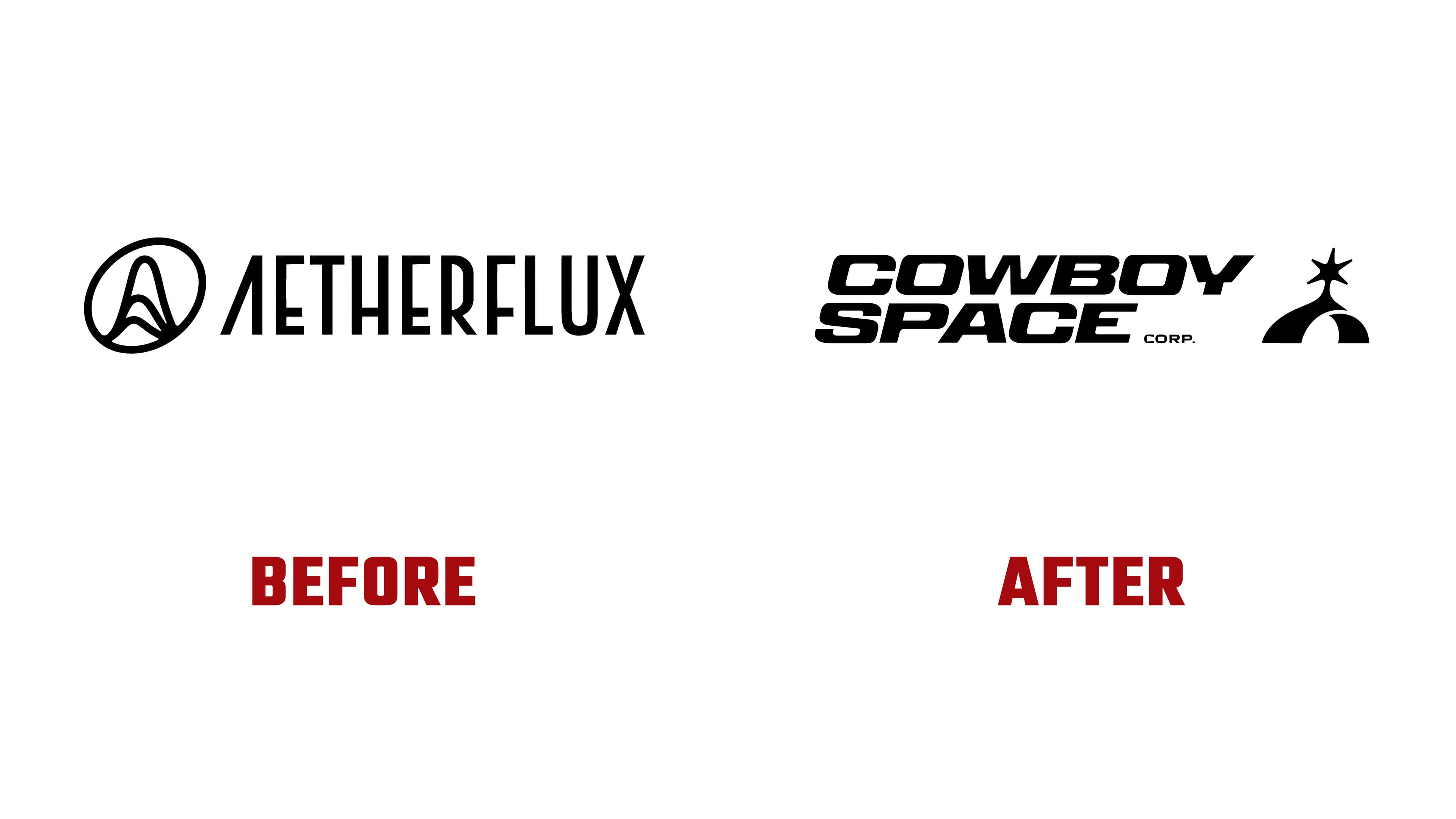
The main task for the new symbol was to make the bold name feel appropriate for an engineering company, rather than turning it into a joke about a space western. The symbol is built on a double meaning. On one side, it reads as a vertical spur connected with the cowboy theme. On the other side, it shows the sun above Earth’s horizon and an exchange of energy between the orbit and the planet. The emblem explains the brand’s mission. Energy is generated above Earth, passes through space infrastructure, and returns to people.
At first, the viewer sees a technological silhouette with a dense form, then the spur becomes clear. This presentation helps Cowboy Space appear like a serious deep-tech project while maintaining a memorable image. For partners and future users, the emblem gives a clear signal. They are looking at a company that plans to build energy infrastructure beyond Earth.

The wordmark is set in Panell Expanded by Displaay. The wide letters create a feeling of a science-fiction corporation. A slight slant connects the lettering with launch and stored energy. Paired with the symbol, the typeface holds a balance between technology and a vintage undertone. The logo looks bold. The empty spaces inside the mark echo the spacing in the lettering. At the same time, the rounded inner corners connect with the shape of the letters. The symbol and name look like one system.
The new name adds tension and energy, while the logo translates them into a controlled image. The identity by Smith & Diction presents the company at the intersection of engineering, orbital infrastructure, and the frontier myth.