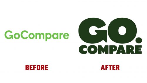
Go.Compare, the well-known Wales-based financial services comparison website, has launched a vibrant new brand identity, culminating in the introduction of the updated Go.Compare logo. Since its inception in 2006, Go.Compare has become a staple for UK consumers seeking to compare prices across various insurance products, including car, home, pet insurance, and breakdown cover. The company gained widespread recognition through its memorable advertising campaigns featuring the iconic fictional opera singer, “Gio Compario,” who quickly became a beloved yet divisive mascot for the brand.
The redesign of the Go.Compare identity was undertaken by the London, UK-based design agency Ragged Edge, tasked with evolving the brand’s image while maintaining its significant market presence and distinctive character. While effectively supporting the brand’s visibility alongside Gio Compario’s antics, the previous logo was critiqued for its conservative approach, lacking the dynamic energy the mascot brought to the brand.
The new Go.Compare logo addresses these concerns by introducing a more compact and impactful square lock-up, enhancing the logo’s functionality across various applications, especially in digital contexts where space is at a premium. A notable change is the emphasis on the word “go,” a strategic move that highlights the service’s proactive nature and echoes the familiar operatic jingle associated with Gio Compario. This design decision infuses the logo with a sense of urgency and enthusiasm, mirroring the exuberant personality of its operatic ambassador.
Gio Compario’s transition into an illustrated format, expertly crafted by illustrator Rami Niemi, marks a significant evolution for the character, aligning with current trends where brands increasingly leverage illustrations to convey their identity. Niemi’s rendition retains Gio’s essential attributes while introducing a modern twist that resonates with contemporary audiences. The simplified illustration style effectively captures the essence of Gio, allowing for versatile application across media while maintaining the character’s charm and recognizability.
The introduction of the new brand identity and the Go.Compare logo reflects the company’s commitment to staying relevant and engaging in a highly competitive market. By revitalizing its visual representation, Go.Compare aims to enhance its appeal to a broader audience, ensuring that the brand remains in consumers’ minds when comparing financial services.


