


![]()
Gobi Cashmere, a renowned global brand for premium cashmere products, has introduced a new logo and visual identity that celebrates its luxurious offerings while honoring its Mongolian roots. This refreshed design reflects a refined direction for the company, blending tradition with modern elegance to appeal to a global audience.
The previous logo, featuring the classic Times New Roman Bold Italic font and ine “Mongolian Cashertagline, e,” projected tradition and premium quality. However, it lacked a distinctive identity that could resonate across international markets. The rebranding addresses this by introducing a more sophisticated and versatile visual style.
![]()
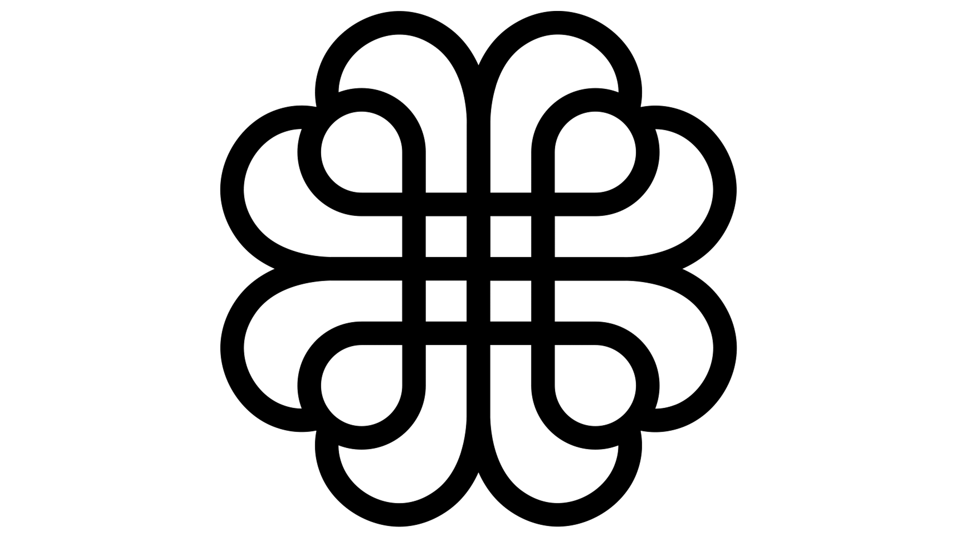
A key addition to the new logo is a graphic symbol of interconnected shapes resembling hearts. This icon captures the softness and craftsmanship of cashmere, doubling as a nod to Mongolian cultural motifs and a stylized representation of a ball of yarn. The thoughtful design bridges the brand’s artisanal roots with its commitment to luxury, creating a visual that feels both grounded and contemporary.
The typography has been significantly refined. The updated wordmark features an elegant serif typeface with carefully crafted proportions and smooth transitions between elements. This design mirrors the softness of cashmere while maintaining a precision that underscores dedication to quality. The letters are evenly spaced and aligned, creating a balanced, harmonious look. The tagline “Mongolian Cashmere” has been removed from a notable shift logo. This simplifies the design, focusing on the brand name and its new symbol. The cleaner layout enhances adaptability across different mediums and markets, ensuring it remains impactful and versatile.
The color palette stays true to timeless black and white, reinforcing the association with elegance, minimalism, and universality. The restrained approach ensures the logo is visually striking without relying on unnecessary details.
This rebranding effort highlights the company’s commitment to preserving its Mongolian heritage while confidently entering the global luxury market. The new symbol encapsulates craftsmanship and cultural identity, while the modernized typography and simplified design reflect the ambition to stay relevant and competitive internationally.
![]()
The refreshed visual identity underscores a dedication to excellence in the cashmere industry. The updated logo communicates quality, heritage, and innovation values by seamlessly combining tradition with modern design. This evolution sets the stage for continued growth and reinforces the status of luxury cashmere leader.