The emblem shows that the platform is a financial source of warmth that can turn a small idea into a big fruit. The GoFundMe logo demonstrates the association of people who provide the necessary energy through monetary donations to develop useful ideas.
GoFundMe: Brand overview
Meaning and History
This service was founded not in 2010 but two years earlier—in 2008. It had a different name than CreateAFund, which is how Damphousse and Ballester conceived it. As a result of numerous design and functional improvements, the website has been renamed GoFundMe.
After the launch, the crowdfunding platform received its logo and wide territorial coverage. It is available to residents of many countries, including the United States, Spain, the Netherlands, Italy, Ireland, Germany, France, Australia, Canada, and the United Kingdom. From its inception until 2020, it has helped raise over $9 billion through donations from 120 million people.
In 2015, the company’s founders sold a controlling stake to Technology Crossover Ventures and Accel Partners and then relinquished website oversight. All this did not affect the identity, and it retained its original appearance for a long time until, in the winter of 2017, GoFundMe expanded with the purchase of CrowdRise. A year later, a logo redesign was undertaken. There are two of them on the crowdfunding platform.
What is GoFundMe?
GoFundMe is an American crowdfunding platform designed to collect voluntary donations for solving various complex problems and holding mass events. It was founded in 2010 and has helped raise over $ 9 billion during this time. Its creators are Brad Damphousse and Andrew Ballester. The head office is located in Redwood City, California.
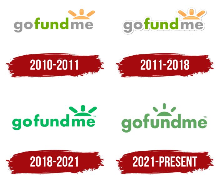
2010 – 2011
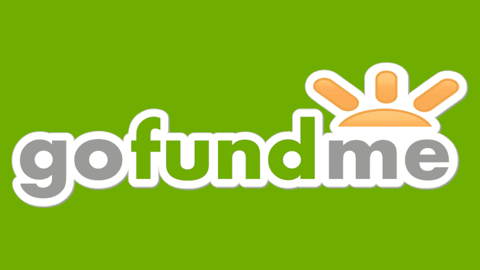
This logo provided a direct basis for all subsequent ones, setting the concept’s tone. The brand name is in streamlined lowercase characters. They have almost no corners, as curved lines and roundings predominate. The only exception is “f,” the crossbar which forms two 90-degree angles.
The word “gofundme” is divided by color into three parts: green (center) and two silver (right and left sides). This lets you focus on the semantic content and emphasize the company’s idea. Above the last text block is the sun. It is depicted as a half-disk rising above “me.” It has three wide beams with semi-oval ends ending at the same height.
2011 – 2018
The debut emblem is inviting; the rounded letters, as if “wrapped” in a protective shell, evoke a feeling of calm and trust. The logo is divided into two functional areas: text and graphics. The first contains the name of the service, rendered in a grotesque, streamlined font. The inscription is located in lowercase to show the service’s availability to each interested person.
The word “gofundme” is divided by color into three parts: “fun” (middle) – light green, “g” and “m” (beginning and end) – silvery. In doing so, the heights “and” balance the right and left sides, emphasizing the center. Around the letters, there is a kind of “buffer layer.” The trimmed contour appeared due to a thin gray stripe connecting to the graphic element.
To the right of the title is the image of the rising sun. It is an orange half-disc with three wide beams. The lateral lines are long; the central one is short. The icon is located above the syllable “m.”
2018 – 2021
The current logo is a revised version of the previous logo. The changes are minor, but the crowdfunding platform’s identity has become simpler thanks to them. This transformation aims to demonstrate how easy it is to get services. Excessive friendliness expressed through soft colors and a “plum” shell, the designers refused. They removed the thin outline around all the elements, leaving the wide “protective” layer to disappear. The developers also changed the shade of green and removed gray and orange colors from the logo.
2021 – today
In 2021, the online fundraising platform GoFundMe focused on creating a new visual identity for its brand. At the same time, the logo changes were minor. The designers kept the inscription consisting of lowercase glyphs and the image as a rising sun. Only now is the latter not above “me,” as before, but above “und.” It is in the free space between the vertical strokes of the letters “f” and “d.” To make the sun more compact, the developers turned its lower element – a semi-oval – into a semicircle. In addition, they reduced the length of the three rays, thereby eliminating the distortion of proportions.
It is noticeable that the turquoise color has become a little darker. The font is very slightly but has changed. The designers made the glyphs more expressive, lengthened the lower part of the “g,” and removed the sharpness on the upper fragment of the “f.” The slightest hint of extended spacing between “go,” “fund,” and “me” has also disappeared: in the current version, there is the same distance between all the letters in the inscription.
GoFundMe: Interesting Facts
GoFundMe, launched in 2010, quickly became a key player in online fundraising. It allows people and communities to raise money for various reasons, like healthcare costs, education, and community projects.
- Wide Impact: It’s one of the biggest fundraising platforms globally, with billions raised for millions of campaigns, showing its significant role in helping others.
- Global Presence: Though it began in the U.S., GoFundMe now operates in many countries, making it easy for people worldwide to start campaigns or donate.
- Diverse Causes: The platform supports various fundraising causes, from medical bills and memorials to education and sports, highlighting its versatility.
- Record Campaigns: Some campaigns have raised remarkable amounts, helping with natural disasters, rare medical conditions, and social causes, demonstrating GoFundMe’s ability to gather massive support.
- GoFundMe Heroes: This program celebrates people who make a big difference through their campaigns, sharing stories of kindness and generosity.
- Safety and Trust: The GoFundMe Guarantee helps ensure donations reach the right people and protects donors from fraud, building trust in the platform.
- No Fees for Personal Campaigns: In the U.S., personal campaigns have no platform fee, with GoFundMe relying on donor tips. This means more money goes directly to those in need.
- Support in Crises: During crises like the COVID-19 pandemic, the platform was crucial for supporting frontline workers, families, and small businesses, showing its role in community aid.
- Partnerships: GoFundMe works with businesses and organizations to enhance support for certain campaigns, including donation matching and focusing on specific causes.
- New Philanthropy Approach: GoFundMe represents a new way of giving, with grassroots-driven campaigns that allow people to support each other directly, changing traditional views on aid and philanthropy.
GoFundMe has transformed fundraising, making it more accessible and community-oriented. It has proven the power of collective support through challenging times and towards common goals.
Font and Colors
The modification took place according to the principle of cutting off the excess. Therefore, in the end, there was a minimalistic version. In the logo’s evolution, a wide white space formed by a thin edging line and excessive brightness was removed. It is now a practical symbol with a twist of its own. It looks equally good both on the site and on any advertising media.
The GoFundMe logo’s style has never changed. The typeface resembles the commercial typeface Joya Sans Bold—smooth, chopped, and rounded. The first logo’s color scheme consists of a rich palette of green # 5ea800, gray # 919191, and orange in two shades—# ffa13d and # ffbc53. But the modern version is more restrained: it uses only green # 01bc66.
FAQ
Is GoFundMe an app or website?
It is both a website and an app. The brand began as a website for creating and managing fundraising campaigns. It now includes a mobile app for iOS and Android, making managing fundraising on smartphones and tablets easy.
The website allows users to create fundraising pages, share their stories, and solicit donations. It has tools for managing campaigns, communicating with donors, and tracking progress. Users can upload photos and videos, write updates, and thank donors through the platform.
The mobile app offers similar features and is designed for mobile devices. This is useful for managing fundraising on the go. Users can use the app to create campaigns, track donations, and share their campaigns on social media or messaging apps.
Is GoFundMe only for America?
The brand is not limited to America. It operates in many countries, allowing people to create and manage fundraisers worldwide. Funds can be sent to 20 countries, and the person withdrawing funds must follow the rules of their country.
When you create a fundraiser, you select a location during setup. Once your fundraiser is published, you cannot change the location. Therefore, choosing the correct country is important to satisfy all withdrawal requirements. GoFundMe allows people from different countries to raise money for personal, charitable, or business needs, connecting people globally.
What does GoFundMe mean?
GoFundMe is a crowdfunding platform that encourages action and mutual assistance. The name “GoFundMe” is divided into “Go,” “Fund,” and “Me,” which signifies raising money for personal needs.
The platform, originally called Create Fund, helps people raise money for various causes, including medical bills, education, disaster relief, personal emergencies, and community projects. Users can share their stories and connect with donors who want to support them.
The brand gives people the opportunity to help each other in difficult times. It offers an easy way for people to contribute to important causes and make a difference in the lives of others.
What kind of picture does GoFundMe use?
The brand uses clear, high-quality images to achieve its fundraising goals. It accepts images of at least 720×405 pixels in PNG, JPEG, or BMP formats. These images must be original and non-infringing.
High-quality images are critical to telling your fundraising story and attracting donors. Clear and compelling images help people understand the campaign’s importance, encouraging them to donate. Using the right images can convey urgency and significantly impact the success of your fundraising.
