 Gol Linhas Aéreas Inteligentes Logo PNG
The Gol Linhas Aereas Inteligentes logo reflects air travel; it evokes the vibrant spirit of Brazil, reminiscent of samba music and the nation’s passion for soccer, rich history, and culture. This emblem is understated yet reassuring, symbolizing the airline’s commitment to safety and quality service. Like the iconic Brazilian beaches and festive carnivals, the logo suggests a feeling of being on vacation, even on a short domestic flight. Simple and effective, it conveys that passengers are in good hands, part of the airline’s extended sky family.
Gol Linhas Aéreas Inteligentes: Brand overview
Gol Linhas Aéreas Inteligentes, Brazil’s largest domestic and third-largest international airline, has quickly become a dominant player in the aviation industry. Founded in 2000 by entrepreneur Constantino de Oliveira Júnior, Gol aimed to democratize air travel in Brazil by making it accessible to a wide audience. Through its low-cost business model and innovative approach, Gol revolutionized the industry by offering competitive fares and changing how Brazilians think about flying.
Since it began flying in 2001, Gol has experienced significant growth and, by 2003, had become the second-largest airline in Brazil.
Gol made acquisitions and formed alliances with international airlines to strengthen its presence further. A major milestone was the 2004 acquisition of VRG—Viação Aérea Rio-Grandense, which led to the company’s rebranding to VRG Linhas Aéreas.
Gol’s commitment to innovation and exceptional customer service is evident in initiatives such as online booking, flexible fares, and the “Smiles” loyalty program. Constantly striving for excellence, Gol is capitalizing on new opportunities with the launch of the Gollog transportation service, diversifying its business portfolio and opening up new growth opportunities.
Meaning and History
What is Gol Linhas Aereas Inteligentes?
It is a Brazilian budget airline headquartered in São Paulo. It operates an extensive network of domestic flights within Brazil and international routes to various destinations in South America, the Caribbean, and North America. Known for its affordable fares, efficient service, and comfortable air travel, the airline has a modern fleet of Boeing 737 airplanes.
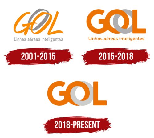
2001 – 2015
The Brazilian airline has chosen a bright and festive logo for its identity, reminiscent of shimmering bird feathers, plant flowers, and the golden hues of a carnival. Orange, the color of the sun, warmth, communication, oranges, embodies everything associated with the South American country. This shade represents the friendliness and sweet experience of flying with the airline to a place of celebration and relaxation.
The three capital letters represent the first part of the name. The name can be associated with the word “goal,” reflecting the company’s precise aim to hit the target. This choice aligns well with the slogan “Nova Gol.”
Another interpretation is that it is an abbreviation for Grupo On Line. This abbreviation emphasizes the airline’s focus on online booking and check-in, showcasing its commitment to bringing new technologies to the transport sector.
An interesting element of the logo is the doubling of the letter ‘O.’ Its gray shadow symbolizes:
- Leadership: the company leaves competitors far behind and continually sets new goals, never resting on its laurels.
- A ball, in tune with the goal association, where two lines symbolize movement.
- Two airplane wings ready for takeoff.
- The symbol of infinity represents ongoing development.
- A portal: travelers move on the company’s flights as though passing through a portal to their desired location. The image speaks of speed and simplicity, connecting different cities and countries.
- Windows: the sign embodies the beauty of flight and the vast expanses visible during travel.
- Airplane engines are the primary drivers of flight.
Below the composition, the company’s full name is written in small gray letters. This shade underscores the airline’s reliability and confidence, symbolizing the affordability and practicality of Gol Linhas Aéreas Inteligentes’ services.
2015 – 2018
In 2015, the company made significant changes to its branding to reflect its growth and development. The letters in the company’s logo were updated to be thicker, symbolizing the airline’s strengthened market position. This change highlights the transformation from a startup airline to the second largest in the country and one of the world’s leading airlines.
A key element of the new logo design is merging the gray and orange letter “O,” forming an infinity symbol. This symbol represents the unlimited possibilities offered by the company to its clients. The two links in this symbol illustrate the ongoing growth and development of the brand. This symbol resembles the intertwining of the symbols for Mars and Venus, interpreted as the joining of hearts and expressing passengers’ affection for the airline.
Another aspect of the company name, “Gold or low-cost,” emphasizes the strategy of combining premium and budget services. This combination suggests that passengers can expect premium service at affordable prices. The logo’s design with the double letter “O” effectively reflects this balance, highlighting the company’s effort to offer the best of both worlds.
The company’s full name is now orange, which enhances its visibility against the airplane livery and makes the brand more memorable and recognizable.
2018 – today
The Gol Linhas Aereas Inteligentes logo features the word “Gol,” with the letter “O” duplicated to form intertwined chain links. One “O” is pale gray, giving it an illusory look, while the other logo is bright orange. The letters are connected without spacing, emphasizing unity and seamless service.
The linked “O”s symbolize cohesion and unity, highlighting the airline’s role in connecting destinations. The bright orange stands out against the pale gray, representing energy and innovation. This color contrast draws attention and reflects the airline’s dynamic nature.
The intertwined chain links formed by the “O” convey interconnection and strength, which is essential for an airline focused on reliability. The pale gray “O” adds subtle depth, while the vibrant orange creates a striking effect. The connected letters signify seamless service, ensuring a smooth experience for customers.


