 Golden State Valkyries Logo PNG
The Golden State Valkyries logo emphasizes the greatness and invincibility of the team, which recently became part of the WNBA. The designers successfully captured everything associated with the franchise in the emblem – its location, name, values, and pursuit of leadership.
Golden State Valkyries: Brand overview
Golden State Valkyries is a new professional women’s basketball club in San Francisco, California. The squad was declared a prospective participant in the Women’s National Basketball Association (WNBA), and a 2025 debut date has been set.
The team’s formation is a component of the WNBA’s expansion strategy, which aims to expand the league’s membership base and the geographic scope of women’s professional basketball in the United States. San Francisco was purposefully chosen as the new team’s home city because it is one of the biggest cities in the US and did not previously have a WNBA team.
The term “Valkyries” highlights the strength and might of women’s basketball by alluding to strong female figures from Norse mythology. The term “Golden State” prefix links the team to the area’s illustrious basketball history, especially that of the NBA’s Golden State Warriors.
The squad has yet to begin practices, but the sports industry has already paid great attention to its formation. With the new team’s debut, interest in women’s basketball should increase in the San Francisco Bay Area and beyond.
The administration will concentrate on constructing the team’s infrastructure in the years preceding 2025, including hiring coaches, assembling a player roster, and developing a fan-attractive marketing plan.
The team’s rise to prominence is regarded as a turning point in the history of women’s professional basketball in the US. It provided fresh opportunities for female players and grew the WNBA’s fan base.
Meaning and History
What is Golden State Valkyries?
This women’s professional basketball club competes in a regional league featuring elite players nationwide and beyond. The club is known for its aggressive and fast-paced style of play, making its games vibrant and thrilling events that draw dedicated fans to the stands. In addition to their on-court success, the team is actively involved in the community: they collaborate with local schools, host youth basketball clinics, and advocate for women’s sports. The team’s players also coach young female athletes and often participate in public events, promoting gender equality in sports.
2025 – today
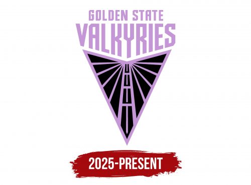
The Golden State Valkyries unveiled their logo in 2024, a year before their official debut in the Women’s National Basketball Association. Although the team had not yet stepped onto the basketball court, it already had a victorious symbol, signaling future success.
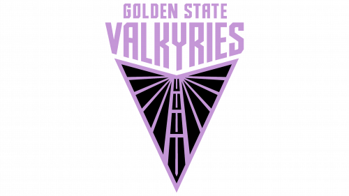
The V-shaped form of the emblem hints at victory. It is also associated with the first letter of the word “Valkyries,” though it is not a classic “V” but resembles the tip of an arrow. The association with weapons is intentional, as the club’s name refers to brave warrior women who circle above the battlefield, choosing the most skilled and courageous heroes among the fallen. They then take their souls to Valhalla to prepare for Ragnarok—the end of the world. The logo even includes several visual references to the Valkyries.
- The first reference is the overall shape, which resembles stylized wings. In some myths, warrior maidens are said to wear helmets with wings and fly on winged horses.
- The second reference is a pattern resembling a sword. The vertical lines in the center of the emblem form its long blade. Valkyries are often depicted with swords, symbolizing their crucial role on the battlefield.
However, the Golden State Valkyries logo’s meaning goes deeper and is not solely tied to Norse mythology. The abstract crossing of lines encodes the Bay Bridge, which connects San Francisco (where the team is set to play home games) and Oakland (the location of the main office and the team’s training facility).
From the central indentation of the stylized “V,” thirteen lines emerge, including the vertical sword blade. They remind us that the emblem belongs to the thirteenth franchise in the Women’s National Basketball Association. The stripes divide the space into ten triangles—five in each stylized wing—symbolic of the starting players who occupy the two sides of the court.
The emblem is dominated by black, a color that best characterizes the grim Valkyries. It is contrasted by light purple elements—dynamic lines that convey the swift energy of professional sports. The shade is rich enough to embody power, nobility, ambition, and strength.
The same purple color is used for the lettering above the graphic symbol. The basketball team’s name is divided into two uneven lines, center-aligned. At the top is the phrase “GOLDEN STATE”—one of California’s nicknames. The designers reduced its size to emphasize the third word—”VALKYRIES.” It is perceived as an extension of the V-shaped emblem, as the letters stretch downward in the shape of the triangular indentation.
The text is in bold, all-caps font with many angles and diagonal cuts. The glyphs have no smooth curves—not even the “O.” This strict geometric grotesque highlights the team’s warrior-like nature, aiming to appear invincible in the eyes of their opponents. This font gives the logo a futuristic look, and the wings below are perceived as a spaceship. Whether intentionally or not, the designers conveyed the club’s modernity and forward-looking ambition.


