![]() Good Morning America Logo PNG
Good Morning America Logo PNG
The Good Morning America logo is bright and attractive, helping it attract viewers and maintain their attention. The emblem signifies the show’s popularity and morning format.
Good Morning America debuted on ABC on November 3, 1975, as the network’s attempt to enter the profitable U.S. morning television market dominated by NBC’s Today show. Airing from 7 to 9 a.m. across American time zones, the program mixed news, weather, interviews, celebrity segments, lifestyle reports, and live features from different locations.
The first hosts were Nancy Dussault and David Hartman. Hartman, a former actor, gave the broadcast an accessible tone, while Dussault brought journalistic experience. The format was close to NBC’s model but lighter in presentation. Growth was slow, yet by the late 1970s GMA had become a real competitor. In 1980, Joan Lunden replaced Dussault, and her partnership with Hartman helped ABC pass NBC in the ratings in 1986.
After Hartman left in 1987, Charles Gibson joined Lunden and kept the show strong into the early 1990s. The mid-1990s were weaker, as NBC regained momentum and ABC tested new hosts and formats. Lisa McRee replaced Lunden in 1997, but the program recovered in the early 2000s when Gibson returned and worked with Diane Sawyer during major events, including the 2000 U.S. election and the September 11, 2001, attacks.
Robin Roberts became co-host in 2005, adding new momentum to the broadcast. Diane Sawyer left in 2009 for ABC Evening News, and George Stephanopoulos joined Roberts. In April 2012, GMA led the weekly ratings for the first time in 16 years. ABC later expanded the brand through GMA Day, Strahan, Sara, and Keke, and GMA3: What You Need to Know, launched in 2018. By 2022, the program marked its 47th year on air.
Meaning and History
![]()
The foundation of America’s most energetic and joyful show’s logo is the theme of the rising sun. This theme is played out in color or shape in all its logos, but most prominently in the first and last emblems.
What is Good Morning America?
A daily morning program of ABC, owned by Disney Entertainment, airing since 1975 from 7 to 9 AM on weekdays and from 7 to 8 AM on weekends across the U.S. It mainly covers political and cultural news, sensations, weather forecasts, and special sections. Since 2012, it has been considered the most-watched show.
1975 – 1987
![]()
The first symbol of the TV program consists of a three-level inscription. Each word of the name forms a separate line. The arrangement creates a structure resembling a mountain.
Interestingly, the name was plagiarized. Originally, ABC launched the show AM America, but it was unpopular. In search of another format, they considered the Boston company’s option. Good Morning! Eventually, the revamped show was named Good Morning America, leading to legal proceedings that Boston’s WCVB-TV lost.
The two O’s in the words Good and Morning are stylized as the gradually rising sun, depicted as a third circle above. The smooth change in color and position, like in frame-by-frame shooting, shows the sun rising from the horizon from 7 to 9 a.m.
The symbol looks compact and brilliantly plays on the theme of awakening.
1987 – 1989
![]()
In 1987, the main host, Hartman, retired, and a new successful duo of anchors was formed. The emblem was updated to match the new style.
The symbol took the shape of America’s contours, which seemed to slowly unfold for the viewer, as if rotating with the globe. The half-turn placement of the map conveyed the theme of the morning and the rising sun. The sun itself was partially visible in the upper left corner.
The program name was executed in two fonts. “Good Morning” in small uppercase letters, echoing the color of the sun and starting right from its image. The word “America” appeared massive and voluminous in the middle of the country’s contour.
The emblem seemed disharmonious due to the many techniques and colors used, which is likely why it was quickly replaced.
1989 – 1996
![]()
From 1989, the program’s logo consisted of a simple two-level inscription with elongated letters, as if reaching for the sun. Meanwhile, the word “America” continued to stand out in size, indicating a wide audience reach across the country.
1996 – 1999
![]()
In 1995, the program lost its leading position to its competitor, Today. Efforts to change the situation led to several innovations, including the departure of host Joan Lunden, who had held the position for 17 years, and a branding update.
The new symbol also consisted of the name. However, its letters became rounder, and a horizontal line separated the words “Good Morning” and “America”. Lowercase letters in America made the inscription less formal but still stood out in size. This choice showed that the program was now more focused on the interests of the country’s residents and entertainment topics rather than political and state issues.
1999 – 2002
![]()
In 1998, Lunden’s partner, Charles Gibson, left the program, and its rating dropped further, bringing it to third place nationally. Therefore, the channel invited a new producer, who brought back Gibson and paired him with Diane Sawyer, creating one of Good Morning America’s successful and long-lasting duos.
The refreshed program’s identity was also transformed. The modern and dynamic black inscription looked like a running line. Its clarity and structure created a sense of professionalism and order.
For the first time, the emblem’s general layout included the ABC channel logo, a black sphere with a white inscription. Adding weight to the logo made it part of a larger family, helping attract more viewers to the morning show.
2002 – 2006
![]()
The Good Morning America logo, updated in 2002, carries special significance and looks bright and energetic, perfectly capturing the spirit of a morning show. The dominant yellow color symbolizes morning, sunshine, and energy. This sunny hue practically shouts “Good Morning!” and radiates positivity, making it ideal for a program that starts the viewer’s day on a positive note.
The key element in this logo is the massive, capital letter “A” in the word “AMERICA.” It emphasizes the show’s importance and status in morning television. The “A” is a visual anchor, representing the program’s leadership and significance throughout the years. In this sense, the logo reflects the show’s return to high ratings when the redesigned look was introduced.
The font is bold, large, and straightforward. This typeface choice underscores the confidence and stability of a brand that has been on the air for years and has earned the trust of a large audience. There are no unnecessary details; everything is simple and direct, showing that the program isn’t about theatrics but delivers what’s important and interesting.
Another detail is the ABC logo, placed next to the show’s name. This element enhances brand recognition, as Good Morning America is part of a larger television family. The black circle with white “abc” letters creates a striking contrast with the yellow text, and this contrast works effectively, making the overall design cohesive without overwhelming it.
At this time, the show was changing, aiming to regain its former popularity and leadership among morning shows. The return to the bright yellow color and the emphasis on the capital “A” symbolized the morning spirit and the show’s resurgence in the ratings. The logo became a statement: the show was back on top.
2006 – 2010
![]()
As it approached its thirtieth anniversary, the show expanded. It added a third host and even planned an additional third hour on weekdays, which debuted in 2007. The new logo underscored the grandeur and scope of the project.
The three-level yellow inscription without the ABC logo showcased the program’s flourishing and expansion. The number three symbolically refers to the three hosts. The lower arc-shaped underline created a sensation that the inscription was rising above the horizon, like the morning sun.
2010 – 2019
![]()
In 2009, the program returned to its roots, bringing back the old studio look and two hosts: a man and a woman. This choice had little impact on the logo. The broadcasting company’s emblem was added to the previous inscription, with a black satellite leading it.
2019 – 2022
![]()
In 2019, the show completely changed its visual style, returning to the theme of the Sun in the logo. The round background speaks of harmony and perfection. The producers selected an excellent team of hosts, and important news and entertainment materials were seamlessly integrated into the broadcast.
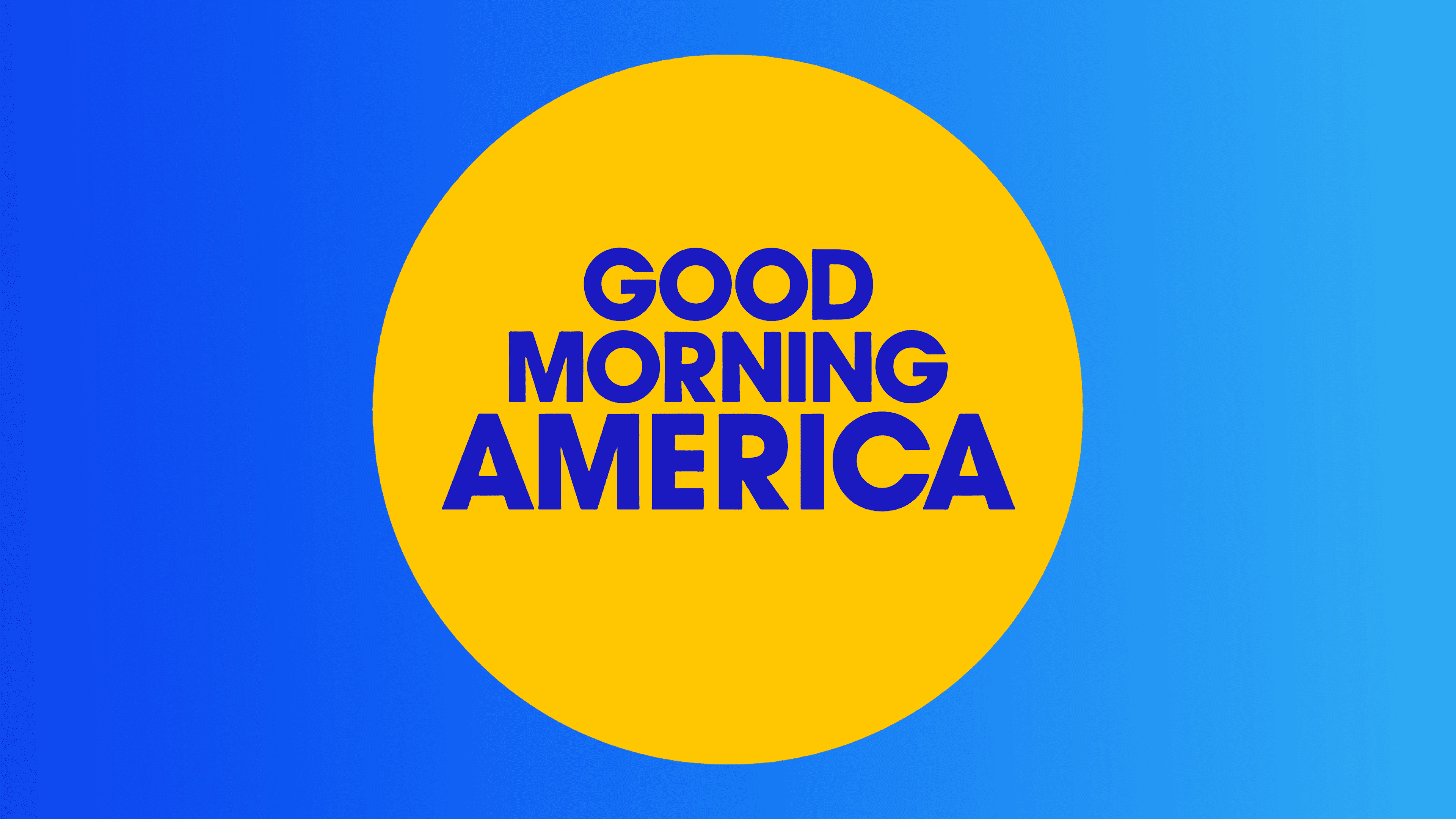
2022 – today
![]()
The modern Good Morning America logo radiates positivity. Simple and bright, it immediately evokes associations with a sunny morning and a good mood. The central element is a yellow circle, symbolizing the sun and setting the right tone. The sun, the first symbol of a new day, brings warmth and light, and the logo perfectly conveys the idea that the show greets viewers in the morning.
The text is in rich blue and centered in the circle. The color combination is intentional: the bright yellow and deep blue create a striking contrast that grabs attention. Yellow is associated with energy and joy, while blue represents confidence and calm. This balance perfectly captures the atmosphere of the morning show, lively yet without unnecessary rush.
The font of “GOOD MORNING AMERICA” is bold and large, adding a sense of confidence and clarity to the logo. There are no embellishments or extra details, emphasizing simplicity and accessibility. Viewers perceive the show as something familiar and easy to connect with. The text is centered and appears embedded in the sun, reinforcing the idea that the show “shines” with the first light of a new day.
Notably, the modernized version of the logo removed the black ABC logo, making it lighter and more “airy.” This was a smart decision, as it made the logo look even brighter and fresher, perfectly matching the dynamic of a morning show.
When the show first aired, its goal was simple—to become part of viewers’ morning routine, offering news and interesting topics and starting the day with a smile. The logo fully reflects this concept. Its simple yet vibrant style has helped the show remain recognizable and beloved for decades.
Font and Colors
Yellow and blue naturally combine with the morning theme. Like an inseparable pair, the blue sky and yellow sun appear at sunrise.
- Yellow is welcoming and friendly. It creates a light, homely atmosphere in the studio.
- Blue represents the intertwining of important news and current topics within the entertainment canvas.
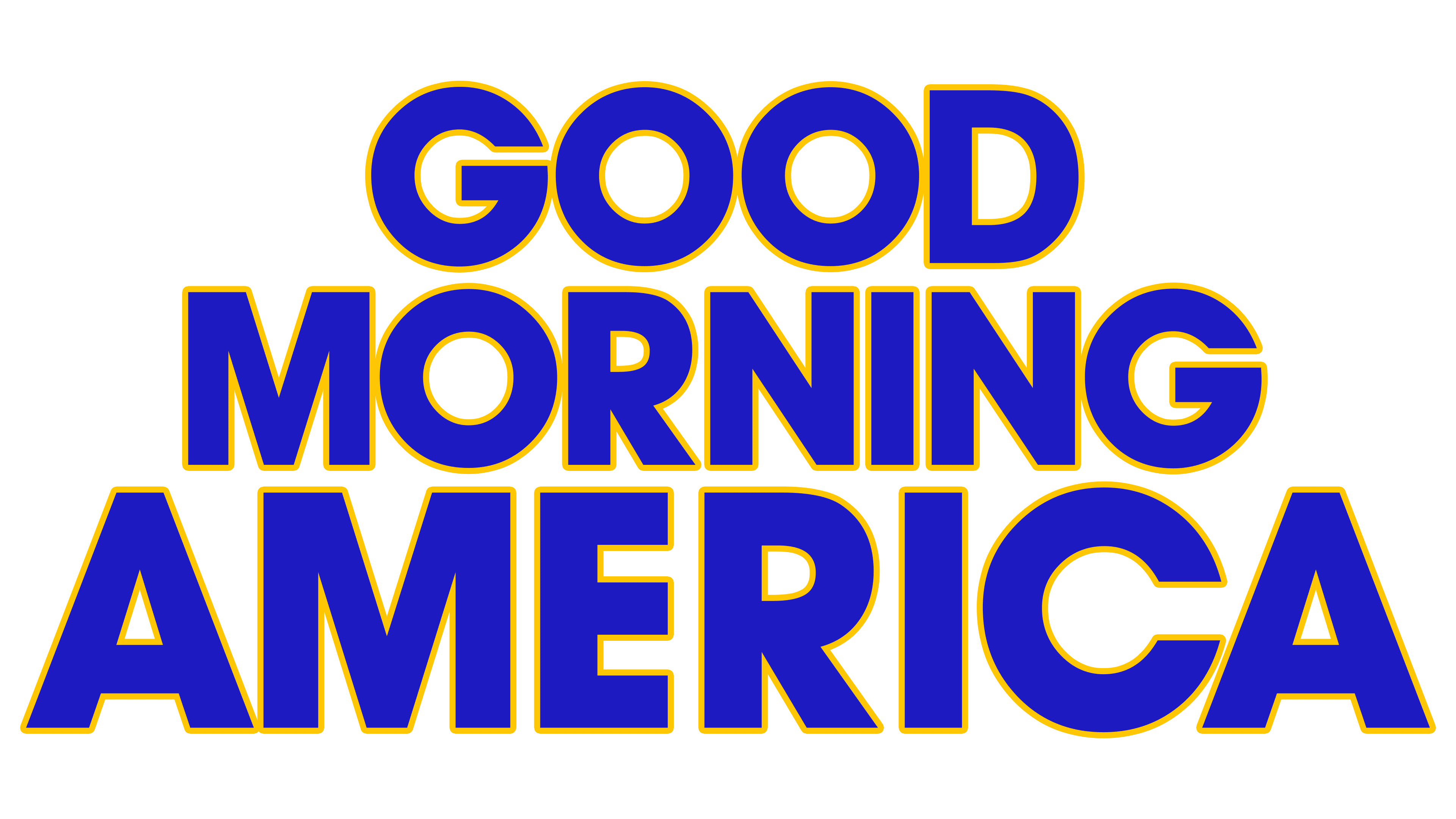
The inscription’s font is the confident and straightforward ITC Avant Garde Gothic Paneuropean Bold.