


 Goodwill Logo PNG
The Goodwill logo reflects the kindness and involvement this organization’s employees show to people who need jobs. The simple symbol suggests an easy solution to employment challenges and, in turn, improved financial stability. The emblem is timeless, attractive, friendly, and trustworthy.
Goodwill Industries began in 1902 in Boston’s South End, where Methodist minister Edgar J. Helms worked at Morgan Chapel. Helms and his parish collected used clothing and household goods from wealthier neighborhoods, then hired unemployed and poor residents, including people often dismissed as “unfit for work,” to repair and resell or redistribute them.
The early model focused on work rather than direct charity. Helms walked through affluent streets with a burlap sack from Thomas Wood and Company, asking for donations door to door. Workers were paid $4 a day when possible or given $5 clothing vouchers in harder periods. His guiding phrase, “not charity, but a chance,” became the organization’s foundation.
In 1905, Helms established the first branch of what would become Goodwill Industries. In 1915, the program reached Brooklyn, where a workshop already used the name “Goodwill Industries.” Helms later adopted it for the wider movement. In 1919, funding from the Methodist Church helped the organization expand across the United States, Canada, and overseas. By 1920, there were 15 branches, including Morgan Memorial in Boston.
By the mid-1930s, Goodwill had about 100 branches in the United States and was placing greater emphasis on jobs for people with disabilities. Unlike the Salvation Army, which focused more on food and temporary shelter, Goodwill centered on paid work and vocational training. Helms died in 1942, but the decentralized network kept expanding. By 2024, Goodwill organizations worldwide reported $8.6 billion in revenue, helped more than 2.1 million people, and placed over 142,000 people in jobs.
Meaning and History
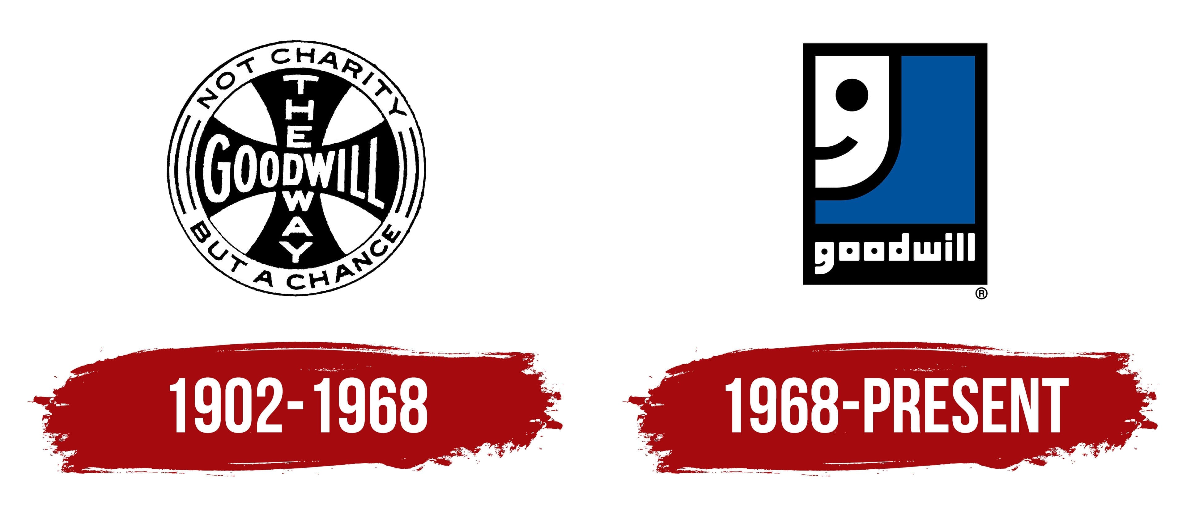
According to official records, Goodwill began doing good in 1902. But in fact, it didn’t exist then: only a young missionary, Edgar Helms, decided to help poor immigrants in the South End community. He felt sorry for people who did not know the language and had no means of subsistence, so he went to locals’ homes and asked them for unnecessary things. But the newcomers were too proud to accept the donations. So the reverend instructed the chapel staff to repair and clean all the items, then sold them to the needy at affordable prices. The profits paid for the labor of those who brought the items to marketable condition. They also used additional income to train immigrants.
Thus came the first Goodwill store. Over time, it grew into an entire network of independent businesses in America and abroad. For more than a hundred years, the organization’s principles have not changed – only its approach to employment has. Now people have a wide range of occupations to choose from, with opportunities to improve their professional skills. Although the core business has long since moved beyond retail, the company still sells donated items and uses the proceeds to support its development.
The Goodwill logo has evolved, too. What once resembled a black-and-white print with lettering now looks very different: a square graphic sign featuring a benevolent smile. The last version was introduced in 1968 and is still used today, suggesting it is iconic and timeless.
1902 – 1968

Until 1968, the organization used a round symbol with a cross at its center, resembling the Iron Cross, Germany’s military order. The horizontal stripe bore the word “GOODWILL.” Its letters widened and narrowed to match the base. The vertical part of the cross bore the words “THE WAY,” split in half. The top and bottom of the frame ring occupied the slogan “NOT CHARITY, BUT A CHANCE,” and the sides showed symmetrical patterns of parallel curved lines.
1968 – today
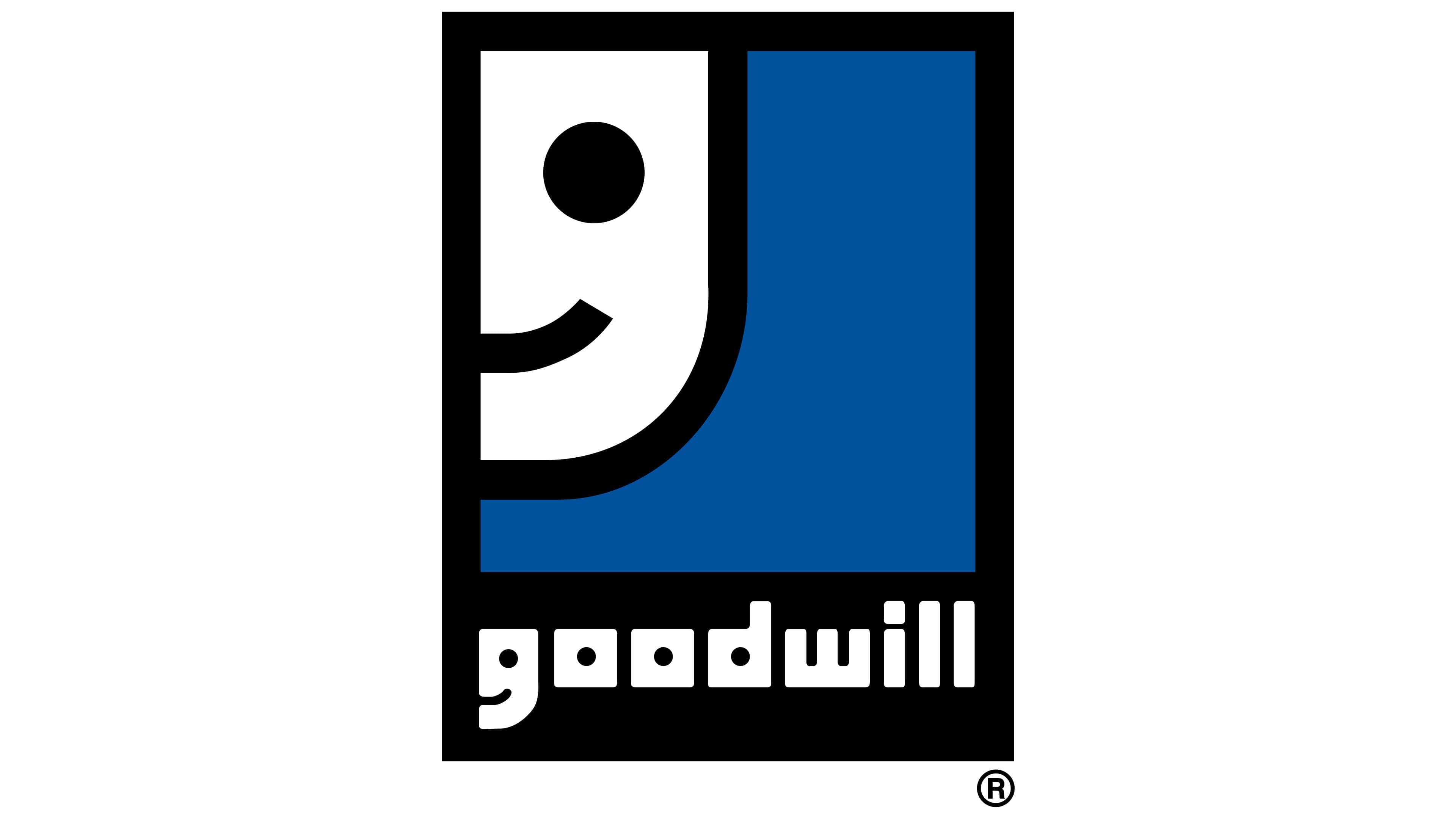
The 1968 graphic sign was designed by the greatest designer of our time, Joseph Selame. He is a branding genius who created dozens of famous emblems for companies such as Kodak and CVS.
The Goodwill logo is called the Smiling G because it features a lowercase “g” that resembles half a smiling face. The letter is in the upper left corner of the vertical rectangle. And the rectangle itself is styled like an old photo card: it is framed with a bottom extension bearing the word “goodwill”. All text elements (including the “g”) are white, the central part is blue, and the outline and frame are black.
The legendary logo is still in use today. On March 29, 2018, it turned 50, and since then, it has appeared not only in commercials but also in popular TV shows. The company isn’t in any hurry to give it up because it risks losing everyone’s trust without a recognizable visual identity.
Font and Colors

The phrase “Smiling G” says it all. Joseph Selame has interestingly played with the name and the essence of Goodwill, turning a simple letter into a benevolent face. It also carries a hidden meaning: a friendly smile is meant to attract attention, instill hope, and convey good intentions. It symbolizes the nonprofit’s support for those in need.
The font used in the Goodwill logo is closely related to ITC Tetra Bold. Typographer Tomi Haaparanta created this geometric sans-serif typeface in 2005. It features square letters with rounded corners. But obviously, designer Joseph Selame created the individual glyphs because he wanted the “g” to look like half a face. The round intra-letter gap looks like an eye, and the space between the two joined parts of the “g” (top and bottom) resembles a smiling mouth.

The interior of the logo is colored blue, known as Pantone Reflex Blue (#17171796). The company name and stylized “g” are white, while their outlines and frames are black. This has been a classic Goodwill color combination since 1968.