


![]() Google AdWords Logo PNG
Google AdWords Logo PNG
There is nowhere easier – such an idea is being promoted by one of the virtual services of the main Internet giant. The Google AdWords logo is symbolic, emphasizing the service’s convenience. Moreover, it is designed in a style that matches all other digital products in this family.
Before AdWords, Google sold premium sponsorship packages: a logo and short text on the search homepage. The minimum price was $10,000 for three months, limiting access to large brands. In October 2000, Google launched AdWords as a self-service search advertising platform. It started with 350 advertisers and used a CPM model, in which brands paid per thousand impressions.
The early ads were short text blocks placed near search results, without banners or animation. Google’s main rival was GoTo.com (later Overture), which introduced keyword auctions with pay-per-click in 1998. Google had the advantage of its own search traffic. In 2002, it moved AdWords to a CPC model, added real-time auctions, and introduced Quality Score, which considered both relevance and bid size.
In 2003, Yahoo bought Overture for $1.63 billion, but Google had already taken the lead in search advertising. That same year, Google launched the Content Network, later known as the Google Display Network, allowing ads to appear on partner sites through AdSense. In 2005, Google acquired Urchin Software, laying the foundation for Google Analytics. In 2006, it acquired YouTube for $1.65 billion, opening the door to video advertising.
In 2007, Google bought DoubleClick for $3.1 billion, strengthening its targeting, ad serving, and display advertising capabilities. By 2008, Google Display Network covered more than 2 million sites. Enhanced Campaigns were introduced in 2013, bringing desktop, tablet, and mobile management into one interface. In 2018, AdWords became Google Ads, reflecting a system that now covered search, YouTube, Gmail, Maps, apps, and partner websites.
Meaning and History
![]()
AdWords started in the fall of 2000 and was immediately focused on online advertising. At first, Google charged a monthly fee for its service, set up ads, and managed content itself. He opened a self-service portal where advertisers self-post, edit, and track information. Then the Internet giant founded a special service called Jumpstart.
Gradually, the platform has improved and grown, offering new opportunities. And each serious stage of its development was marked by a change in the interface and identity. The largest event in this regard occurred in 2018, when the parent company undertook a rebranding. It was then that the contextual advertising service was called Google Ads and had a radically different logo. It has four in total.
What is Google AdWords?
Google AdWords is an online advertising service to promote goods and services. These can be both text ads and short-format videos. They land on search results pages, apps, and video content. The online service has existed since 2000 and has been called Google Ads since 2018. Its main headquarters is located in Mountain View, California (USA).
2000 – 2010
![]()
The debut emblem emphasized the advertising service’s “affinity” with the parent company. Therefore, at first, she had no personal symbols, only a general one. It represented a text composed of the words “Google” (the platform’s copyright holder) and “AdWords.” The first part was set in the corporation’s corporate style, with multi-colored letters decorated with short serifs. Everything else was typed in simple gray grotesque.
2010 – 2015
![]()
This period was marked by the second half of the service name being on equal footing with the first. It was enlarged and moved from under the tail of the “g” to the right side. “AdWords” was thin and light gray, and “Google” had no shadows.
2015 – 2018
![]()
2015 was a turning point for the contextual advertising service, as it was then that it received its logo and icon for use in the mobile application. The designers overhauled the text: they converted the word “Google” into a two-dimensional format and made the “AdWords” lettering almost twice as thick. They changed the font, concentrating on the grotesque. The personal badge looked like a hut composed of two wide stripes: its left side was painted blue, the right side green. The icon schematically conveyed the first letter of the program name “A.”
2018 – today
![]()
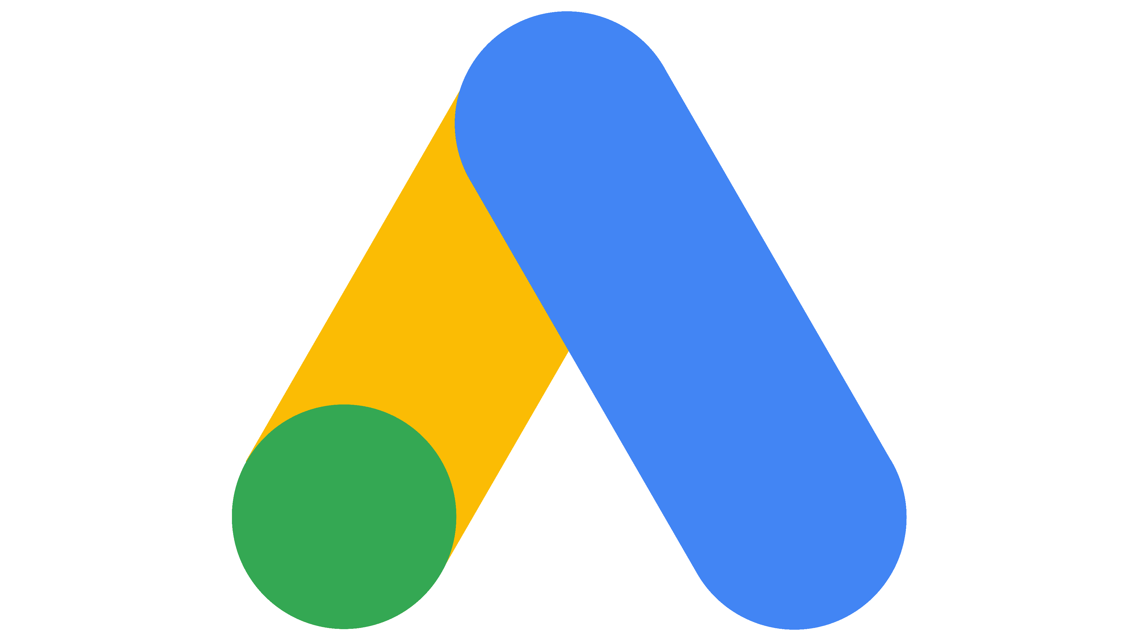
After being renamed to Google Ads, the advertising service gained its first real logo, which includes both text and graphic components. The developers took the icon and transformed it into a universal emblem that now marks the product across all its formats. The visual identity mark consists of two bold lines with rounded ends. The left leg is colored yellow with a green dot at the bottom, while the right leg is completely blue. As before, the figure in the form of a hut represents the letter “A” without the central crossbar. The name of the service is located below and, according to tradition, is made in gray grotesque.
Font and Colors
Interestingly, the Google contextual advertising platform was launched in 2000, and its logo did not appear for 18 years. All this time, she used a common identity, to which the designers modestly added her name. But in 2018, everything changed: the service earned its symbol because it expanded, became very popular, began generating significant income, and rightfully deserved a personal identity badge.
The logo uses Google’s typeface, Product Sans, which is based on the Futura typeface designed by Paul Renner in 1927. The second part of the name, included in the emblem, is made in a subtle grotesque. The color scheme combines gray with red, yellow, blue, and green.