


![]() Google Chat Logo PNG
Google Chat Logo PNG
The Google Chat logo promises productive and useful communication. Correspondence and sending messages in the service are simple and convenient. Data transfer is fast. The emblem represents the chat as an ideal place for business communication and project teamwork.
Google Chat grew out of Google’s long search for a workable messaging platform. The first major step came in August 2005 with Google Talk, launched into a market led by AOL Instant Messenger, Yahoo! Messenger, and MSN Messenger. Its main strengths were a clean interface, XMPP support, and direct integration with Gmail, which made chat part of everyday email use.
Google then moved through several experiments. In 2010, Google Buzz added messaging and microblogging to Gmail, but privacy concerns led to its shutdown within a year. In 2011, Google+ introduced Huddle (later Messenger), while Hangouts became the platform’s strongest feature, helped by free browser-based group video calls and the 2012 launch of Hangouts on Air.
In May 2013, Google announced Hangouts as a unified service for Google Talk, Google+ Messenger, text, voice, and video. Google Talk remained alive for years, losing browser support in 2015 and shutting down fully in 2017. That same year, Google introduced Hangouts Chat for G Suite as a workplace product aimed at Slack, with rooms, Google Drive, and Docs integration, plus bots. Hangouts Meet launched alongside it.
On April 9, 2020, Hangouts Chat became Google Chat. In 2021, Google opened it to personal accounts and began migrating Hangouts users. On November 1, 2022, Hangouts was officially shut down, with conversations and contacts transferred to Google Chat. In December 2023, Google redesigned Chat with a new side panel and AI-based features, positioning it inside Google Workspace alongside Gmail, Drive, and Meet.
Meaning and History
![]()
The program’s logo has changed several times. As a result, the authors sought to introduce new elements to convey the necessary message to potential customers and highlight the development and potential of Google Chat as a modern messenger.
What is Google Chat?
First of all, it is an internal messenger of the corporation. In short, it is planned to completely replace Google Hangouts. You can use this software’s functionality for free.
2005 – 2013
![]()
The prototype of the modern service was Google Talk. It lasted eight years, from 2005 to 2013. The logo consisted of the word “Talk” in the company’s classic color palette (blue, red, yellow, green). The author decided to use lowercase for all characters, creating an atmosphere of friendliness and customer focus. The corners in the symbols are slightly rounded. In addition to the software name, a dialogue symbol is shown to the right of it, in white with black outlines.
2013 – 2014
![]()
Hangouts have replaced Google Talk. It was launched in 2013. The company used the first logo variation for only one year. It is based on the image of the dialogue, with the green outline and the white quotes inside. This color palette was not chosen by chance: green indicates the company’s realism and growth, and white its transparency in its activities. Thus, Google wanted to demonstrate that it could bring together millions of users worldwide to communicate with one another. Interestingly, the authors did not use verbal forms, preferring the laconic logo directly.
2014 – 2020
![]()
After a year of using the original logo for the Hangouts service, it was decided to change it. They were minimal. For example, a darker shade of green was used to create it. The corners in quotes are now pointed. In addition, a shadow was added to create the effect of three-dimensionality in the image. The emblem was used until 2020, when it was decided to replace Hangouts with Google Chat. However, in 2015, the service name was also added below the image. It is made in a classic font with rounded characters. All characters, except for the first letters in words, are lowercase. The gray color was used for the lettering. At the same time, “Google” has a more saturated hue.
2017 – 2020
![]()
In parallel with Hangouts, Google developed another project, namely Google Chat. The first version was launched in 2017. The verbal inscription was made in a classic font with rounded, gray letters. To the left of the title is a dark green dialog symbol with an “@” inside. For this symbol’s image, the author chose white. Thus, the logo conveyed the essence of the service: it lets you contact any Google user in seconds.
2020 – today
![]()
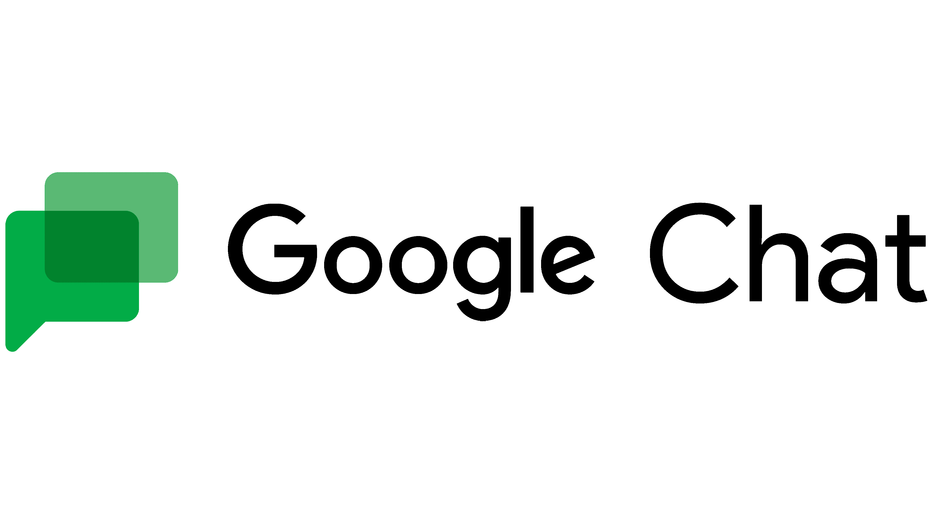
After three years of using the original Google Talk logo, it was decided to change it. The name of the service remained the same as in the previous version. In turn, the emblem has changed. Now there were two figures present. The dark green rectangle is overlaid with a dialog image of a brighter hue. In doing so, the “@” symbol has been removed. The emblem so clearly conveys the service’s functionality that sometimes the logo shows only it, without the Google Chat name.
Font and Colors
The authors used a classic rounded font. Minimalism is the name that did not interfere with conveying the essence of the service, creating an atmosphere of friendliness and customer focus.

The title’s color palette consisted exclusively of black. The classic Google Talk service was the exception, active from 2005 to 2013. It used classic colors for Google. For the emblem, various shades of green were used to indicate the corporation’s constant development and purposefulness.