


![]() Google Cloud Logo PNG
Google Cloud Logo PNG
The emblem exemplifies diversity and direct associations. The Google Cloud logo represents a wide range of cloud products. They will make the user’s life brighter and easier.
Google entered cloud computing later than its main rivals. Amazon Web Services had launched commercial cloud products in 2006, while Google made its first move in April 2008 with App Engine, a service for running web applications on Google’s infrastructure.
Access was initially limited to 10,000 developers, but demand grew quickly. By the end of May 2008, 75,000 users had joined, with over 80,000 still waiting. App Engine became a full commercial product in November 2011. In May 2010, Google launched Cloud Storage. In June 2012, Compute Engine appeared in preview as a rival to AWS Elastic Compute Cloud and Microsoft Azure Virtual Machines. That year, BigQuery became generally available.
Compute Engine entered full commercial release in December 2013. In March 2014, Google cut cloud prices by 30% to 85%, signaling a direct fight for market share. A key shift came in 2015, when Google released Kubernetes and transferred it to the Cloud Native Computing Foundation. It later became an industry standard used across the cloud market. That same year, Google bought Bebop, founded by VMware co-founder Diane Greene, who then led Google’s cloud business. In 2016, Google acquired Apigee and Qwiklabs.
In 2019, Thomas Kurian, a former Oracle executive, became head of Google Cloud. At Google Cloud Next, he introduced Anthos, built for hybrid and multi-cloud management across AWS, Microsoft Azure, and local servers.
Google bought Looker for $2.6 billion in 2019 and AppSheet for $2.6 billion in 2020. The Google Cloud name eventually replaced Google Cloud Platform, combining infrastructure services with Google Workspace, which was renamed from G Suite in 2020.
Meaning and History
![]()
In 2008, the Google App Engine web framework was launched as an environment for developing applications and sites. This moment became the starting point in the cloud platform’s history, as it evolves with new services. Moreover, all products, both old and recent, have their recognizable style, subordinated to the general corporate design.
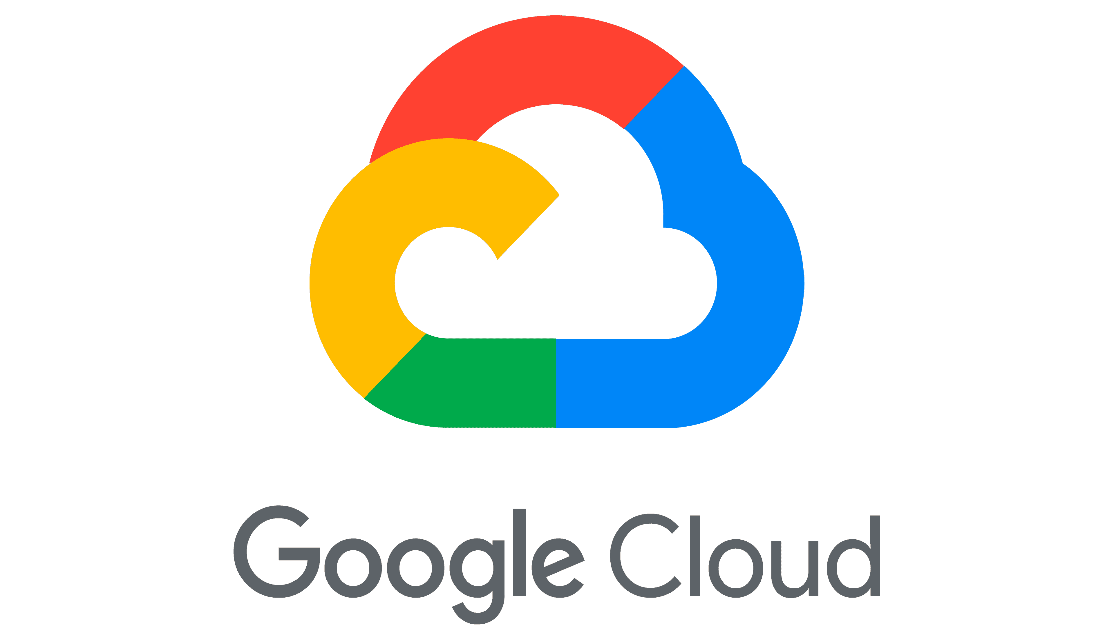
Google Cloud also has a logo based on the parent company’s corporate font and color scheme. It consists of a colorful cloud image and minimalistic gray lettering. The words “Google” and “Cloud” look the same, except for the difference in line thickness. The first half of the name appears darker because it is bolder. The second, accordingly, looks lighter because of the thin strokes.
What is Google Cloud?
This is often referred to as Google Cloud Platform, a web service for cloud computing. On the other hand, there is another Google Cloud that includes GCP, G Suite, and other products of the American corporation.
The text is to the right of the icon and is the same size. The capital G is not much smaller than the cloud, which protrudes slightly from above and below. Google adheres to symmetry principles in its platform design, as reflected in the Google Cloud logo. All components are balanced and coordinated in shape.
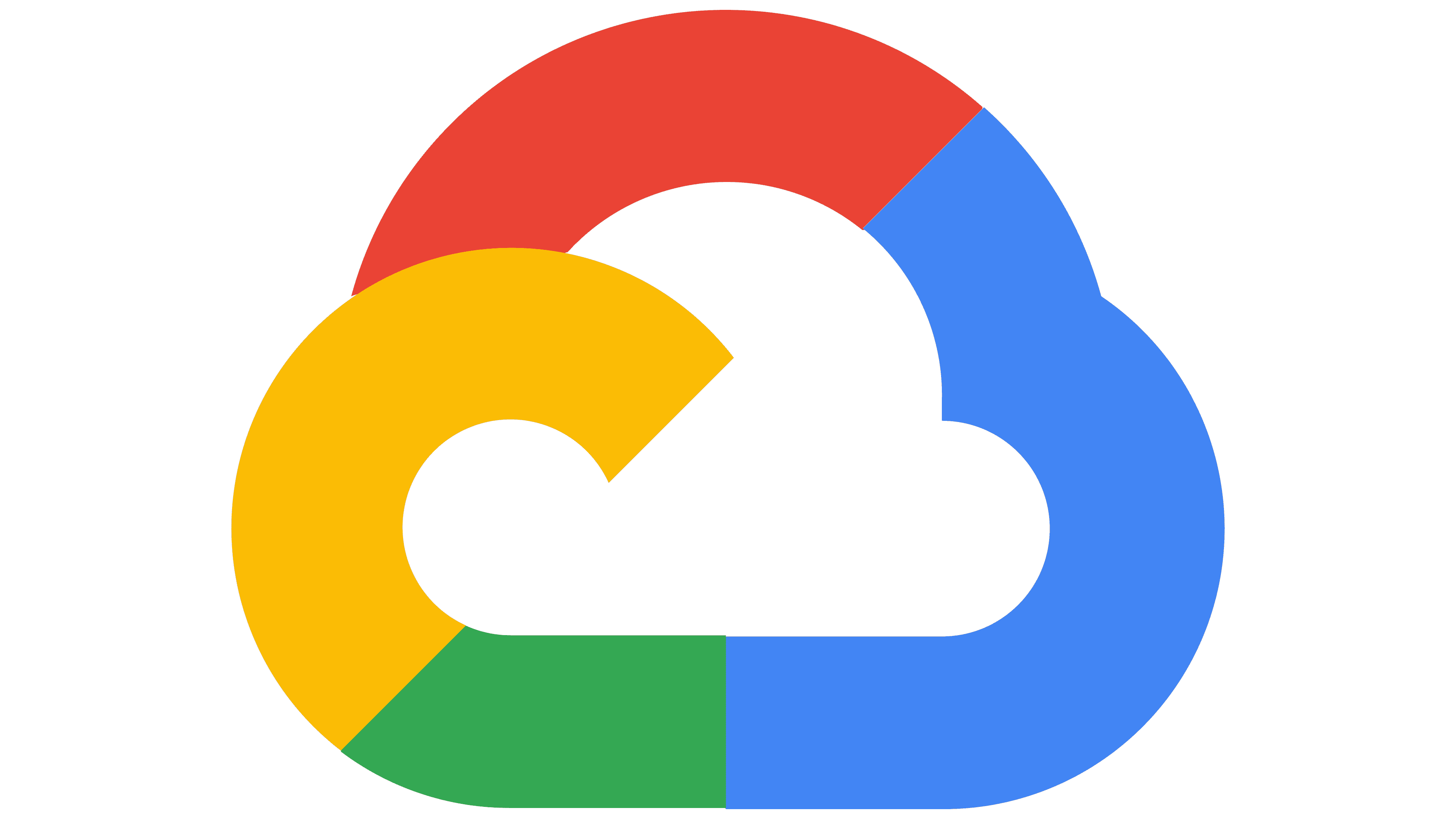
The graphic sign is expectedly similar to a cloud because this symbol reveals the essence of the brand. But it doesn’t look standard: both the outlines and the color palette align with Google’s corporate style. The image comprises multicolored segments connected to form a complex element with an internal gap. The curved lines form the cloud’s outline as children draw it. Simultaneously, the orange stripe is the only one of all that has a free end that goes beyond the limits of a closed geometric figure. The curved line resembles the top half of the letter “G.”
Font and Colors
When organizing their products, the parent company always uses the same font. Therefore, the Google Cloud logo’s inscription is standard: it is set in the branded typeface Product Sans, based on Neuzeit Grotesk and Futura. Geometric sans was developed in 2015 for use in wordmarks in numerous Google services.
The designers changed only the shape of the letter “e,” making the horizontal line diagonal. The 45-degree slope corresponds to the angle at which the “G,” “g,” and “C” edges are cut. The combination of lowercase and uppercase characters revealed the font’s originality. The round shape and the absence of serifs hint at the service’s adaptability to external conditions, from adapting to users’ requirements to creating new technological solutions.
The logo colors were taken from the Google palette. The segment that looks like “G” is colored gold (#FFD400), the top of the cloud is red (#FF3333), the right side is blue (#3BCCFF), and the small segment at the bottom is light green (#48FF48). For the lettering, the designers chose a gray (#5F6368), similar to the dark Shuttle Gray (#61666B).
FAQ
What is the symbol for Google Cloud?
The symbol is a blue hexagonal icon. Each product and service in the Google Cloud Platform (GCP) has its own unique blue hexagonal icon. These icons represent Google’s technology and tools, especially in architecture diagrams and technical references.
Use a generic blue hexagon for products and services that don’t have a unique icon. This design helps users quickly identify and differentiate between various company offerings. The blue hexagon is a recognizable brand symbol that represents its range of cloud-based products and services.
Is Google Cloud still a thing?
Yes, Google Cloud is still a big player in cloud computing. It continues to grow and offers a wide range of services to businesses. Whether you’re new to the cloud or already using it, the company helps businesses modernize and transform.
The brand focuses on open-source, hybrid, and multi-cloud solutions. These help businesses avoid dependence on a single vendor and speed up development. The company provides tools and services like computing, storage, databases, machine learning, and data analytics. Google Cloud ensures strong data and application security.
What does the Google Cloud logo mean?
The logo represents the service it offers. Shaped like a cloud, it directly illustrates its focus on cloud computing. This makes it easy for users to understand its primary function.
The logo uses the same colors as Google’s branding: blue, red, yellow, and green. These colors link Google Cloud to its parent company, reinforcing trust and reliability.
The cloud shape illustrates the platform’s role in providing cloud-based solutions, such as computing power, storage, and data analytics. It highlights the flexibility and scalability these services offer to businesses. The cloud shape clarifies its function, while the colors connect it to Google’s larger ecosystem. This helps users recognize and trust the platform as part of the Google family.
What is the logo of Google Cloud?
The logo features a small cloud outlined by a single curving line. This simple design represents the cloud computing services the brand offers. The cloud outline uses the same colors as the main Google logo: blue, red, yellow, and green. These colors link Google Cloud to its parent company, creating a cohesive and recognizable identity.
Next to the cloud icon is the name “Google Cloud” written in gray. The gray text contrasts with the vibrant cloud colors, making the name stand out while keeping the look clean and professional.
This logo design clearly conveys the platform’s cloud computing capabilities and visually connects it to Google’s broader ecosystem.
What is the font of the Google Cloud logo?
The logo uses two versions of the Product Sans font: a thin and a bold. Product Sans is a custom typeface developed by Google, forming the core of Google’s visual identity and that of its brands. This font is clean, modern, and approachable, and it fits Google’s branding.
Using Product Sans in the logo ensures a consistent look across all Google products. The thinner version gives a sleek and professional appearance, while the bold version adds emphasis and clarity. Product Sans features rounded letterforms and geometric shapes, giving the logo a friendly, accessible feel.
This consistency helps users quickly recognize and trust Google Cloud as part of the larger Google ecosystem.