


![]() Google Drive Logo PNG
Google Drive Logo PNG
The Google Drive logo is bright and eye-catching. The image shows different facets of the software. The emblem encodes various file types, ways to work with them, and directions for which the service will be useful.
The roots of Google Drive trace back to the mid-2000s, during the rise of Web 2.0. In 2005, the small startup Upstartle launched Writely, a browser-based text editor that enabled real-time collaboration without installation. Co-founder Sam Schillace described it as a new type of application that rethinks desktop software for the web. On March 9, 2006, Google acquired Upstartle for about $10 million. In parallel, it bought 2Web Technologies and developed early online spreadsheets in Google Labs. By October 2006, these tools merged into Google Docs & Spreadsheets.
Rumors of a cloud storage service called “GDrive” circulated as early as 2006. Internally, Google already used a system with 500 MB of storage for employees. In 2007, Dropbox was founded by Drew Houston and Arash Ferdowsi, and it reached 50 million users by 2011. Microsoft launched SkyDrive in 2007, while Box, founded in 2005, focused on enterprise storage.
On April 24, 2012, Google Drive launched publicly with 5 GB of free storage. Apps were released for Windows, macOS, and Android, followed by iOS. The platform integrated Google Docs, Sheets, and Slides, forming a unified workspace. The launch triggered debate over terms of service, particularly Google’s license to process user content, which the company framed as a technical necessity.
In 2013, free storage increased to 15 GB, shared across Gmail, Google Drive, and Google Photos. In 2014, “Suggesting” mode appeared in Docs. In 2016, “Tasks” enabled assignment tracking. In June 2018, paid storage became Google One. In 2020, Google Apps was rebranded as Google Workspace. In 2023, Duet AI was introduced and later, in 2024, renamed to Gemini for Google Workspace, based on Gemini 1.5 Pro.
Meaning and History
![]()
Despite the changes made, Google has chosen to keep all elements intact. Therefore, any adjustments were insignificant. The main details have been preserved in their places: a triangle composed of wide, multicolored stripes. Essentially, the icon has evolved from pale to bright and now includes red. This is the lower right corner color because the mix of blue and yellow creates that tone.
What is Google Drive?
It is a file-hosting service that lets you store data in the cloud, access it from any device, and share it freely with other users.
2012 – 2014
![]()
The logo appeared in April 2012. It appeared alongside the launch of the cloud document storage program. Displays a suite of office applications focused on web collaboration.
To emphasize this concept, the creators used an isosceles triangle, with each side representing what is included in Google Drive. Namely – presentations, tables, documents.
2014 – 2020
![]()
During the redesign, the developers removed almost all corner shadows from the logo; now the stripes that form an isosceles triangle appear to form a parallelogram. The only shaded area remains in the lower-left corner: it falls on the blue side. The color palette has been preserved, but its spectrum has been changed. As a result, the tones became restrained and muted. The icons representing Google services are arranged on three sides of the triangle. Docs is a blue bar with four white lines; Slides is a yellow slice with one slide; Sheets is a green sector with a two-sided table.
2020 – today
![]()
The updated logo is now used, with minimal changes. The corners of the icon are rounded. An area of two superimposed sides appeared (in those places, the color is more intense). As a result of the adjustments, the triangle’s edges become trapezoidal. The Docs icon has two full and one incomplete line. The Slides frame has been simplified and looks like a blank photo space. Sheets has reduced the table to four cells.
Font and Colors
The triangular shape of the brand name emphasizes the trinity of the services provided. And the closed figure speaks to reliable protection of user data, with no single loophole for outsiders.
The three corners represent a close-knit working environment and the connection among representatives of the three access levels (reader, commentator, and editor). The colors are also symbolic and are linked to the file type: blue – DOCS, green – LEAVES, yellow – SLIDES.
FAQ
What is the symbol of Google Drive?
The symbol is a white triangle inside a geometric frame with three colored sides. Each side represents one of the software’s main options: Google Docs, Google Sheets, or Google Slides.
The logo’s colors are blue, green, and yellow. The blue side represents Google Docs, the green side represents Google Sheets, and the yellow side symbolizes Google Slides. This color scheme helps users link each color to its respective program.
The logo’s simple, recognizable design reflects its purpose: creating, storing, and sharing documents, spreadsheets, and presentations.
What is Google Drive used for?
This free service lets you store files online and access them anywhere using the cloud. It helps you save and manage documents, photos, videos, and other files without using space on your device.
A key feature of the brand is its integration with Google Docs, Sheets, and Slides. These tools let you create and edit documents, spreadsheets, and presentations directly in your web browser.
The company offers different storage plans. The free plan includes 15 GB of storage, which you can upgrade for more space. The service is accessible from computers, smartphones, and tablets, so that you can access your files anytime.
Why is the Google Drive logo a triangle?
The logo is a triangle that symbolizes information security. Each side of the triangle represents a key part of data protection: availability, integrity, and confidentiality.
Availability means that data is always accessible when needed. Users can access their files anytime from any device with an internet connection. The cloud-based system supports this by storing files online.
This means the information users upload remains exactly as saved, without unauthorized changes. Confidentiality involves protecting data from unauthorized access. The brand uses encryption to keep files secure. Only users and those they grant permission to can access the data, helping keep sensitive information private and secure.
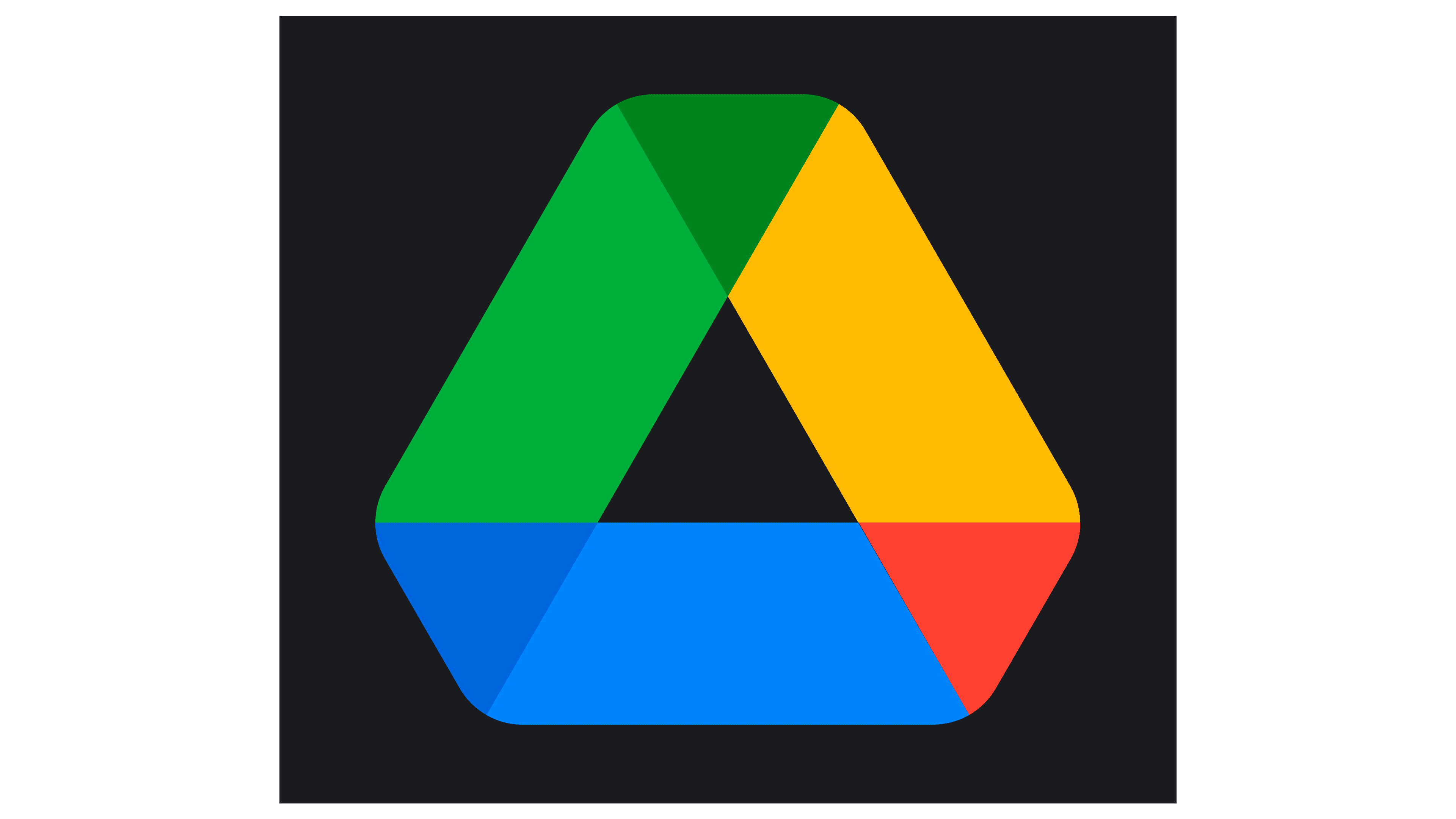
What is the logo of Google Drive?
The logo is a stylized triangle with a white, empty center. It has three colored trapezoids: light green, orange, and blue. Three smaller triangles in dark green, blue, and red are between these trapezoids.
The design symbolizes the integration of Google Drive’s different services. The colors represent the various applications within the brand: Google Docs, Google Sheets, and Google Slides. The light and dark green elements represent Google Sheets, the blue elements symbolize Google Docs, and the orange and red elements represent Google Slides.
The white center signifies openness and accessibility, showing users can store, manage, and access their files from anywhere. The combination of shapes and colors creates a dynamic, recognizable logo that highlights the brand’s commitment to providing a unified platform for file storage and collaboration.
Did Google Drive get a new logo?
Yes, the brand got a new logo in 2020. This update was part of Google’s rebranding effort to unify the design of its productivity tools, such as Google Docs, Google Sheets, and Google Slides.
The new logo retained the triangular shape while introducing a modern look with refined colors and lines. The updated design aimed to create a cohesive and contemporary feel across all Google services. The new logo continues to symbolize integration and connection among Google’s services, maintaining its recognizable, user-friendly design.
Can I use the Google Drive logo?
You can use the logo, but you must follow Google’s branding guidelines. These rules ensure the logo is used correctly and consistently, keeping the brand’s identity intact.
Google specifies how the logo should be displayed, including size, color, and placement. You cannot alter or modify the logo in any way. It should appear as Google provided, maintaining its original proportions and design.
Using the logo correctly means not distorting it, changing its colors, or adding effects. The logo should represent the brand clearly and not mislead users.