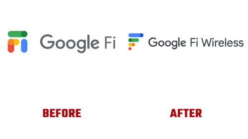
The era of chaos has come to an end. On April 19, 2023, Google’s telecommunication service announced significant changes that will enhance its image:
- It underwent a rebranding, adding the word “Wireless” to the ambiguous “Fi.”
- It systematized the chaotic lines in the logo.
- It added support for smartwatches.
- It expanded its rate plan.
- It planned the release of a new version of the app.
In this way, the wireless service provider is getting closer to users and integrating innovations more actively. It is expanding the list of covered devices and attracting new customers. One of the measures is the change in the brand identity. If the previous service name was not associated with mobile telecommunication, it now directly states it: Google Fi Wireless. Huge changes have also occurred in the visual identity.
- Bold and colorful lines have been regrouped. If the stripes previously represented an unclear accumulation, they are now structured and arranged in length. The largest element is at the top, with a short, dotted one at the bottom.
- The “inverted staircase” symbolizes the scale of wireless signals and the choice of digital device options, which usually appear on the screen when adjusting the volume or brightness. They also indicate the tuning switches in electronic gadgets, such as on/off.
- The modernized logo fundamentally differs from the standard icons of digital products in the Google family: it is not a single solid element composed of several segments. The emblem consists of four fragments arranged separately from each other.
Although the stripes have remained in the company colors, there are more of them than usual. Typically, Google’s design features four colors: red, blue, yellow, and green. Here, there are seven, as three shades have been added to the points on the lines.


